Definitive guide
Best Public Speaker Websites of 2026 | 45 Examples
Start Building →
View Examples →

👋 How I curated this list
Welcome friendly stranger! You’re looking for some inspiring website examples. You found the right page.
About me
My name is Ralph de Groot. I’m the founder and author at My Codeless Website. Wake me up for a great web design. I love writing about website examples, too!
How I curated this list
Once a year I collect 500 website examples to create/update this article. I create a shortlist which I send to my team of web designers. Together, we vote to determine the order of this list.
Next to that, I always follow our editorial policy when writing my articles, to make sure they are really helpful and useful for you.
Best public speaker website examples
- Steven Bartlett
- Colonel Chris Hadfield
- Ken Hughes
- Simon Sinek
- Roz Savage
- Preston Smiles
- Amy Eliza Wong
- Mel Robbins
- Erin King
- Clint Pulver
- Chad Mathew
- Phil M Jones
- Katie Linendoll
- Sarah Wells
- Kindra Hall
- Jeff Ponders
- Dan Lier
- Josh Valman
- James Taylor
- Tony Robbins
- Daymond John
- Eric Thomas
- Nick Vujicic
- Gary Vaynerchuk
- Brian Tracy
- Taylor Elyse Morrison
- Marshall Goldsmith
- Martha Beck
- Tim Tebow
- Zack Kass
- Rich Bracken
- Kristen Hadeed
- Jeff D. Speaks
- Perry McCarthy
- Tima Deryan
- John C. Maxwell
- Amanda Brinkman
- Ron Tite
- Yassmin Abdel-Magied
VIEW THEME / DEMO ▶
VIEW HOST / DEMO ▶
1. Steven Bartlett
URL: https://stevenbartlett.com/
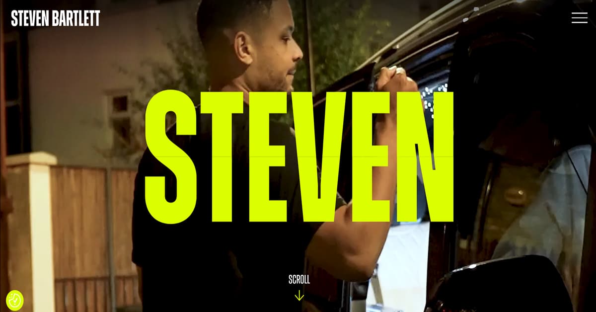
Steven Bartlett is Europe’s fastest-rising, successful entrepreneur and revered motivational speaker on various topics. A visit to his website gives visitors a very energetic vibe due to the choice of colors, typography, and visuals. Talk about using neon yellow green against black, high-definition background videos, and magazine-styled layout for its design. Not to mention the built-in mouseover effects and animated image scrollers. Really hip and interactive!
The things we love about this public speaker website design
- Use of fast-loading background videos and consistent branding
- Interesting content including an autobiographical timeline
- Lots of social proofs and lead magnets including a pop-up opt-in
🚀 Here's the website builder I recommend to replicate this website
VIEW THEME / DEMO ▶
VIEW HOST / DEMO ▶
2. Colonel Chris Hadfield
URL: https://chrishadfield.ca/
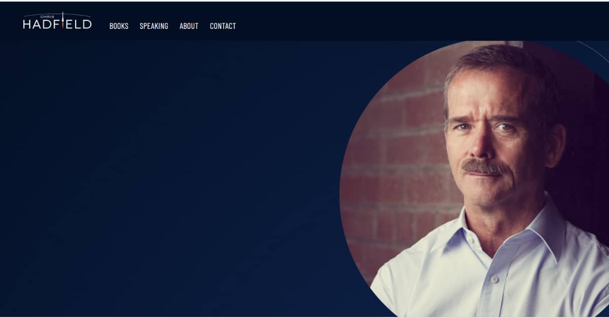
Who would have thought that one of the Speakers Spotlight’s 2024 Most Requested Speaker is a topnotch NASA astronaut. His cosmic experience led him to become a bestselling author, Tech Entrepreneur, and business leader. All of these hats one will see in his space-themed, interactive website. Its contents are really interesting!
The things we love about this public speaker website design
- Consistent color theme
- Nice animation and effects
- Simple yet informative
🚀 Here's the website builder I recommend to replicate this website
VIEW THEME / DEMO ▶
VIEW HOST / DEMO ▶
3. Ken Hughes
URL: https://www.kenhughes.info/
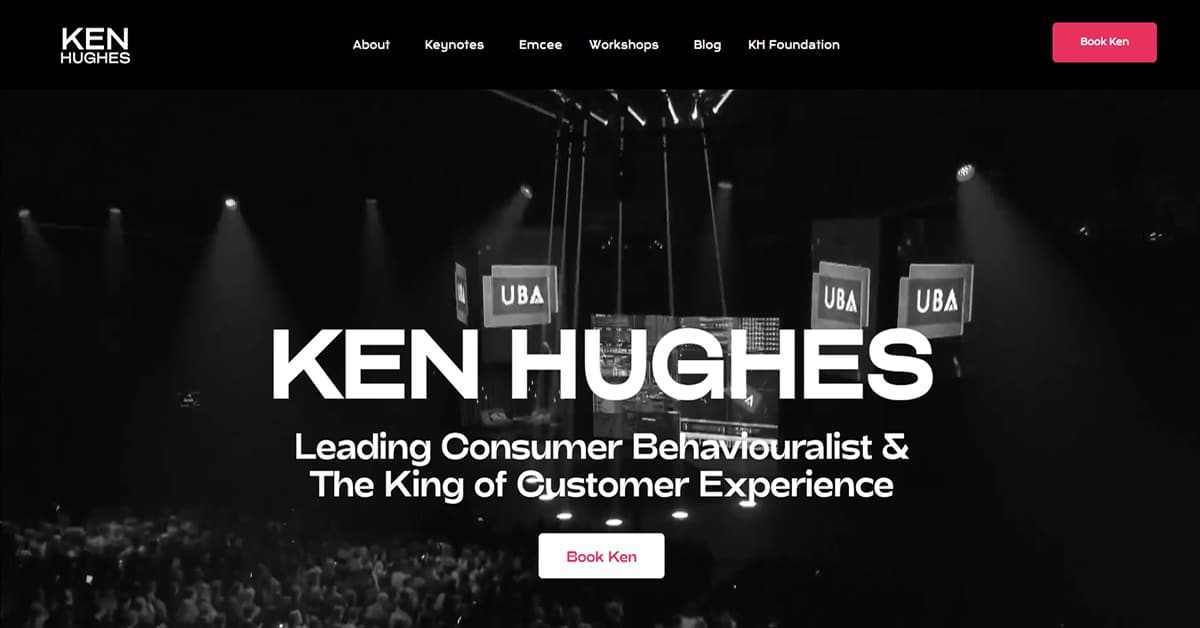
Crowned King of Customer Experience, Ken Hughes is one of the top keynote speakers in Europe when it comes to consumer behavior. He is also a sought-after motivational speaker on artificial intelligence, change, disruption, and innovation. His black themed website has a nice combination of bold, rounded fonts; rounded-edged colorful graphics; and animated effects. Beautiful!
The things we love about this public speaker website design
- Use of color in the visual hierarchy, especially for CTA buttons
- Interactive and fun to navigate
- Trendy layout with lots of social proofs and lead magnets
🚀 Here's the website builder I recommend to replicate this website

VIEW THEME / DEMO ▶
VIEW HOST / DEMO ▶
4. Simon Sinek
I like the funky, loud fonts used on Simon Sinek’s website. It’s as loud as the color scheme in use: orange against hues of purple. But this is not hurtful to the eyes because of the generous white spaces and muted grays matched with vibrant photos.
While I find the hand-drawn icons and background graphics adorable and creative! It is as playful as the layout of the copy, which is spontaneous and lively.
The things we love about this public speaker website design
- Great color scheme
- Playful layout and typography
- Lots of white spaces
🚀 Here's the website builder I recommend to replicate this website
VIEW THEME / DEMO ▶
VIEW HOST / DEMO ▶
5. Roz Savage
URL: https://www.rozsavage.com/
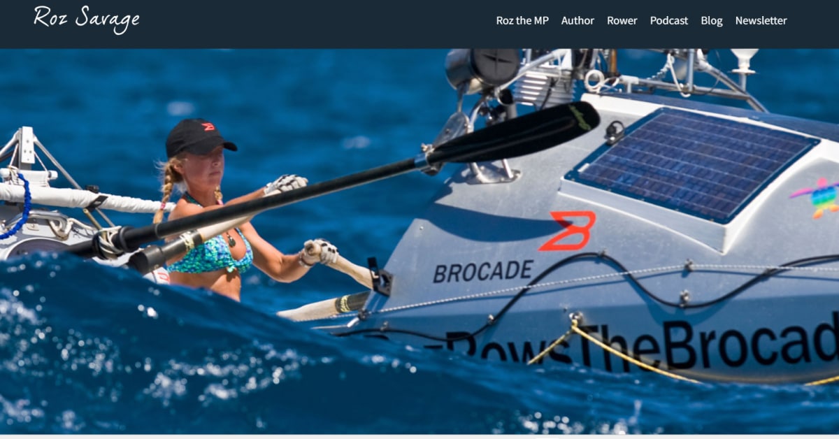
A four-time Guinness World Records holder, Roz Savage is a totally unique motivational speaker for corporate events. She specializes in sharing her experiences and insights on courage, determination, leadership, resilience, and teamwork. Her website opens with a photo slider above the fold, showing the many facets of her professional life as an author, member of the Parliament, ocean rower, and speaker. A very interesting thing to watch as an overview about her.
The things we love about this public speaker website design
- Very neat and organized
- Lots of white spaces to balance the content
- Wide use of social proofs and lead magnet
🚀 Here's the website builder I recommend to replicate this website
VIEW THEME / DEMO ▶
VIEW HOST / DEMO ▶
6. Preston Smiles
URL: https://prestonsmiles.com/
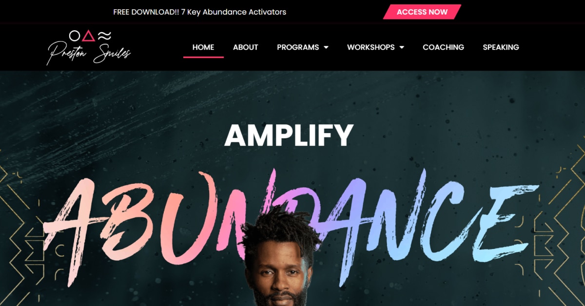
Coach Preston Smiles has a strong grasp of the value of the individual touch. Putting his own photo above the fold and directing attention to the call to action button is a wise approach. I also like the idea of a unique font that creates a deeper sense of personal branding. Check him out now!
The things we love about this public speaker website design
- By looking at the headline, he’s drawing your attention to it as well
- Nice call to action
- Clear menu structure
🚀 Here's the website builder I recommend to replicate this website
VIEW THEME / DEMO ▶
VIEW HOST / DEMO ▶
7. Amy Eliza Wong
URL: https://www.alwaysonpurpose.com/
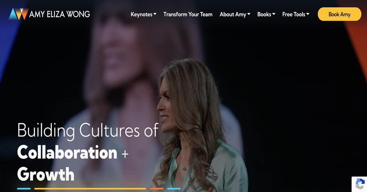
One of the Top 10 speakers recommended by America’s Executive Speakers Bureau, Amy Aliza Wong is a master in “Conversational Intelligence” for personal development and effective leadership. The compelling message, interesting content highlighted by CTAs, and trendy layout is sure to retain visitors in her website.
The things we love about this public speaker website design
- Use of color (yellow) in the visual heirarchy and CTA buttons
- Great combination of typography for easy and lively reading
- Lots of social proofs and lead magnets
🚀 Here's the website builder I recommend to replicate this website
VIEW THEME / DEMO ▶
VIEW HOST / DEMO ▶
8. Mel Robbins
URL: https://www.melrobbins.com/
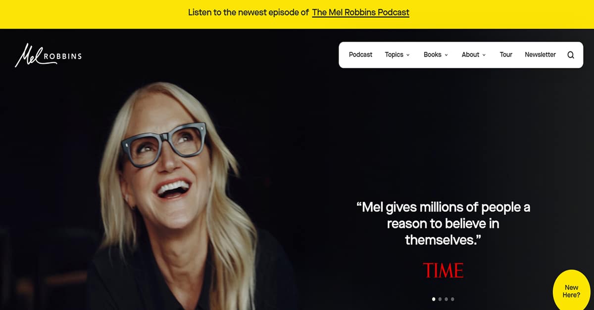
It is hard not to notice that Mel Robbins loves the color yellow once you visit her website. Yellow call-to-action buttons, after all, are the first thing you’ll notice when the website loads. Well, next to her laughing photo above the fold.
Mel Robbin’s website is outrightly simple in content—having only four sections for the menu. Yet on mouseover, each section in the menu expands with more content, visuals, and links. Simple is the best, after all.
The things we love about this public speaker website design
- Cool drop-down menu
- Simple layout and content
- Great use of color for visual hierarchy
🚀 Here's the website builder I recommend to replicate this website

VIEW THEME / DEMO ▶
VIEW HOST / DEMO ▶
9. Erin King
Oh yes. I love this design, as it’s very clean and professional. I like how this website has a clear UX which points users learn more about Erin. The design that they use for the page is modern and has a vibrant color palette which suits her branding well. Very fresh and inspiring design! Check this out now!
The things we love about this public speaker website design
- Fresh design
- Lots of white spaces
- Awesome colors
🚀 Here's the website builder I recommend to replicate this website

VIEW THEME / DEMO ▶
VIEW HOST / DEMO ▶
10. Clint Pulver
Say hi to Clint! Yes, this website does a great job of transferring energy to its visitors. Everything about this design feels upbeat and inspiring. You can easily tell that he is great at what he is doing since the website exudes professionalism and fun at the same time. Definitely make sure to check this one out!
The things we love about this public speaker website design
- Energetic background video
- Clear headline
- Professional photography
🚀 Here's the website builder I recommend to replicate this website

VIEW THEME / DEMO ▶
VIEW HOST / DEMO ▶
11. Chad Mathew
I’m a big fan of Chad! Well, I’ve never met him, but I like his website! His website is clean, compact, and professional. I like how he displays his career in numbers, right below the fold. This is a way to show how great and trustworthy he is in his job. What an awesome man! Definitely check this one out!
The things we love about this public speaker website design
- Cool ‘numbers’ feature
- Great copywriting
- Professional design
🚀 Here's the website builder I recommend to replicate this website

VIEW THEME / DEMO ▶
VIEW HOST / DEMO ▶
12. Phil M Jones
URL: https://www.philmjones.com/
This website is definitely great. The power of video to its fullest. I like how Phil features a nice headline on top of his background video. I also love the tagline that is being highlighted on the landing page which can easily touch your heart. If you want to learn more, visit his page now. Very inspiring!
The things we love about this public speaker website design
- Great headline
- Great background video
- Professional design
🚀 Here's the website builder I recommend to replicate this website

VIEW THEME / DEMO ▶
VIEW HOST / DEMO ▶
13. Katie Linendoll
URL: https://katielinendoll.com/
I like how to website instantly captures the attention of the visitor with an eye-grabbing background image. It’s interesting to see the main call to action button plays a video in an external window. I like the video, but would probably have it open up as a pop-up within the website so visitors don’t have to leave the website. Cool!
The things we love about this public speaker website design
- Awesome background image
- Nice video
- Slick design
🚀 Here's the website builder I recommend to replicate this website
VIEW THEME / DEMO ▶
VIEW HOST / DEMO ▶
14. Sarah Wells
URL: https://thesarahwells.com/
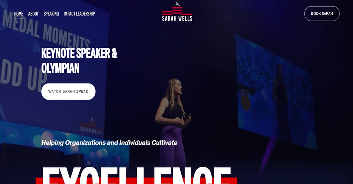
Excellence is the driving force behind Sarah Wells’ success as an Olympian. It has also been the theme of her talks given to individuals and various organizations around the world. Looking at her website, it does not fall short of what she stands for. This visitors can see from the quick-loading video background above the fold, to the unique shapes the vibrant photos and graphics are cut, and to the manner the website’s content is presented. Very professional!
The things we love about this public speaker website design
- Great selection of typography
- Well-planned and designed
- Strategically placed CTA buttons and interactive social proofs
🚀 Here's the website builder I recommend to replicate this website

VIEW THEME / DEMO ▶
VIEW HOST / DEMO ▶
15. Kindra Hall
This one has everything a good public speaking website should have. A clear headline, bright images, and nice video footage. The inspiring tagline on the landing page will easily capture your attention because of the large font that they used for it. I also like the color palette which is very calming and has a professional vibe as well. Awesome!
The things we love about this public speaker website design
- Nice color scheme
- Slick typography
- Nice images
🚀 Here's the website builder I recommend to replicate this website

VIEW THEME / DEMO ▶
VIEW HOST / DEMO ▶
16. Jeff Ponders
URL: https://www.jeffponders.com/
Love this one! This website features a powerful background image that instantly sets authority. The dark color palette gives the website an impression of seriousness and professionalism. However, the sleek design of the page makes it aesthetically pleasing and trustworthy to the audience. I love everything about this website, so check them out now. So minimal, so clean!
The things we love about this public speaker website design
- Awesome menu
- Cool background image
- One of the cleanest websites I’ve ever seen
🚀 Here's the website builder I recommend to replicate this website

VIEW THEME / DEMO ▶
VIEW HOST / DEMO ▶
17. Dan Lier
Want to check out a unique public speaker website example? Have a look at this one. It uses powerful copywriting, and conversion driven. You can easily get inspired by the tagline and will give you the will to change now. Professionalism and a great color palette are remarkable on this website, so check it out now!
The things we love about this public speaker website design
- Great copywriting
- Nice ‘as featured on’ section
- Very clear call to action button
🚀 Here's the website builder I recommend to replicate this website

VIEW THEME / DEMO ▶
VIEW HOST / DEMO ▶
18. Josh Valman
URL: https://www.joshvalman.co.uk/
Josh Valman is a corporate speaker and consultant. I like how he establishes authority by featuring his consultancy client’s right below the fold. I love the font style he used for the website which is very modern and sleek. The design may look simple but it is very pleasing to the eyes. Clever move—great design!
The things we love about this public speaker website design
- Lots of social proof
- Professional design
- Lots of white spaces
🚀 Here's the website builder I recommend to replicate this website

VIEW THEME / DEMO ▶
VIEW HOST / DEMO ▶
19. James Taylor
URL: https://www.jamestaylor.me/
The first thing you see when visiting James’s site is that commanding picture and the great black-and-white scheme. This feature-rich website is so inspiring and just simply exudes professionalism. His photo on the landing page is proof that he is doing well in his job and I know you will like him too. Great job!
The things we love about this public speaker website design
- Uplifting photos
- Smooth and modern interface
- Classy write-up. Highly recommended!
🚀 Here's the website builder I recommend to replicate this website

VIEW THEME / DEMO ▶
VIEW HOST / DEMO ▶
20. Tony Robbins
URL: https://www.tonyrobbins.com/
Tony Robbins is an internationally acclaimed public speaker besides being a philanthropist, a constant #1 New York Times Bestselling Author, and a veteran life coach.
With so many accomplishments, it is not surprising that his website has much to offer. Yet the information is well categorized in a dropdown menu and an easy-to-find layout. The website also has a nice color theme of black, white, and cool blue.
The things we love about this public speaker website design
- Well-planned navigation and menu
- Organized and clean design
- Very interactive content
🚀 Here's the website builder I recommend to replicate this website

VIEW THEME / DEMO ▶
VIEW HOST / DEMO ▶
21. Daymond John
What I like about Daymond John’s website is the nice color theme: mocha and black. It’s a not-so-common color theme used in websites. It gives a sense of groundedness, which is why it seems this sought-after international speaker has been called, “The People’s Shark”.
It’s a title Daymond John achieved for being approachable and helpful. It is seen clearly in the encouraging copywriting that is presented in unique fonts. Plus, I also love how color was used to uniquely separate copy from the wonderful background photos of this renowned brand guru.
The things we love about this public speaker website design
- Unique, clean layout
- Wonderful photos and typography
- Nice color theme
🚀 Here's the website builder I recommend to replicate this website

VIEW THEME / DEMO ▶
VIEW HOST / DEMO ▶
22. Eric Thomas
Hip is the perfect word to describe the website of multi-awarded international speaker Eric Thomas. It has a cool design, fancy special effects, and an interplay of large but slim typography.
The color theme is also unique. It tweaks the usual black-and-white theme with undertones of scarlet red in gradients and full color. Good CTAs and ample social proofing come as a slider of company endorsements and a real-time counter of social media followers.
The things we love about this public speaker website design
- Beautiful visuals
- Great typography
- Unique color theme
🚀 Here's the website builder I recommend to replicate this website

VIEW THEME / DEMO ▶
VIEW HOST / DEMO ▶
23. Nick Vujicic
Nick Vujicic’s website captures his tenacity for overcoming personal limitations through a background video above the fold. The video shows this international speaker standing before a multitude of people and being given a standing ovation. It’s enough proof of how captivating he is, much like his website with its minimalist design, attractive color scheme, and compelling copywriting.
The things we love about this public speaker website design
- Minimalist design
- Compelling copywriting
- Great background video
🚀 Here's the website builder I recommend to replicate this website

VIEW THEME / DEMO ▶
VIEW HOST / DEMO ▶
24. Gary Vaynerchuk
URL: https://garyvaynerchuk.com/
Gary Vaynerchuk’s website has a cheerful color theme of violet and yellow with black and green in between. It seems to mirror the type of personality this business tycoon and renowned public speaker.
What I liked most in his website is the timeline of his life story, which is interestingly presented as an image slider. It has nice photos that come to life (become colorful from a grayscale or dimmed effect) on mouseover. The layout of his website is also out-of-the-ordinary since the menu is located on the left. The menu, by the way, is well-organized, colorful, and interactive.
The things we love about this public speaker website design
- Colorful visuals and effects
- Interactive menu
- Nice design concept
🚀 Here's the website builder I recommend to replicate this website

VIEW THEME / DEMO ▶
VIEW HOST / DEMO ▶
25. Brian Tracy
URL: https://www.briantracy.com/
There are three things I like most in Brian Tracy’s website: the clean layout, minimalist design, and the use of color for visual hierarchy. Tinges of teal and orange are used as highlights for important information and CTAs against the muted color of light to dark gray. This and the lively photos that accompany it blend well as one great visual. Oh, and I like their transparent drop down menu, too!
The things we love about this public speaker website design
- Use of color for visual hierarchy
- Clean layout
- Cool dropdown menu
🚀 Here's the website builder I recommend to replicate this website
VIEW THEME / DEMO ▶
VIEW HOST / DEMO ▶
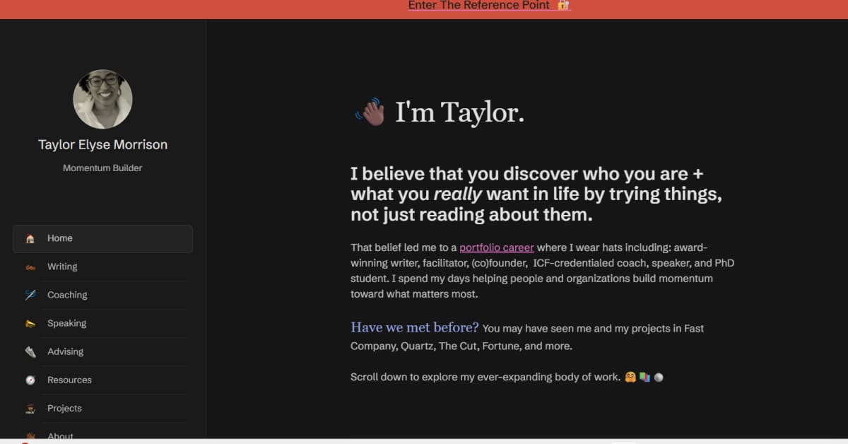
26. Taylor Elyse Morrison
Taylor Elyse Morrison’s website is an aesthetic masterpiece, captivating visitors with a well-thought-out color scheme and border usage for images. The outcome is fantastic! Her work at the intersection of self-care and personal development is presented in a way that is both accessible and actionable, making her website a delightful experience for those interested in her offerings.
The things we love about this public speaker website design
- Designs are filled with eye-catching colors
- Attractive, easy-to-read fonts
- Not afraid of simplicity
🚀 Here's the website builder I recommend to replicate this website
VIEW THEME / DEMO ▶
VIEW HOST / DEMO ▶
27. Marshall Goldsmith
URL: https://marshallgoldsmith.com/
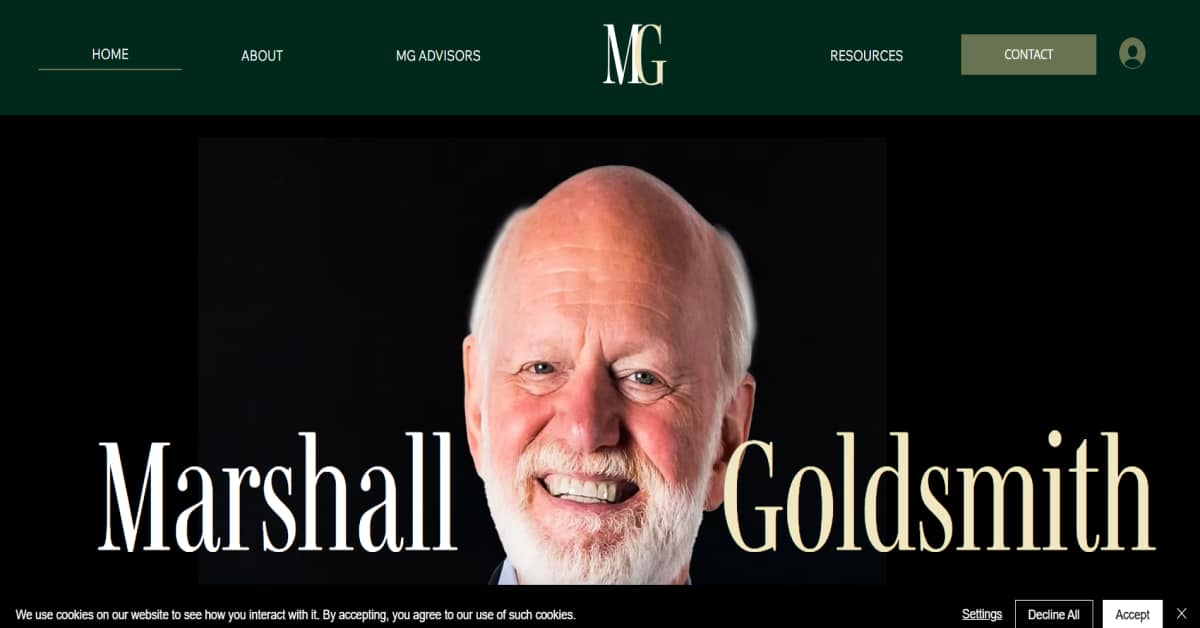
Cited as one of the World’s Best Life Coaches 2024, Dr. Marshall Goldsmith has a very interesting call to action button strategically placed at the upper right-hand corner of his website. It is labeled, “MarshallBOT”.
Clicking the golden orange CTA would open a new window where one can “talk to him” through his avatar, which is run by Artificial Intelligence (AI). For someone in his senior years, Marshall Goldsmith is true to his title as one of the Top Ten Business Thinkers of the World.
Besides the techie content, the website has a funky and lively design due to colorful handwritten-style illustrations used as accents. The website also has generous white spaces paired with a green and golden-orange theme.
The things we love about this public speaker website design
- Consistent color theme
- Uniquely fun visuals
- AI features
🚀 Here's the website builder I recommend to replicate this website
VIEW THEME / DEMO ▶
VIEW HOST / DEMO ▶
28. Martha Beck
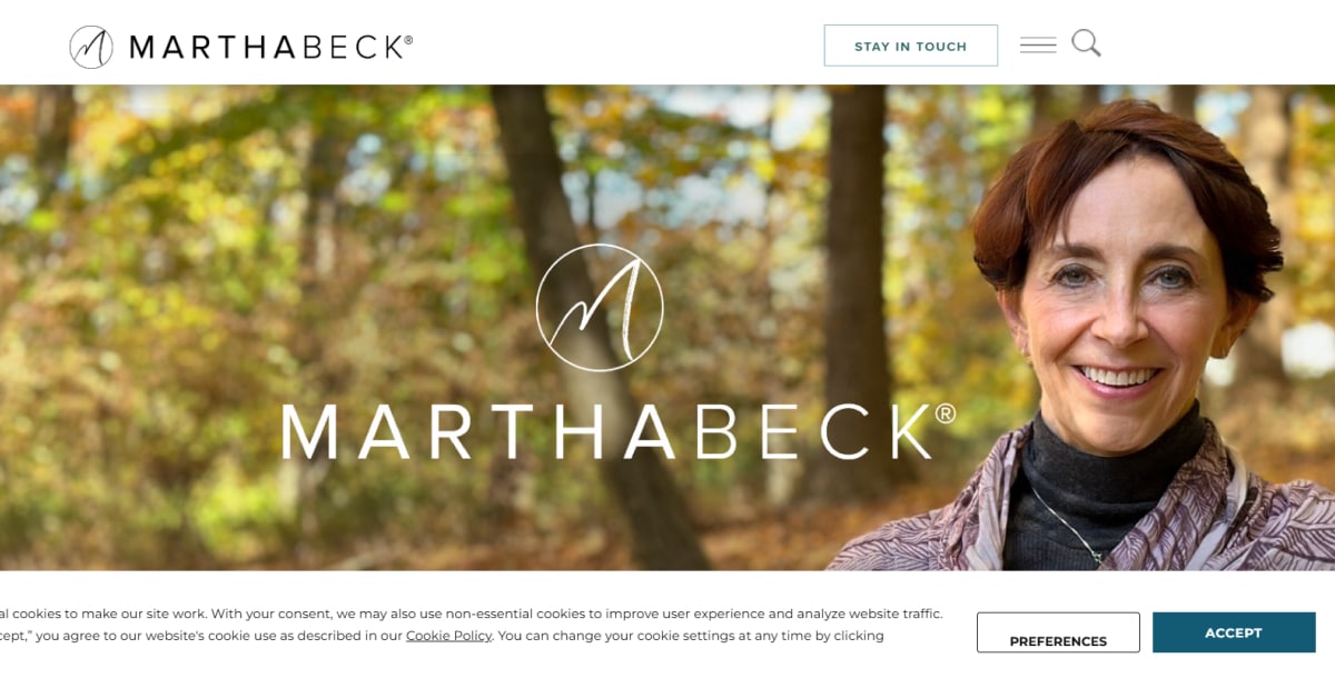
I like how Martha Beck’s tagline matches her photo above the fold. Both convey a sense of direction, encapsulating what life coaches are meant to be. Life coaches help people know where they are in life and where to next.
I also like the minimalist design, generous white spaces, the interesting image slider, and the very neatly tucked yet expanding menu. The website is among the few I’ve spotted on this list that offers accessibility options, which are very visitor-oriented.
The things we love about this public speaker website design
- Strong branding
- Minimalist design
- Visitor oriented through accessibility options
🚀 Here's the website builder I recommend to replicate this website
VIEW THEME / DEMO ▶
VIEW HOST / DEMO ▶
29. Tim Tebow
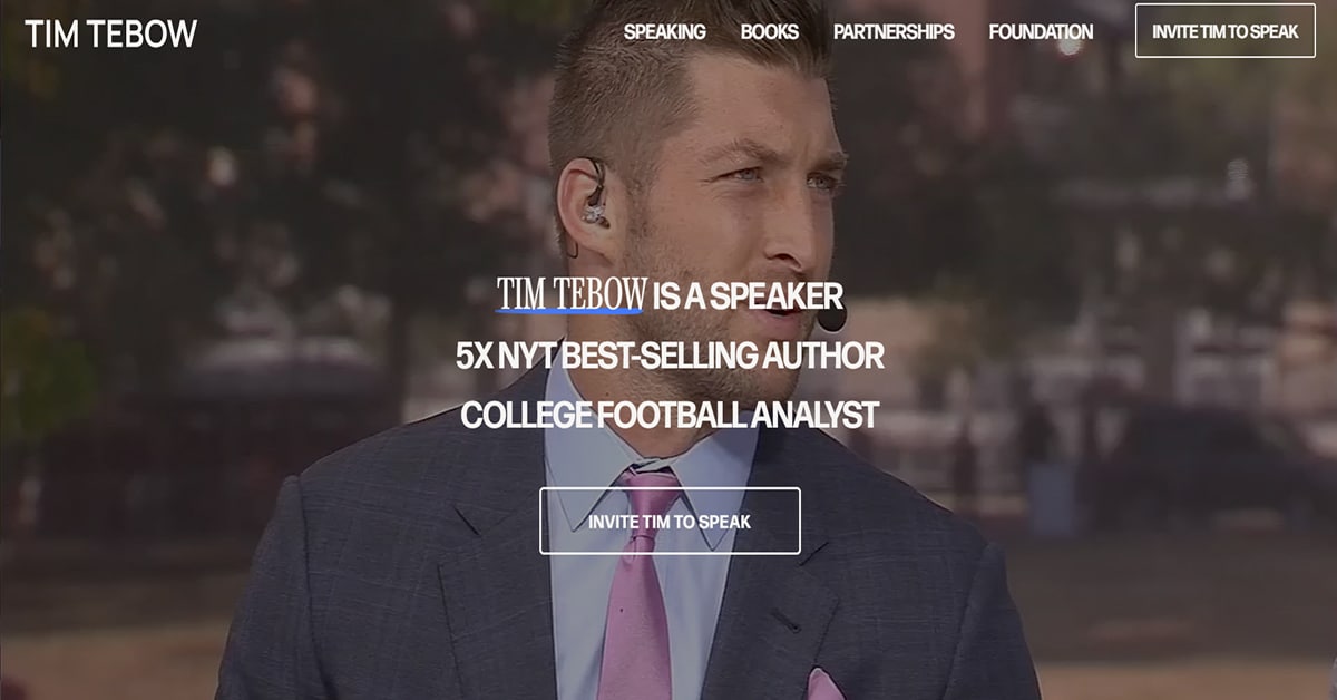
Tim Tebow has a simple black-themed website highlighted by white and orange uppercased robust fonts above the fold. The website’s minimalist, magazine-style design incorporates images and typography with a masculine vibe. It pretty much reflects this American sports celebrity turned most sought after public speaker of 2025.
The things we love about this public speaker website design
- Minimalist-style expanding menu integrated with CTA buttons and vibrant photos of speaker
- Simple yet equipped with interactive features
- Strong branding
🚀 Here's the website builder I recommend to replicate this website
VIEW THEME / DEMO ▶
VIEW HOST / DEMO ▶
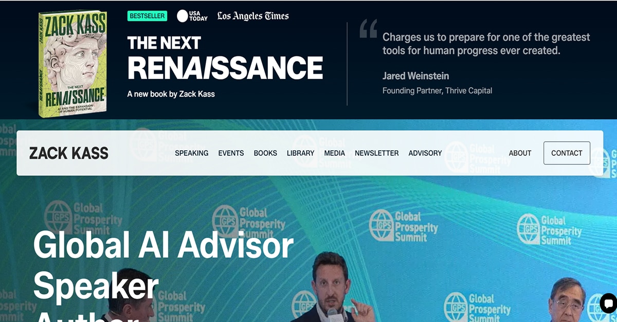
30. Zack Kass
Referring to himself as a “futurist”, Zack Kass is regarded by All American Speakers as one of the Top Keynote Speakers For 2025 Events. He advocates AI as the main thrust of his thought leadership talks after spending more than a decade in commercializing the technology. Using a minimalist design, his website uses earthen tones of gray and dark teal. The unique video above the fold reflects the overlayed compelling message the speaker wishes to deliver on the vast potential of AI for humanity.
The things we love about this public speaker website design
- Nice storytelling through video above the fold
- Consistent color theme and layout
- Strategically-placed CTA buttons and lead magnets
🚀 Here's the website builder I recommend to replicate this website
VIEW THEME / DEMO ▶
VIEW HOST / DEMO ▶
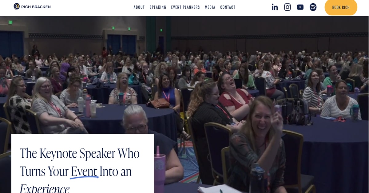
31. Rich Bracken
URL: https://www.richbracken.com/
Rich Bracken’s website has a chirpy vibe to it. That’s thanks to the pastel colors of orange, pink, and blue that are interplayed in the design for highlighting important content. It truly reflects this public speaker’s energetic persona who has numerous Fortune 100 clients in his speakership portfolio.
The things we love about this public speaker website design
- Strategically-placed CTA buttons using color in the visual hierarchy
- Use of animated image scroller for social proofs
- Clean, easy-to-read, and organized content
🚀 Here's the website builder I recommend to replicate this website
VIEW THEME / DEMO ▶
VIEW HOST / DEMO ▶
32. Kristen Hadeed
URL: https://www.kristenhadeed.com/
A member of the Executive Speakers Bureau, Kristen Hadeed is sought after keynote speaker on human leadership by organizations and individuals. Her website is loud and vibrant with colors, various fonts, and rich multimedia. It’s very interactive and even has a chatbot version of herself. Neat!
The things we love about this public speaker website design
- Great combination of typography
- Energetic vibe
- Well-planned and organized content
🚀 Here's the website builder I recommend to replicate this website
VIEW THEME / DEMO ▶
VIEW HOST / DEMO ▶
33. Jeff D. Speaks
Jeff Speaks has the simplest website I have seen so far for those in this list. It’s quite uncommon for someone who has spoken around the world on authentic leadership and mental health. Not to mention being an award-winning author at that. What I like about the website is its soothing colors and straightforward content.
The things we love about this public speaker website design
- Very clean and easy to navigate
- Strategically-placed CTA buttons
- Use of social proofs and lead magnets
🚀 Here's the website builder I recommend to replicate this website
VIEW THEME / DEMO ▶
VIEW HOST / DEMO ▶
34. Perry McCarthy
URL: https://www.perrymccarthy.co.uk/
Perry McCarthy is a world-renowned F1 racer turned London’s most popular corporate speaker to date. He has a simple yet cool website with an entertaining video above the fold. The video presents this Motor Sports celebrity’s life in the fast lane to his new-found career. Really interesting!
The things we love about this public speaker website design
- Brimming with social proofs
- Fast-loading video above the fold
- Lots of happy people photos
🚀 Here's the website builder I recommend to replicate this website
VIEW THEME / DEMO ▶
VIEW HOST / DEMO ▶
35. Tima Deryan
URL: https://www.mountaingipsy.com/
Tagged as one of the 2024 Top 10 Keynote Speakers in Europe, Tima Deryan believes in “breaking boundaries” to contribute positively in the world. Her website, branded online as Mountain Gypsy, opens with a photo of Mount Everest above the fold–a testament of her achievement as the first Lebanese woman to finish the Seven Summits challenge and reach the summit of Mount Everest. Just awesome!
The things we love about this public speaker website design
- Minimalist and colorful design
- Great story narrative
- Use of social proofs, lead magnets, and chatbot
🚀 Here's the website builder I recommend to replicate this website
VIEW THEME / DEMO ▶
VIEW HOST / DEMO ▶
36. John C. Maxwell
URL: https://www.maxwellleadership.com/
A New York Times Best-Selling Author, Talent Concierge Artists Agency ranks John C. Maxwell as one of the Top 10 Motivational Speakers of 2024. He specializes in transformational organization and leadership, which he also teaches under his foundation, “Maxwell Leadership”. His minimalist-designed website is extensive in content but well organized, user-friendly, and easy-to-navigate. Go check it out!
The things we love about this public speaker website design
- Strong branding
- Well-planned navigation and menu
- Use of lead magnets
🚀 Here's the website builder I recommend to replicate this website
VIEW THEME / DEMO ▶
VIEW HOST / DEMO ▶
37. Amanda Brinkman
URL: https://amandakbrinkman.com/
Professional yet funky are the two words the popped to mind after visiting Amanda Brinkman’s website. This trailblazer in brand marketing and creativity sure knows what she’s doing since her personality is really seen in her website. Another minimalist website, it uses a uniquely trendy layout incorporating varying circular patterns and shapes in the design. Simple but very attractive.
The things we love about this public speaker website design
- Strong branding
- Use of color in the visual hierarchy and CTA buttons
- Compelling copywriting
🚀 Here's the website builder I recommend to replicate this website
VIEW THEME / DEMO ▶
VIEW HOST / DEMO ▶
38. Ron Tite
URL: https://rontite.com/
Ron Tite wears many hats but the primary among them is being a renowned speaker on Marketing and Purpose-Driven Leadership. His website is simple–no frills yet friendly, interactive, and colorful. The narrative is powerful and reflective of his expertise not only as an author but also as a marketer. Above all, his website is a good example of one that uses color in the visual hierarchy and the typography.
The things we love about this public speaker website design
- Compelling copywriting
- Strong branding
- Lots of white spaces, social proofs, and vibrant photos
🚀 Here's the website builder I recommend to replicate this website
VIEW THEME / DEMO ▶
VIEW HOST / DEMO ▶
39. Yassmin Abdel-Magied
URL: https://www.yassminam.com/
Yassmin Abdel-Magied is an world famous award winning speaker on diversity, change management, and leadership. Set with a black and white theme, Yassmin’s website
opens with an animated automatic photo slider presenting her various talks over the years. The website uses a minimalist design that brings to the fore the sharp photos and informative videos on the speaker.
The things we love about this public speaker website design
- Simple navigation and menu
- Rich multimedia content
- Lots of social proofs
🚀 Here's the website builder I recommend to replicate this website
These are my favourites.
BONUS – Here is my favorite template
Public Speaker Template
URL: https://mycodelesswebsite.com/try-theme/life-coach
Why this is such a great template:
- Clean design, great to turn visitors into customers
- Wordpress compatible, easy to customize
- Free download if you’re a Divi member
BONUS: Wix
URL: wix.com
Although this one shouldn't be on the list - I couldn't keep this one from you. Wix has amazing website themes and leads by example. Their own homepage looks stunning.
What can you learn from this great website
- Playful design
- Clear call to actions
- Great user experience

Modern Examples

Startup Examples

Wix Examples
More website examples
3 Award Winning Web Designers I recommend
I highly recommend you to have a look at their portfolios!
HIGH-END
WEBFLOW EXPERT

Arch Web Design
archcowebdesign.com
We're a Canadian Webflow agency that helps SaaS companies increase their revenue using high-converting websites. We've worked with over 200 SaaS companies and see an average 3.7x increase in website leads.
✓ Top Companies worked with:
Hugo (acquired by Calendly), SmartSuite,
DuxSoup
✓ Our average client increases their conversions by 3.7x in 90 days
✓ We've helped our clients secure $200M in funding

Vrrb
vrrb.com
Vrrb is an award-winning creative agency based in Los Angeles. 14+ years of experience building extraordinary websites, applications, and digital solutions for the world's most recognizable brands.
✓ Our core services include branding, website design/development, mobile apps, digital strategy, and ongoing support
✓ We work with companies (50+ employees) and funded startups to accelerate growth
✓ Clients include Ferrari, Visa, HP, UCLA, and Behr Paint
1
Explore inspiring website templates
Epic website templates you install and customize.


2
Select the right page builder.
Using a page builder allows you to build a website without using code.
Here is the one I recommend.

About the author
My name is Ralph de Groot. I love excellent web design. In fact, you can wake me up at night if you find an inspiring website. Besides writing on My Codeless Website I also love to read and travel.
PS: If you decide to purchase a tool I recommend, I get a small commission at no extra cost to you.
Checklist: 5 ways to make your public speaking website beautiful and highly converting
1. Don’t break the 5 second rule
The moment a visitor lands on your website you only have 5 seconds to make a good impression.
That’s 5 short seconds to convince your visitor to stay on your website – and don’t hit the ‘back’ button.
Make sure the text on your website is appealing and gets your visitor excited. Don’t waste the first 5 seconds of somebody’s visit with unnecessary fluff.
2. Don’t confuse your visitor with too many call to actions
Great call to actions draw the attention of your visitors.
That said, you don’t want your call to action buttons fighting for the attention of your visitor. Pick the most important call to action for that page, and go with it.
In case you want to show multiple call to actions anyway, make sure to give them a different design, with your primary call to action being the most notable one.
3. Use video footage to make your website come alive
In the list with website examples you found some cool websites which use video background in the header of their website. If you have video footage yourself, definitely consider doing this as well.
- It makes your website come alive
- It adds credibility and makes you look professional
4. Use a ‘smart lead form’ to turn visitors into clients
Getting someone to visit your website is one thing. Getting them to do business with you is the next one.
Sure, you can add your contact information to your website – you should – but don’t expect people to be calling right away.
Make it easy. Add a ‘discuss your project’ contact form to enable them to get in touch with you.
Make it as easy as possible. I recommend not using more than 3 fields in your contact form.
5. Design mobile first
Last year over 52% of all the website traffic worldwide came from mobile devices.
More than half of the website visits are on a mobile device.
This percentage will only increase in the coming years, therefore the mobile design of your website is crucial for the success of your flower shop business.
When designing your website, think about the mobile design before you build your desktop website.
Growth hacking: 3 powerful strategies to promote your speaking website
1. Use a LinkedIn-bot to generate traffic on autopilot
Allright. You’re now probably thinking one of two things:
- That sounds spammy. I’m not going to do that.
- A bot? How does that even work? I’m not a scientist.
Trust me, I thought the same as you. But it’s not as sketchy as it seems.
Dux-Soup is a LinkedIn tool which allows you to ‘look’ at 100 LinkedIn profiles per day.
This tool automatically visits LinkedIn profiles of people of your choice. In the past, I’ve used this a lot to get in touch with business owners.
I would have Dux-Soup open the profiles of 100 business owners per day.
It’s actually pretty simple:
- Download the Dux-Soup tool
- Open your LinkedIn account
- Search for ‘business owner’ or any other job description’
- Click the ‘Visit profiles’ button.
Now here comes the important part: Make sure your LinkedIn profile is optimized.
This means:
- A good looking profile picture
- A good tagline which describes what you do
- A great profile description which demonstrates your skills as a constructor
- Some nice portfolio projects on your LinkedIn profile
Let’s say 20% of every profile visit converts into a ‘return-visit’. That will mean 20 potential business owners who look at your LinkedIn profile every day.
That’s 600 potential leads in a month.
2. Target hot traffic with retargeting ads
Imagine.
A potential client is looking for flower shop services and stumbled upon your website. But after scrolling through your website for 30 seconds, he or she got a phone call from a friend. After calling for 20 minutes they forgot about your website and they close down their computer.
Auch.
That’s why I use retargeting advertisements to bring back these lost leads.
This will enable you to display advertisements to people who visited your website.
Just install a Facebook pixel on your website to target all your website visitors with an advertisement on Facebook or Instagram.
3. Experiment with offline marketing
Here’s one I absolutely love. If you send cold emails to potential clients, probably 10% or less will open it. Now what if you change that to physical letters? That’s more like 90%.
Now I don’t want you to write the entire sales letter by hand, simply the name+address on the envelope will do.
Bonus tip: I’d recommend you to buy coloured envelopes, as they get noticed better and will increase your open rate.
FAQ
What makes a good public speaker website?
A great speaker design should have a clean design, be easy to navigate and include a lot of social proof. Have a look at this page for great example websites.
How to create a public speaking website?
- Analyze the best examples on this page
- Make notes of what you like – and what you don’t like
- Design your own site with this drag & drop website builder
- Publish your website with our recommended hosting platform.
How much does a public speaker website cost?
A web designer will charge anywhere between $3500 and $8000 for a decent website. However, this article will teach you to do it yourself for less than $100.
What information is needed on a public speaker website?
Your website will need at least the following pages: ‘Home, About us, Contact, Product overview. To create trust with your visitor it’s important to show lots of pictures of your products.

