Definitive guide
Best Dark Websites of 2026 | 30+ Examples
Start Building →
View Examples →

👋 My Experience With Dark Web Design
Hi – it’s Ralph here 👋 In the past 10 years, I’ve designed 15+ dark websites. What I learned over the years building dark websites:
1. Contrast and Readability
To create a great dark website, I highly suggest taking time to plan a great contrast between colors and ensure the readability of your content. Use vibrant colors to highlight your CTAs.
2. User-friendly Navigation
Dark websites often have a minimalist design, so I suggest ensuring simple and easy navigation for your visitors. Make sure that your menus are still visible and easy to access, so use an accent color or light colors.
3. Emotional and Psychological Impact
Keep in mind the right use of dark website aesthetics. Make sure that when planning the design it will fit the branding of your website and the audience will enjoy navigating it. I suggest giving your visitors an option to switch to light mode
Focus on this, and you’ll be fine.
PS: I suggest taking a look at the website examples below. Get inspired by their designs and see which website builders they’ve used. Best of luck!
👋 How I curated this list
Welcome friendly stranger! You’re looking for some inspiring website examples. You found the right page.
About me
My name is Ralph de Groot. I’m the founder and author at My Codeless Website. Wake me up for a great web design. I love writing about website examples, too!
How I curated this list
Once a year I collect 500 website examples to create/update this article. I create a shortlist which I send to my team of web designers. Together, we vote to determine the order of this list.
Next to that, I always follow our editorial policy when writing my articles, to make sure they are really helpful and useful for you.
Best dark website examples
- General Condition
- Dark
- Hey Orbi
- Steve Edge Design
- LONGSHOT
- BLCK VC
- Vovi Studio
- Wicked Templates
- Copilot
- Tabulio
- Clyde
- Fleava
- Andrew Leguay
- Darkroom
- Studio Maertens
- Peter Lindbergh
- Yuto Takahashi
- USSR Design Almanac
- Black Dog Story
- Eyesprint
- Peter Lindbergh
- Throwbacks Music
- Furrow Studio
- Brother Film
- Framer
- Henri Heymans
- Richard Payne
- Woo Hyon Kang
- BlueYard
- Spotify for Artists

VIEW THEME / DEMO ▶
VIEW HOST / DEMO ▶
1. General Condition
A warm welcome from this website with a creative and fun page above the fold. Below the fold, the black and white content continues to be very fun and enticing with lots of great images, animations, and write-ups. So nice to see!
What we love about this web design:
- Fantastic theme in word and image
- Creative way to show past work
- Fun design yet professional
🚀 Here's the website builder I recommend to replicate this website
VIEW THEME / DEMO ▶
VIEW HOST / DEMO ▶
2. Dark
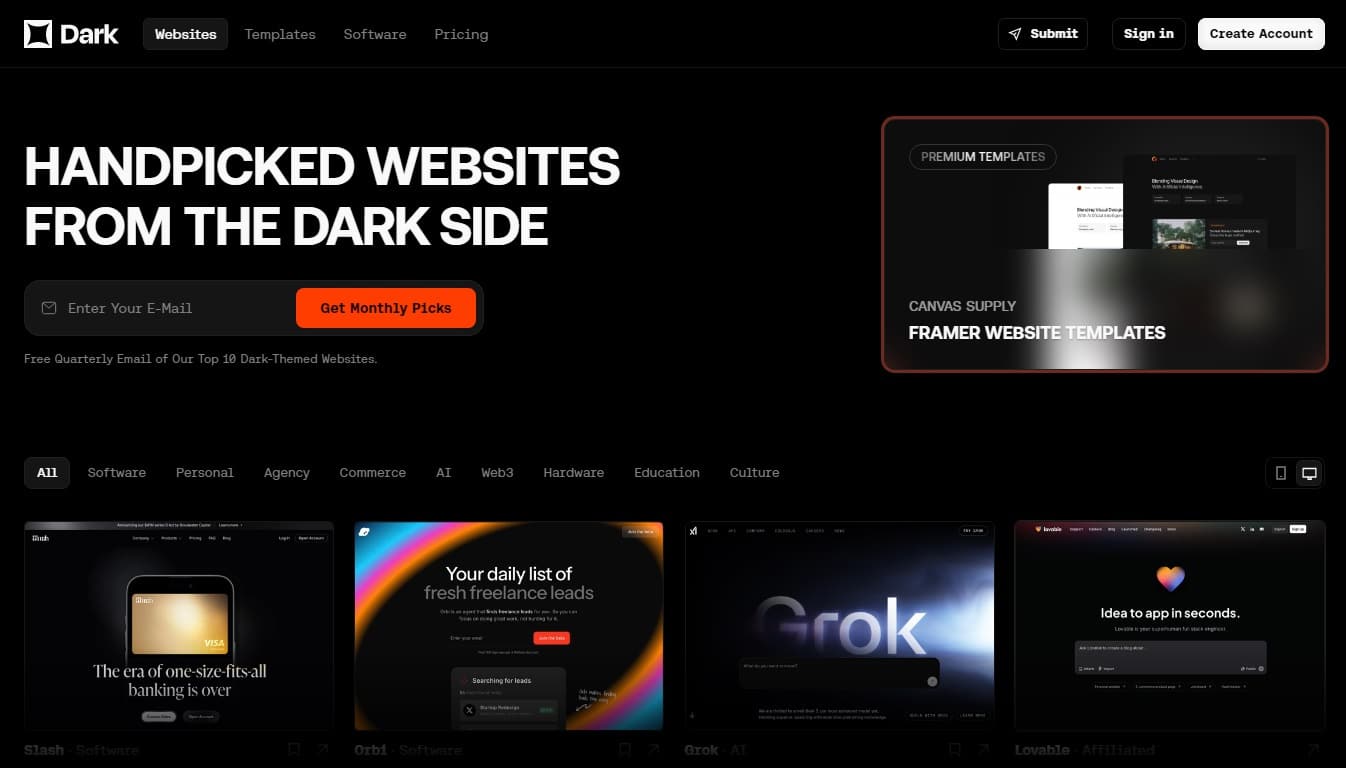
This website, as the name implies, is a great example of a dark-themed website. A membership-based website, the accessible examples of dark-themed websites are truly captivating. Dark’s website layout is neat and organized. It uses attractive visuals made more visible by the dark theme and the use of contrasting colors for fonts. Not to mention a witty message above the fold.
What we love about this web design:
- Use of a lead magnet as part of the design above the fold
- Use of color in the visual hierarchy
- Strategically-placed CTA buttons
🚀 Here's the website builder I recommend to replicate this website

VIEW THEME / DEMO ▶
VIEW HOST / DEMO ▶
3. Hey Orbi
A great example of a dark-themed website, The great thing about Hey Orbi’s website—besides the use of a minimalist design—is its generous use of contrasting colors to enliven the design. This contrast is implemented in CTA buttons, text, and animation. Outstanding!
What we love about this web design:
- Use of glassmorphism to make design elements more lively
- Use of lead magnets, social proofs, and cool animation
- Down-to-earth and witty tone of writing
🚀 Here's the website builder I recommend to replicate this website
VIEW THEME / DEMO ▶
VIEW HOST / DEMO ▶
4. Steve Edge Design
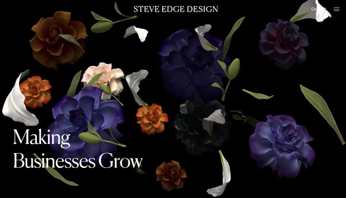
Wow! That is the perfect description of this website. The background 3D animation—a very detailed and realistic one—above the fold set against a black theme was just captivating. The website uses a minimalist design adorned with large, high-quality, vivid photos. This makes the images seem as if they are popping out of the page.
What we love about this web design:
- Impressive images and animation
- Cool mouse-over effects
- Trendy layout and font
🚀 Here's the website builder I recommend to replicate this website

VIEW THEME / DEMO ▶
VIEW HOST / DEMO ▶
5. LONGSHOT
If you’re a fan of quirky and clever animations paired with retro-inspired and timeless pop culture illustrations, then LONGSHOT is the ultimate website for you! You’re gonna be blown away by how insanely original their concepts are, from start to finish!
What we love about this web design:
- Eccentric and witty animations
- Vintage-inspired and classic pop culture illustrations
- Original concept
🚀 Here's the website builder I recommend to replicate this website

VIEW THEME / DEMO ▶
VIEW HOST / DEMO ▶
6. BLCK VC
Bold words are written on the first highlight and focuses on the services. With that, a dark background provides more emphasis. Sliding down follows different colored backgrounds with different write-ups
What we love about this web design
- Sectional website design and different background colors
- Call to action above the fold
- Nice photography
🚀 Here's the website builder I recommend to replicate this website

VIEW THEME / DEMO ▶
VIEW HOST / DEMO ▶
7. Vovi Studio
Prepare to be captivated by Vovi Studio’s irresistible website slogan and cutting-edge aesthetic that will undoubtedly grab your attention! If you believe that’s all there is above the fold, try hovering your cursor over the shapes again. An explosion of color awaits you! Don’t miss this one out!
What we love about this web design:
- Sleek web design
- Color-pop effects
- Plain & gradient color schemes work so well together
🚀 Here's the website builder I recommend to replicate this website

VIEW THEME / DEMO ▶
VIEW HOST / DEMO ▶
8. Wicked Templates
https://www.wickedtemplates.com/
True to its name, this website offers ready-to-use Tailwind website starter templates for every need. Wicked’s design and layout are, in themselves, simple and easy to navigate. Their use of contrasting colors to their dark theme is gentle on the eyes, yet directs visitors to their offerings.
What we love about this web design:
- Consistent use of the dark theme in its design
- Minimalist layout with crisp and clean graphics
- Strategically placed CTA buttons set with mouseover features
🚀 Here's the website builder I recommend to replicate this website
VIEW THEME / DEMO ▶
VIEW HOST / DEMO ▶
9. Copilot
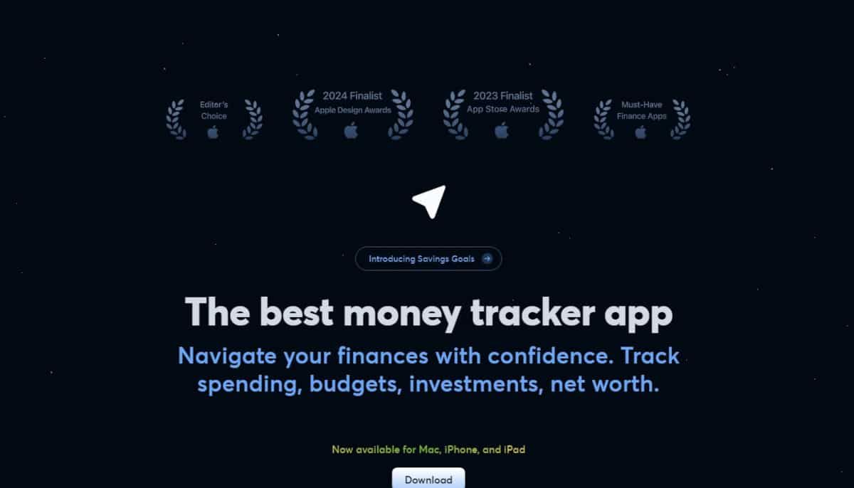
Copilot certainly understands the importance of social proof on a website, making it the prominent visual above the fold. Their use of duotone graphics, icons, and photos was carefully selected to blend with their dark theme, making it appeasing to the eyes. Plus, they did great using both 2D and 3D graphics with glassmorphism effect to make the overall design come alive.
What we love about this web design:
- Unique minimalist layout (center-aligned) with carefully-crafted visuals and smooth animation
- Strong branding seen in choice of images, font, and writing
- Lots of social proofs
🚀 Here's the website builder I recommend to replicate this website
VIEW THEME / DEMO ▶
VIEW HOST / DEMO ▶
10. Tabulio
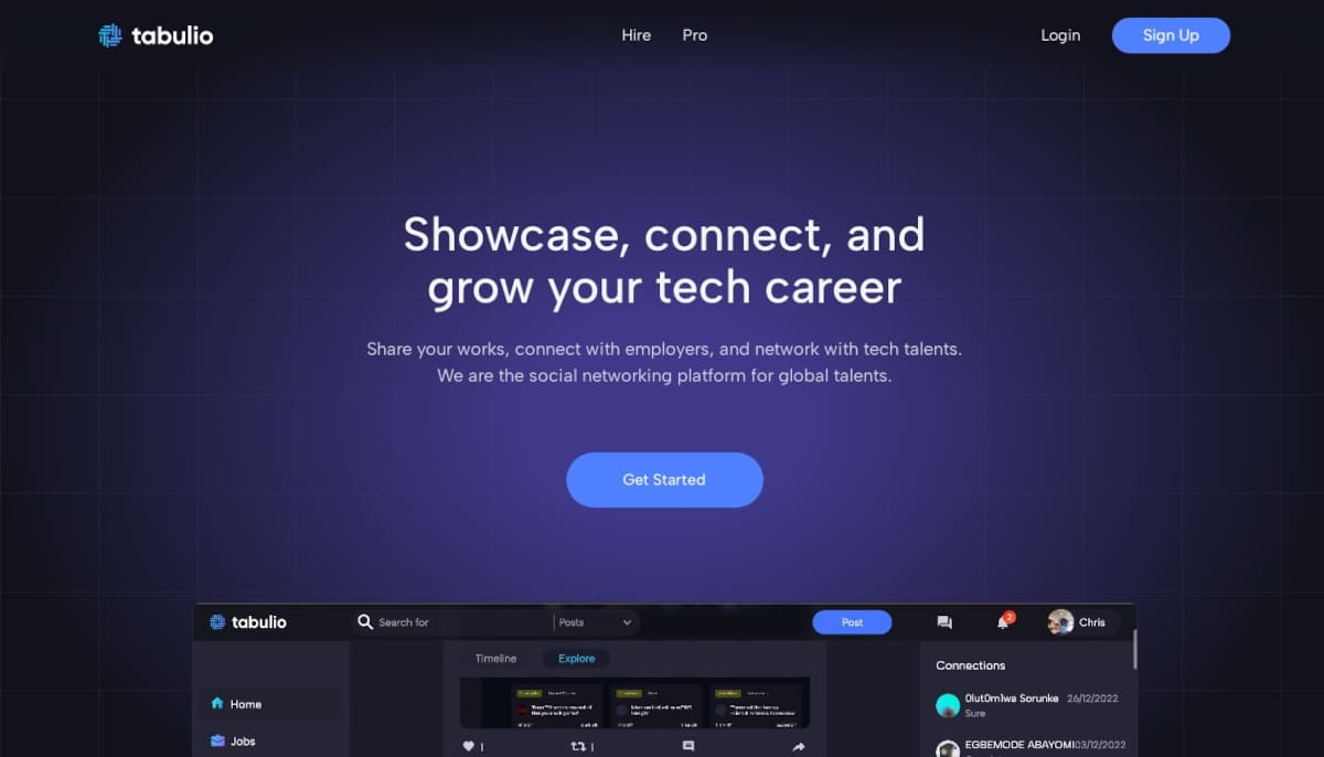
Tabulio is another dark-themed website using a gradient of pale blue to black. The theme is paired with lots of rounded corner images using a glassmorphism effect for an overall smooth design. The website is very interactive. It has lots of animation from image and text scrollers to a nicely-embedded video demonstrating the actual use of their product.
What we love about this web design:
- Consistent color theme aligned with their branding
- Strategically-placed CTA buttons that uses branding color
- Social proofs are made a part of the design
🚀 Here's the website builder I recommend to replicate this website

VIEW THEME / DEMO ▶
VIEW HOST / DEMO ▶
11. Clyde
Clyde is not just another dark-themed website but an exemplary one. It uses a gradient of purple and orange to black. But what really makes this website superb is its fast loading speed despite being fully animated, beginning with the background. Scrolling down the website, it presents an interactive narrative of who they are and what they offer. It is just amusing!
What we love about this web design:
- Unique blend of color for their dark theme that is consistently used throughout the design
- Great combination of fonts, copywriting, images, and unique special features (e.g. multi-colored page scroller)
- Minimalist yet trendy layout
🚀 Here's the website builder I recommend to replicate this website

VIEW THEME / DEMO ▶
VIEW HOST / DEMO ▶
12. Fleava
Fleava extensively uses 3D imagery in its website using a dark theme of gray. The website is a showcase of the company’s expertise in 3D design, digital art, and seamless animation. Using a minimalist layout and glassmorphism effect for graphics, the website is impressive but not flashy. There’s a sense of simpleness and professionalism in its overall design.
What we love about this web design:
- Provides visitors with very pleasant user experience
- Highly interactive yet quick-loading website
- Compelling messages and great copywriting
🚀 Here's the website builder I recommend to replicate this website
VIEW THEME / DEMO ▶
VIEW HOST / DEMO ▶
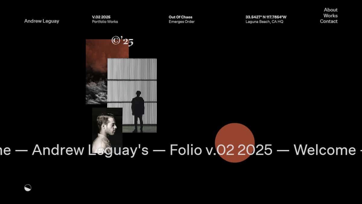
13. Andrew Leguay
This website welcomes you with LARGE-FONT LETTERING that moves all over the place. I recommend that you prepare yourself before viewing this one because Andrew Leguay made sure that his homepage is full of excitement.
What we love about this web design
- Smooth and fast animations
- Well designed and functional
- Elements that facilitate engagement
🚀 Here's the website builder I recommend to replicate this website
VIEW THEME / DEMO ▶
VIEW HOST / DEMO ▶
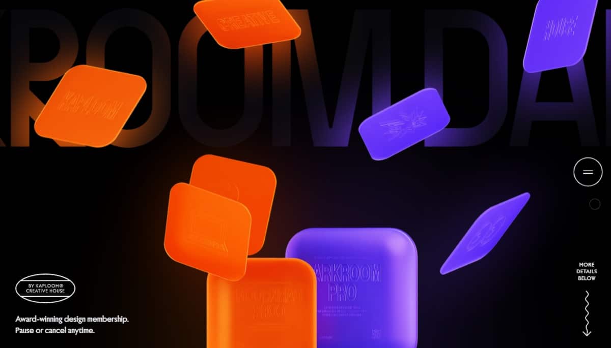
14. Darkroom
The Darkroom is a product of Kaploom Creative House for membership-based designs accessible to everyone. Their website has a dark color scheme composed of a black background with bright orange and blue animation above the fold. It is overlayed with similarly-colored 3D images, which could be seen in other areas as one scrolls down the page. Overall, it is professionally designed and a bit cute for its use of emojis as icons.
What we love about this web design:
- Use of crisp 3D graphics and sharp photos
- Modern, minimalist layout
- Lots of animation and user-centered special features
🚀 Here's the website builder I recommend to replicate this website

VIEW THEME / DEMO ▶
VIEW HOST / DEMO ▶
15. Studio Maertens
Studio Maertens is an interdisciplinary industrial design studio based in Berlin that specializes in product design, product consulting, and digital photography. As you browse this page, it grows increasingly technical and sophisticated. Overall, the designer elevated animation to a new level.
What we love about this web design
- Keeps website content fresh
- Classy and professional
- Visual options that are appealing to the eye
🚀 Here's the website builder I recommend to replicate this website

VIEW THEME / DEMO ▶
VIEW HOST / DEMO ▶
16. The Virtual Economy
https://atelier.net/virtual-economy/
Are you a fan of galaxy designs? If yes, then you’ll absolutely love The Virtual Economy. As you open their website, you’ll be welcomed by a galaxy of activity. Visit them for a new economic frontier that may just be the answer to the generational wealth gap!
What we love about this web design
- Aesthetically pleasing design
- Galaxy elements
- Page elements are memorable
🚀 Here's the website builder I recommend to replicate this website

VIEW THEME / DEMO ▶
VIEW HOST / DEMO ▶
17. Yuto Takahashi
Yuto Takahashi is a 10/10 website! I love how creative Yuto is in presenting a portfolio worth looking at. The animation is excellent, and the colors that surround the pages enliven all corners. Beautifully designed!
What we love about this web design
- Design elements facilitate engagement
- Conversion is the top priority
- Navigation makes sense
🚀 Here's the website builder I recommend to replicate this website

VIEW THEME / DEMO ▶
VIEW HOST / DEMO ▶
18. USSR Design Almanac
This website’s dark surface is enhanced by the use of orange, a bold, warm hue that conveys enthusiasm. Like yellow and red, it can be very attention-grabbing, which is perhaps why it is often used in dark website examples. Overall, USSR Design Almanac looks modern and chic.
What we love about this web design
- Readily accessible contact and location
- Modern and chic color scheme
- Optimized for search and the social web
🚀 Here's the website builder I recommend to replicate this website

VIEW THEME / DEMO ▶
VIEW HOST / DEMO ▶
19. Black Dog Story
Get ready to dive into this awesome website! Black Dog Story kicks off with vibrant Korean characters that come to life with a mesmerizing ripple effect. If you enjoy engaging narratives supported by fluid animations and transitions, this is the one for you.
What we love about this web design:
- Wonderful storytelling!
- Creative and interactive graphics
- Smooth animations and transitions
🚀 Here's the website builder I recommend to replicate this website

VIEW THEME / DEMO ▶
VIEW HOST / DEMO ▶
20. Eyesprint
Eyesprint will literally make your eye sprint with everything that is happening. Each corner has a piece of vital information to make you hooked, and the black and white color combination didn’t disappoint. Nicely done!
What we love about this web design:
- Excellent web interfaces and interactive designs
- High-quality content
- Strong brand identity
🚀 Here's the website builder I recommend to replicate this website

VIEW THEME / DEMO ▶
VIEW HOST / DEMO ▶
21. Peter Lindbergh
https://peterlindbergh.obys.agency/
Out of all examples here, Peter Lindbergh focused on using zoom animations to introduce himself and his awesome works! I love how “emphasized” every element is to entertain each visitor. Well done!
What we love about this web design:
- Well-written, keyword-rich content
- Well-formatted images that are easy to scan
- Website loads within 4 to 6 seconds
🚀 Here's the website builder I recommend to replicate this website

VIEW THEME / DEMO ▶
VIEW HOST / DEMO ▶
22. Throwbacks Music
https://bahaasamir.me/throwbacks-music/
Want to visit the music memory lane? Throwbacks Music presents musicians from the past that we still love and admire today. I appreciate how they presented each musician in such a way that we could listen to them as if nothing else mattered. Nice!
What we love about this web design:
- Browser compatibility
- Good contrast between background and text
- The design automatically attracts the user’s eyes
🚀 Here's the website builder I recommend to replicate this website

VIEW THEME / DEMO ▶
VIEW HOST / DEMO ▶
23. Furrow Studio
Furrow Studio’s website is 100% awesome! I honestly thought I was in Microsoft Paint when I opened it. They actually nailed the part where the visitors have to uncover the background image because they dig deep to discover the great stories that lie just below the surface. Nicely done!
What we love about this web design:
- All design elements work seamlessly
- Keeps the target audience in mind
- User-friendly navigation
🚀 Here's the website builder I recommend to replicate this website

VIEW THEME / DEMO ▶
VIEW HOST / DEMO ▶
24. Brother Film
Brother FIlm’s website will never back down when it comes to design. As you visit them, you’ll instantly discover how experienced and solid they are as a creatively-led video production company. Click the link to know why I’m so smitten by them! Indeed, excellent site design = more trust = more profitable conversions.
What we love about this web design
- Great design with a purpose in mind
- Relevant and original content
- Color choices compliment each other
🚀 Here's the website builder I recommend to replicate this website
VIEW THEME / DEMO ▶
VIEW HOST / DEMO ▶
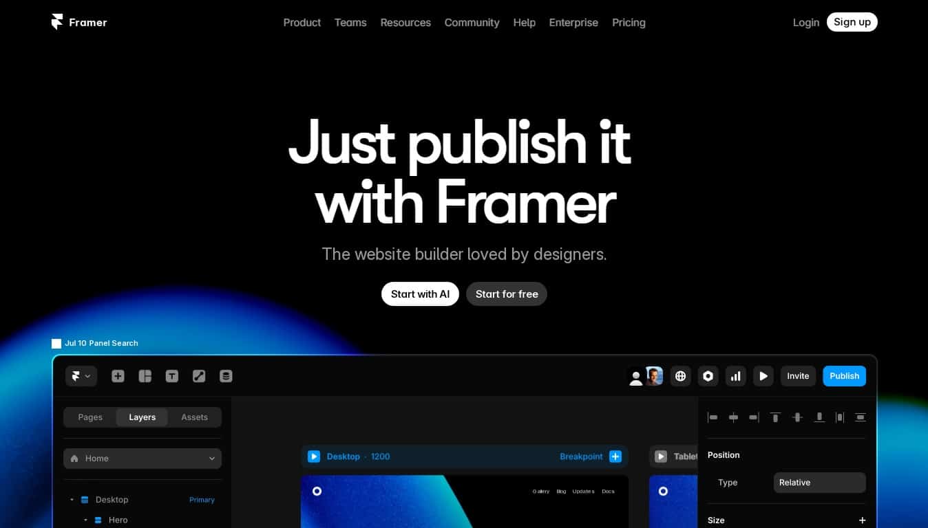
25. Framer
Framer’s dark-themed website is simple with touches of giant gradient blue orbs here and there. The graphics and photos are boxed in rounded, multi-colored corners for extra emphasis in the design. Center-aligned in alignment, the vivid images paired with white colored fonts give the website an overall pleasant design.
What we love about this web design:
-
Use of the glassmorphism effect on creative elements
-
Use of color in the visual hierarchy
-
Interactive content
🚀 Here's the website builder I recommend to replicate this website

VIEW THEME / DEMO ▶
VIEW HOST / DEMO ▶
26. Henri Heymans
Step right up and get ready to be blown away by Henri Heymans’ portfolio! As soon as you walk in, you’ll see a hypnotic show: an enchanting animation of a glitchy, yet perfectly smooth sphere. It’s a feast for the eyes that will leave you both curious and strangely happy. With its unique styles and animations, this website takes creativity to new heights!
What we love about this web design:
- Personal copywriting
- Neon green as an accent color really work so well in the design
- Smooth scrolling animation
🚀 Here's the website builder I recommend to replicate this website
VIEW THEME / DEMO ▶
VIEW HOST / DEMO ▶
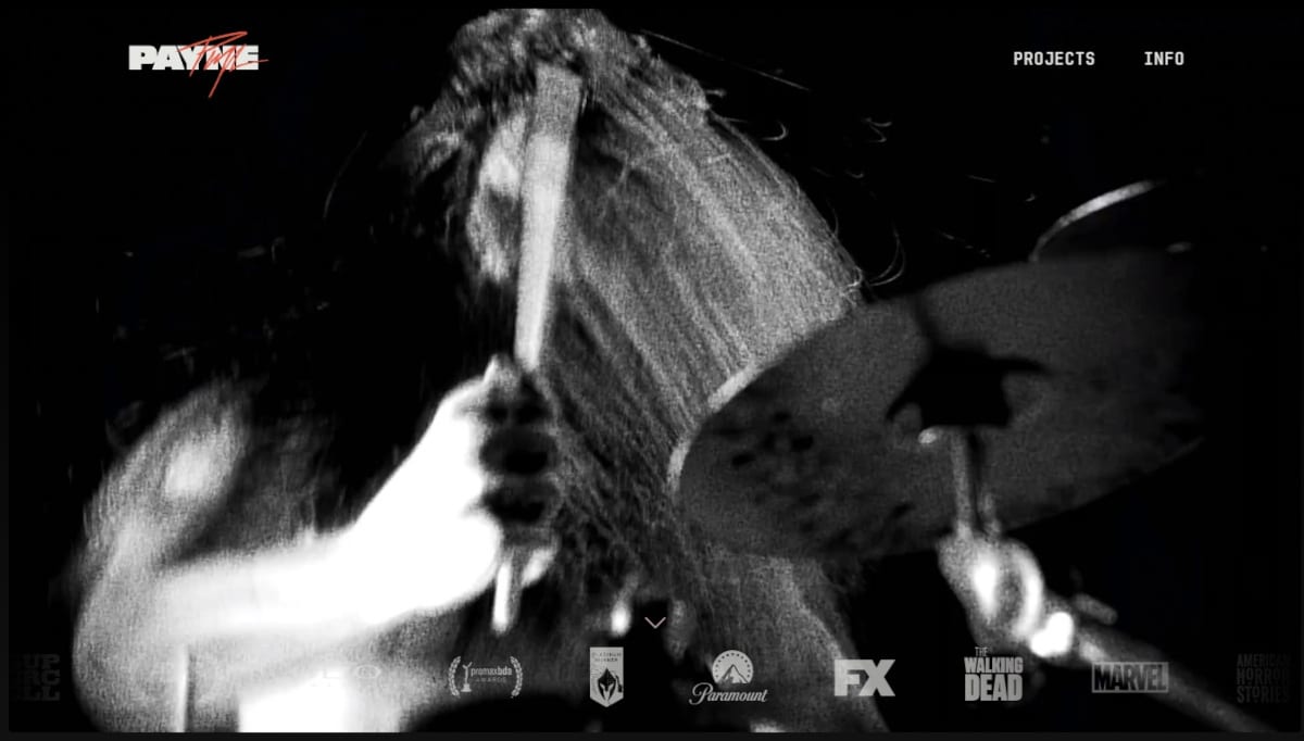
27. Richard Payne
The website of award-winning director Richard Payne is multi-media rich in content. A compilation of clips from movies directed and designs made is the main visual above the fold. Scrolling down, one would see a tile—comic strip style—of photo stills of the director’s latest projects. The cool thing is that on mouseover, it animates and presents a video clip of the project. It’s an adrenaline-pumping website. Check it out!
What we love about this web design:
-
Beautiful illustrations, modern layout with a minimalist approach
-
Lots of entertaining content
-
Use of social proofs
🚀 Here's the website builder I recommend to replicate this website

VIEW THEME / DEMO ▶
VIEW HOST / DEMO ▶
28. Woo Hyon Kang
Woo Hyon Kang is the author of “Point Story,” which details how he converted Korea’s Nami Island into an extraordinary tourist destination using his concept of “one simple point.” His website amazingly presents his creative perspective of life and his imaginative prowess against a black background matched with numerous special effects. This website is full of creativity.
What we love about this web design:
- Aesthetically designed
- Classy writeup with the white-colored font on black
- Quite a decent layout with pictures
🚀 Here's the website builder I recommend to replicate this website

VIEW THEME / DEMO ▶
VIEW HOST / DEMO ▶
29. BlueYard
BlueYard is more than just a German company that invests money. From the first page of this website, you wouldn’t really know what to expect. The excitement starts with a bunch of texts and a big button in the middle of the screen that says “Begin!” Then, the sci-fi and futuristic styles will blow your mind.
What we love about this web design:
- Mind-blowing user experience
- Sci-fi and futuristic designs
- Superb interactive graphics
🚀 Here's the website builder I recommend to replicate this website

VIEW THEME / DEMO ▶
VIEW HOST / DEMO ▶
30. Spotify for Artists
This website starts with a black theme but shifts to a festival of vibrant colors below the fold. It is a great way to surprise viewers with their website’s versatility and concept! Furthermore, the image sliders of Spotify for Artists is out ofthis world! Love it!
What we love about this web design:
- Awesome image sliders!
- Moving graphics are everywhere
- Unique animations
🚀 Here's the website builder I recommend to replicate this website
These are my favourites.
BONUS – Here is my favorite template
Bar Template
URL: https://mycodelesswebsite.com/try-theme/bar
Why this is such a great template:
- Clean design, great to turn visitors into customers
- Wordpress compatible, easy to customize
- Free download if you’re a Divi member
BONUS: Wix
URL: wix.com
Although this one shouldn't be on the list - I couldn't keep this one from you. Wix has amazing website themes and leads by example. Their own homepage looks stunning.
What can you learn from this great website
- Playful design
- Clear call to actions
- Great user experience
HIGH-END
WEBFLOW EXPERT

Arch Web Design
archcowebdesign.com
We're a Canadian Webflow agency that helps SaaS companies increase their revenue using high-converting websites. We've worked with over 200 SaaS companies and see an average 3.7x increase in website leads.
✓ Top Companies worked with:
Hugo (acquired by Calendly), SmartSuite,
DuxSoup
✓ Our average client increases their conversions by 3.7x in 90 days
✓ We've helped our clients secure $200M in funding

Vrrb
vrrb.com
Vrrb is an award-winning creative agency based in Los Angeles. 14+ years of experience building extraordinary websites, applications, and digital solutions for the world's most recognizable brands.
✓ Our core services include branding, website design/development, mobile apps, digital strategy, and ongoing support
✓ We work with companies (50+ employees) and funded startups to accelerate growth
✓ Clients include Ferrari, Visa, HP, UCLA, and Behr Paint
Checklist: 5 ways to make your dark website beautiful and highly converting
1. Don’t break the 5-second rule
The moment a visitor lands on your website you only have 5 seconds to make a good impression.
That’s 5 short seconds to convince your visitor to stay on your website – and don’t hit the ‘back’ button.
Make sure the text on your website is appealing and gets your visitor excited. Don’t waste the first 5 seconds of somebody’s visit with unnecessary fluff.
2. Don’t confuse your visitor with too many call to actions
Great call to actions draw the attention of your visitors.
That said, you don’t want your call to action buttons fighting for the attention of your visitor. Pick the most important call to action for that page, and go with it.
In case you want to show multiple call to actions anyway, make sure to give them a different design, with your primary call to action being the most notable one.
3. Design mobile first
Last year over 52% of all the website traffic worldwide came from mobile devices.
More than half of the website visits are on a mobile device.
This percentage will only increase in the coming years, therefore the mobile design of your website is crucial for the success of your dark website.
When designing your website, think about mobile design before you build your desktop website.
4. Watch people using your website without telling them what to do
Once your website is ready it’s time to launch. Well, almost.
Invite some friends or colleagues and put them in front of a computer. Ask them to pretend to be a potential customer and have them visit your website.
Now sit next to them, and don’t say anything (this will be harder than you think).
Do this with at least 5 people and learn from their behavior:
- Did they follow the steps you expected them to?
- Did your website load fast enough?
- Was everything clear to them?
5. Collect real testimonials from real members
By now you probably realized social proof is extremely important when it comes to building a great website. Take it to the next level, and add testimonials from your members.
Don’t write them yourself, don’t ask your friends to write them. Everybody will feel something is off.
Want to go for the perfect score? Include video testimonials. Trust me, this will turn your website into a conversion machine.
Growth hacking: 3 powerful strategies to promote your dark website
1. Go viral with a viral give-away
Imagine.
You send your website to 5 friends. Who each send it to 5 friends.
Now, these friends also send it to 5 friends. Oeh la la! Continue this loop for a while, and your website is actually going viral.
Viral Loops is a referral marketing tool that helps you to explode your website with new visitors.
We’ve used Viral Loops to create virality with multiple websites. It allows you to build a sustainable referral scheme that helps you to grow your website rapidly.
2. Use local SEO
SEO is a great way to attract local clients. SEO stands for Search Engine Optimization and helps you to get free website traffic through search engines.
Check out these articles about local SEO if you want to learn more about this:
3. Do a press release
Yikes! A press release? That’s not for your website, right?
Well. It is actually. Journalists LOVE small businesses and the entrepreneurs behind them. It makes sense – if you’re at a birthday party, friends are probably always asking how your business is doing.
Everybody loves entrepreneurs.
Write a press release about a milestone your company achieved. It doesn’t really matter what it is your company did, just make it juicy and interesting.
Create a list of journalists and reach out to them. The key in this process is the follow-up. If you’re just sending them just one email you’re probably not going to have a lot of success. Remind them at least once within a period of 7 days.
Being featured by local news outlets actually is good for your SEO. The more websites mention you on their website, the higher you’ll rank in the search engine.
FAQ
What makes a good dark website?
A great dark website should have a clean design, be easy to navigate and include a lot of social proof. Have a look at this page for great example websites.
How to create a dark website?
1. Analyze the best dark websites on this page
2. Make notes of what you like – and what you don’t like
3. Design your own site with this drag & drop website builder (includes free themes)
4. Publish your website with a cheap hosting plan (includes free domain + SSL)
How much does a dark website cost?
A dark website will cost you anywhere between $1200 and $5000. Of course, it’s cheaper to do it yourself. Have a look at the tools I recommend in this article to get started for under $100.


