Definitive guide
Best Clean Websites of 2026 | 56 Examples
Start Building →
View Examples →

👋 How I curated this list
Welcome friendly stranger! You’re looking for some inspiring website examples. You found the right page.
About me
My name is Ralph de Groot. I’m the founder and author at My Codeless Website. Wake me up for a great web design. I love writing about website examples, too!
How I curated this list
Once a year I collect 500 website examples to create/update this article. I create a shortlist which I send to my team of web designers. Together, we vote to determine the order of this list.
Next to that, I always follow our editorial policy when writing my articles, to make sure they are really helpful and useful for you.
Home » Blogs » Website Examples »
Best Clean website examples
- Firescript
- Milkshake
- By Crea
- Illo
- Green Peas For Breakfast
- Mark Woodland
- Spring/Summer
- Themes Kingdom
- Natan
- Norm Architects
- Futuretheory
- Azimut
- Master and Dynamic
- The Little Architecture Company
- FREECELL Architecture
- United Network Studio
- AND
- Sergison Bates
- Amanda Matrocchio
- Spenda
- GEST by Yachtcloud
- Robert M. Gurney, FAIA Architect
- Kohost
- xMoney
- Aces
- BlueReceipt
- Viral Loops
- Ethos
- RightMessage
- Toy Fight
- The Design Space.Co
- Dragonfly Ave
- Nuo
- Andrew Mccarthy
- Patrick David
- Pigment Branding Studio
- Julemont
- Pete Nottage
- Mama Joyce Peppa Sauce
- Thirteen Thoughts
- Camille Styles
- Megan Ellaby
- The Sweet Spot
- Samantha Evans
- Navigate
- Vinya Cameron
- Lasse Pedersen
- Animal
- JustCoded
- WP Viking Agency
- Babylonia
- Adchitects
- Belle Epoque
- Bite Size

VIEW THEME / DEMO ▶
VIEW HOST / DEMO ▶
1. Firescript
Firescript is a freelance web designer and developer based in Canada. If you love understated elegance, this is the place for you! For your utmost convenience, all call-to-action buttons are conveniently positioned above the fold. In addition, a wonderful social proof emerges as you scroll down! Amazing.
Things we love about this clean website design
- Simple but stylish
- Call to action above the fold
- Great social proof
🚀 Here's the website builder I recommend to replicate this website

VIEW THEME / DEMO ▶
VIEW HOST / DEMO ▶
2. Milkshake
Milkshake’s website excels at creating a mesmerizing website beginning with colors that make one recall of strawberry milkshakes served in one’s childhood. Despite having a clean layout, they still managed to incorporate a lot of design touches. Very cool! This is the perfect website to visit if you’re into creativity, colorful scheme, and great typography!
Things we love about this clean website design
- Super creative
- Very colorful
- Great typography
🚀 Here's the website builder I recommend to replicate this website
VIEW THEME / DEMO ▶
VIEW HOST / DEMO ▶
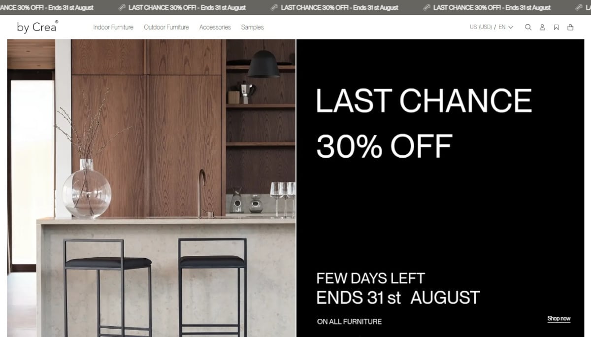
3. By Crea
URL: https://by-crea.com
I appreciate how this website automatically translates its content into English for visitors from outside Sweden. Talk about localization! Additionally, despite being an e-commerce site for their products, the Crea website is classy, minimalist, and indeed clean.
Things we love about this clean website design
- Big, soft-toned colors for product shots using a white background for a cleaner look
- Lead magnet, social proof, and simple animation in place
- Nice effect for plain product photos changing to more vivid ones on mouse-over
🚀 Here's the website builder I recommend to replicate this website

VIEW THEME / DEMO ▶
VIEW HOST / DEMO ▶
4. illo
URL: https://illo.tv/
Illo’s website delivers their brand promise with its colorful content–a spectrum of powerful colors from white to green–and interactive features combined with big fonts. Love it! illo definitely is one to watch when it comes to modern portfolio and clean website examples!
Things we love about this clean website design
- Awesome animations
- Very unique web design
- Lots of whitespace
🚀 Here's the website builder I recommend to replicate this website

VIEW THEME / DEMO ▶
VIEW HOST / DEMO ▶
5. Green Peas For Breakfast
https://www.greenpeasforbreakfast.com/
The color scheme they use for this website is just yummy to look at–like a strawberry latte paired with a slice of banana bread for breakfast! That’s lots of white, pink, and mocha aided with a conglomerate of multi-colored illustrations cleverly blended with black and white photos and what-have-yous. All these neatly presented in a clean layout and very light animation.
Things we love about this clean website design
- Clever visuals
- Amazing typography
- Incredible color scheme
🚀 Here's the website builder I recommend to replicate this website

VIEW THEME / DEMO ▶
VIEW HOST / DEMO ▶
6. Mark Woodland
URL: https://www.markwoodland.com.au/
Mark Woodland’s website presents all the aspects of his professional life, from a former military man to a full-scale successful entrepreneur of four different businesses. A completely minimalist website that uses screen-to-screen background photos overlayed with a short, yet compelling blurb. Everything about it is actually clean yet impressive.
Things we love about this clean website design
- Animated yet quick-loading transitions from one section of the website to another
- Extensively uses background videos in all sections and throughout pages
- Big, bold fonts that resonate the personality of the website’s owner
🚀 Here's the website builder I recommend to replicate this website
VIEW THEME / DEMO ▶
VIEW HOST / DEMO ▶
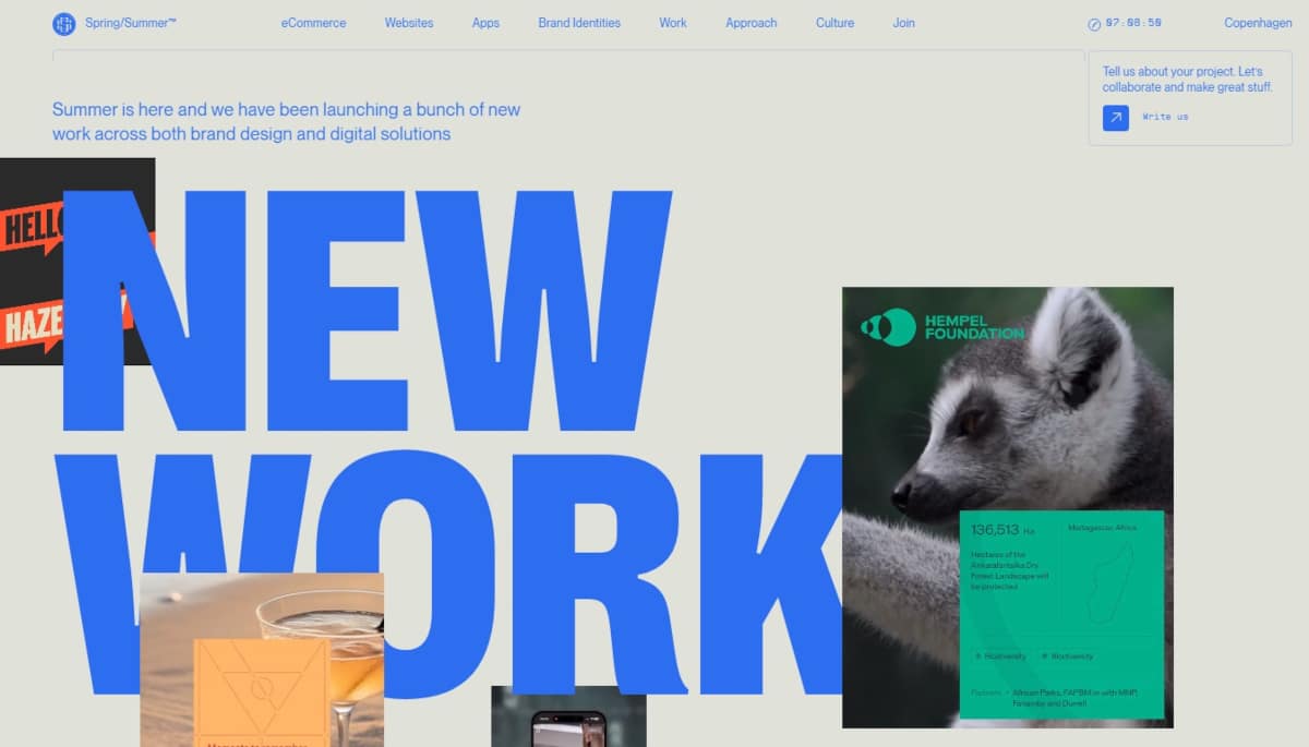
7. Spring/Summer
Spring/Summer used color contrasting in its website to make it very appealing. I love the colors used, which changes even for its vertical menu as one scrolls down the website. There are a lot of images on this website that stand out and really “create lasting impressions” that in turn evoke “product desire” that this digital design agency is known for!
Things we love about this clean website design
- So colorful
- Lots of whitespace when text is used
- Interesting navigation style
🚀 Here's the website builder I recommend to replicate this website

VIEW THEME / DEMO ▶
VIEW HOST / DEMO ▶
8. Themes Kingdom
URL: https://themeskingdom.com/
Themes Kingdom creates a captivating design. The website has a distinct color theme that stands out with its gradient palette. Be sure to check out this one if you’re into vibrant designs, trendy logos, and sleek navigation options. Click the link immediately!
Things we love about this clean website design
- Very colorful
- Cool logo
- Nice navigation style
🚀 Here's the website builder I recommend to replicate this website
VIEW THEME / DEMO ▶
VIEW HOST / DEMO ▶
9. Natan
URL: https://natan.be/
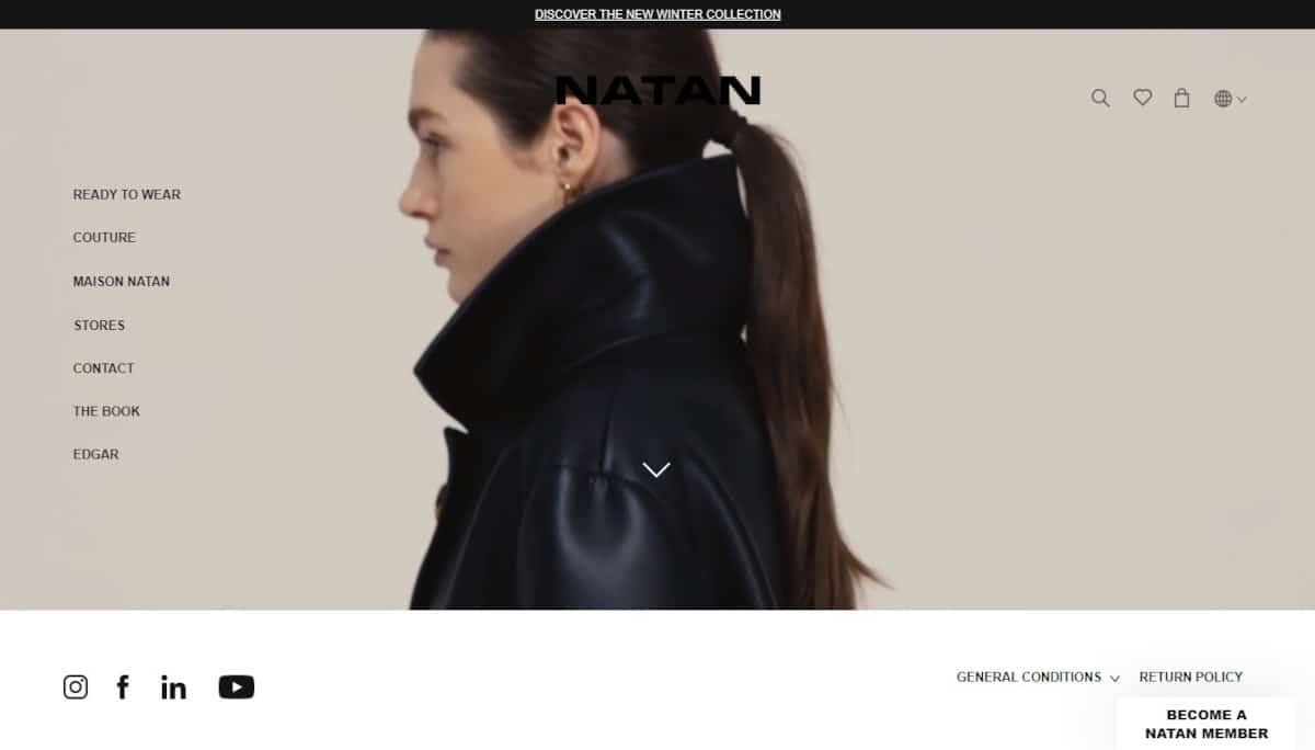
Natan’s website has a clean and straightforward design! Prepare to be impressed by the background video, which showcases a variety of models displaying their unique clothing lines on the homepage. If you’re looking for a fashion website that’s stylish and easy to navigate, this is the place to go.
Things we love about this clean website design
- Lovely video
- Clean menu on the left
- Great use of animations
🚀 Here's the website builder I recommend to replicate this website

VIEW THEME / DEMO ▶
VIEW HOST / DEMO ▶
10. Norm Architects
URL: https://normcph.com/
Norm Architects’ design looks polished from head to toe. The overall color theme of the website is off white, made elegant by the crisp photos of their finished projects, which are presented in an animated image slider. Everything looks classy and inspiring!
Things we love about this clean website design
- Branding always on top
- Great choice in tile spacing and size keeping images large enough
- Absolutely sunning images
🚀 Here's the website builder I recommend to replicate this website

VIEW THEME / DEMO ▶
VIEW HOST / DEMO ▶
11. Futuretheory
URL: https://futuretheory.com.au/
I love the abundant use of whitespace here, or should I say blue space. Go check this one out for a clean design with lots of text and images. To save you some time, Futuretheory prides itself on listening and working with its clients’ to ensure they receive exactly what they are looking for in terms of web design and development.
Things we love about this clean website design
- Nice typeface
- Bold and blue
- Very unique design style
🚀 Here's the website builder I recommend to replicate this website

VIEW THEME / DEMO ▶
VIEW HOST / DEMO ▶
12. Azimut
URL: https://azimutyachts.com/en/
Azimut, manufacturer of luxurious yachts, has a unique concept for its website. It lets visitors experience a “ride” on its yacht–online. It’s brand promise, after all, is “live unexpected enchantment.” Scrolling down the website past beautiful photos of the interiors of its yacht, visitors arrive at a map of the sea where photos of their different yachts are displayed! Lots of visual content here so don’t miss this one!
Things we love about this clean website design
- Cool animations and videos
- Lots of whitespace used
- Quite unique style, very remarkable
🚀 Here's the website builder I recommend to replicate this website

VIEW THEME / DEMO ▶
VIEW HOST / DEMO ▶
13. Master and Dynamic
URL: https://www.masterdynamic.com/
Master and Dynamics opens its website with a spectacular video on its newest products, which is beneficial! The contrasting models of headphones, earphones, and speakers shown in crisp photos arranged neatly below the video make the website eye-catching, especially with its clean layout.
Things we love about this clean website design
- Stunning images
- Smart menu idea with images
- Cool black and yellow colors
🚀 Here's the website builder I recommend to replicate this website

VIEW THEME / DEMO ▶
VIEW HOST / DEMO ▶
14. The Little Architecture Company
URL: https://thelittlearchitecturecompany.co.uk/
The little Architecture company’s homepage consists of a great slider and uses incredible images. I love how minimal yet powerful this architecture website is. This is the one if you’re looking for a reliable design, great pictures, and excellent use of whitespaces to make every corner look easy on the eyes.
Things we love about this clean website design
- Great pictures
- Clean design
- Lots of whitespace which makes the website easy on the eye
🚀 Here's the website builder I recommend to replicate this website

VIEW THEME / DEMO ▶
VIEW HOST / DEMO ▶
15. FREECELL Architecture
Oh yes, the power of a clean design with a touch of simplicity. FREECELL Architecture did a great job in the design of their website by highlighting its four most important sections as powerful images. Though there isn’t much animation or special effects, this remains a great inspirational website! I urge you to visit this website if you’re into simple designs and intuitive user experience.
Things we love about this clean website design
- Simple design and intuitive user experience
- Clear navigation
- Beautiful pictures
🚀 Here's the website builder I recommend to replicate this website
VIEW THEME / DEMO ▶
VIEW HOST / DEMO ▶
16. United Network Studio
URL: https://www.unstudio.com/
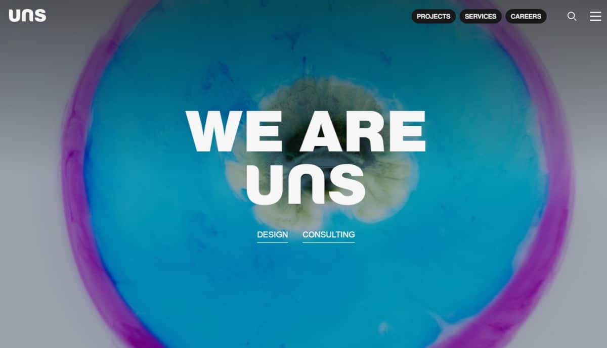
The UNS or United Network Studio website has a very interesting design. Everything is visually breathtaking with full-page background photos and videos. The provided menu has an interesting layout for the names of the sections and unique text effects. Click the link to witness some modern aesthetics!
Things we love about this clean website design
- Amazing background pictures and videos
- Clean design with lots of whitespace
- Nice font styling throughout the website
🚀 Here's the website builder I recommend to replicate this website

VIEW THEME / DEMO ▶
VIEW HOST / DEMO ▶
17. AND
AND’s website is superbly impresive with its bold vertical menu at the middle of its landing page highlighting various specializations. The color combinations are just a standout–red orange, black, blue, and white–along with the unique cuts in the layout and image placements. Very inspiring!
Things we love about this clean website design
- Bold style
- Clean, big images
- Unique web design style
🚀 Here's the website builder I recommend to replicate this website
VIEW THEME / DEMO ▶
VIEW HOST / DEMO ▶
18. Sergison Bates
URL: https://sergisonbates.com/
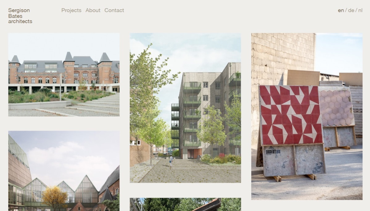
This website’s white theme is very helpful in highlighting the multi-colored thumbnail photos of Sergison Bates’ past projects. The portfolio also has a unique feature that enlarges the thumbnail once the plus sign below it is clicked. What actually happens is a new window hovers to display all the photos pertaining to that particular project. Very inspiring!
Things we love about this clean website design
- Unique design
- Great images
- Playful design
🚀 Here's the website builder I recommend to replicate this website

VIEW THEME / DEMO ▶
VIEW HOST / DEMO ▶
19. Amanda Martocchio
URL: https://amandamartocchio.com/
This website example is definitely worth looking at. New York’s licensed architect Amanda Martocchio used a unique interface to guide visitors through the website. In particular, the website is designed like a compass that allows you to scroll the website according to the arrow’s directions. Each area in the animated scroll is a clickable image leading to a particular section of the website. Great one!
Things we love about this clean website design
- Nice scroll animations throughout the website
- Amazing images
- Clean design
🚀 Here's the website builder I recommend to replicate this website
VIEW THEME / DEMO ▶
VIEW HOST / DEMO ▶
20. Spenda
Spenda did an extremely great job at making the website come ‘alive’just by using the right colors. I love it. I also like the effect they made for a bulleted list using icons representing the text being listed. Plus, clicking the text revealed on the white space beside it what the text is about. That’s without having to load a new page for each text description. Neat!
Things we love about this clean website design
-
Strong branding
- The website feels ‘3D’
- Nice effects for features
🚀 Here's the website builder I recommend to replicate this website

VIEW THEME / DEMO ▶
VIEW HOST / DEMO ▶
21. GEST by Yachtcloud
URL: https://my-gest.com/
GEST’s website gives visitors a test of this luxurious experience with animated macroshots of the gadget, powerful messaging, and tinges of gold integrated in the design. Add to that, a personalized live chat agent who is able to call visitors wherever they may be in the globe. Awesome!
Things we love about this clean website design
- Elegant visuals
- Great scrolling animations
- Lots of whitespace
🚀 Here's the website builder I recommend to replicate this website
VIEW THEME / DEMO ▶
VIEW HOST / DEMO ▶
22. Robert M. Gurney, FAIA Architect
URL: https://robertgurneyarchitect.com/
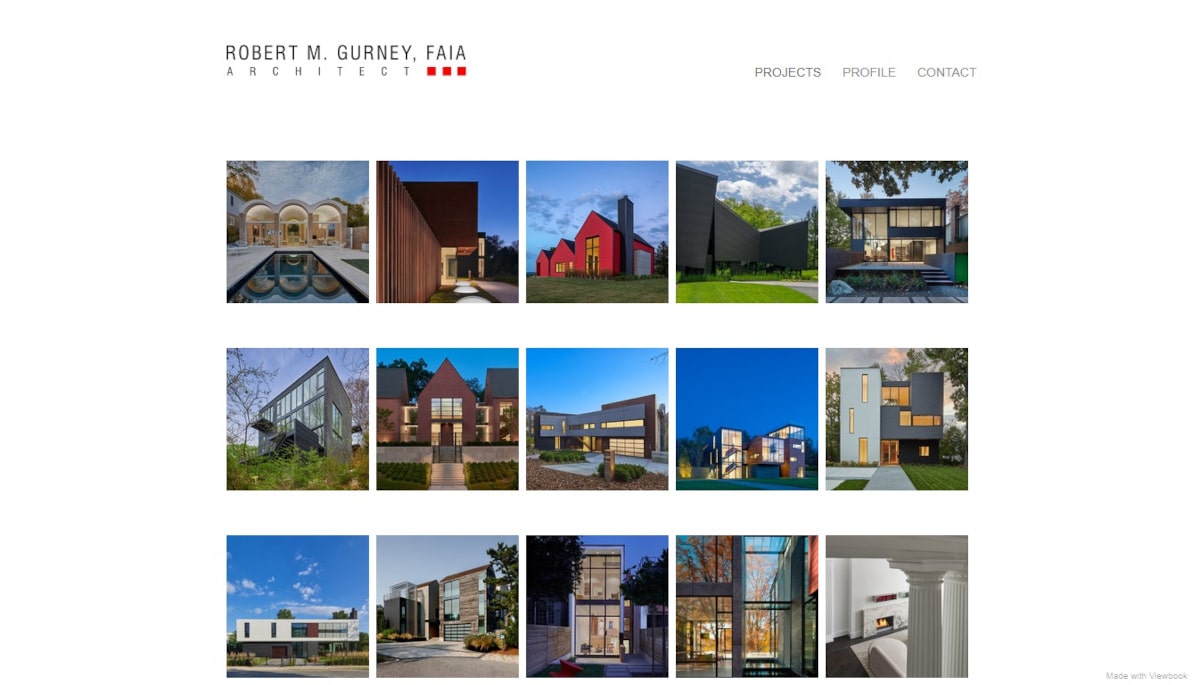
Ever heard the saying: “an image says more than a 1000 words?” Clearly, Robert did. He doesn’t waste any words describing his portfolio projects but shows it in slick, tiny images arranged neatly in columns and rows against an all white background. The output? A visually appealing and professional design. Go take a look at this website to learn a great way of displaying client projects and personal portfolios!
Things we love about this clean website design
- Unique design
- Great way of displaying previous projects
- High-quality images
🚀 Here's the website builder I recommend to replicate this website
VIEW THEME / DEMO ▶
VIEW HOST / DEMO ▶
23. Kohost
URL: https://kohost.io/
I love Kohost’s website. First of all, the tagline is clean and simple. Then, the two call to action buttons below are nicely designed and match perfectly well with the background color. Visit this one if you prefer designs with powerful color schemes and epic scrolling animations!
Things we love about this clean website design
-
Very powerful color scheme
- Nice call to ation buttons above the fold
- Epic scrolling animations
🚀 Here's the website builder I recommend to replicate this website
VIEW THEME / DEMO ▶
VIEW HOST / DEMO ▶
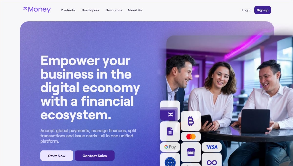
24. xMoney
I love how xMoney’s web design is minimal yet serves its purpose. However, don’t be mistaken, building such a clean design is harder than it looks. Click the link to learn more about the business. You’ll be welcomed by various content as soon as you arrive! Helpful explanations about their products await.
Things we love about this clean website design
-
Nice color scheme
- Great explanation of product benefits
- Nice animations
🚀 Here's the website builder I recommend to replicate this website
VIEW THEME / DEMO ▶
VIEW HOST / DEMO ▶
25. Aces
Aces is a Japanese company that uses algorithms to create margins on how people move. This marketing specialist has a fully interactive website, employing generous animations in the layout of its design. Using a black-and-white theme, the website has very minimal but lively photos and lots of white areas for its dominating text content. Yet it is appealing and professionally-done.
Things we love about this clean website design
-
Nice animations
- Clean web design
- Very unique website concept
🚀 Here's the website builder I recommend to replicate this website
VIEW THEME / DEMO ▶
VIEW HOST / DEMO ▶
26. BlueReceipt
URL: https://www.bluereceipt.com/
The BlueReceipt website is the ultimate combination of design and conversion. The multi-colored fonts, scrolling visuals and texts, animated features, and clean layout makes the website appealing despite the voluminous presentation of statistical data and industry information. I also appreciate the use of bulleted lists that made the information easier to understand!
Things we love about this clean website design
-
Compelling copywriting
-
Cool animations
- Attractive call to action buttons
🚀 Here's the website builder I recommend to replicate this website
VIEW THEME / DEMO ▶
VIEW HOST / DEMO ▶
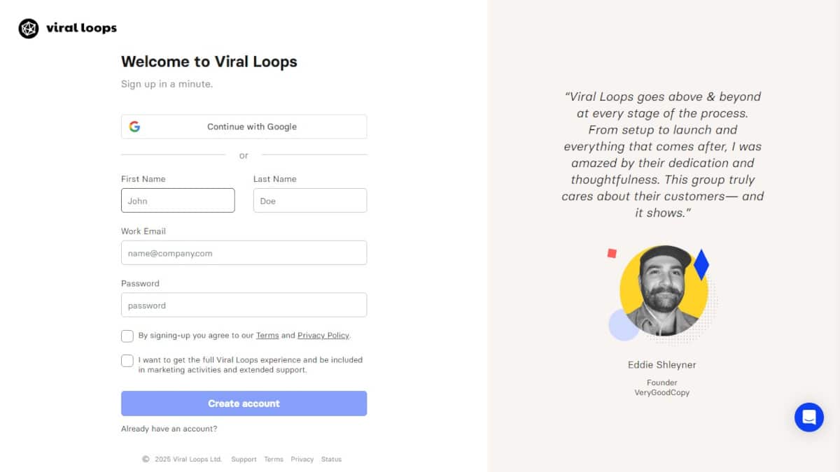
27. Viral Loops
Despite not having splashy features nor any animation, Viral Loops’ website is attractive and professionally-designed. The clean layout, powerful copywriting, and organized content makes it user-friendly and easy to navigate. Two important features that must be integrated in a website’s design to make it appealing to visitors.
Things we love about this clean website design
-
Unique color scheme
- 2 well cooperating call to action buttons above the fold
- Simple yet powerful menu structure
🚀 Here's the website builder I recommend to replicate this website

VIEW THEME / DEMO ▶
VIEW HOST / DEMO ▶
28. Ethos
URL: https://www.getethos.com/
Browsing Ethos’ website is both stress free and super easy. The website, which relies heavily on social proof, is easy to navigate, provides useful and clear resources, and lots of CTAs to help visitors get their life insturance quickly. Well done!
Things we love about this clean website design
- Very clear copywriting throughout the website
- Lots of whitespace which makes the website appealing
- The call to action stands out and looks great
🚀 Here's the website builder I recommend to replicate this website
VIEW THEME / DEMO ▶
VIEW HOST / DEMO ▶
29. RightMessage
URL: https://rightmessage.com/
I love this website. Everything in this design screams ‘value’ and makes me want to sign up immediately. They did a great job at listing their product benefits. Get more than just names and email addresses. Find out who’s on your list, what they need from you, and to understand your audience better though this website.
Things we love about this clean website design
-
High focus on conversion
- Great way of showcasing benefits
- Clean design which emphasizes their call to action buttons
🚀 Here's the website builder I recommend to replicate this website

VIEW THEME / DEMO ▶
VIEW HOST / DEMO ▶
30. Toy Fight
URL: https://toyfight.co/
Toy Fight has a rather intriguing name for a creative partner, what more the visuals they use in their website’s homepage: two 3D mannequins of naked men. This award-winning agency sure delivers the message of their unconventional ingenuity when it comes to creativity and design. Beyond the angry mannequins, the website packs beautiful typography, light animated effects, warm colors, and clean layout in one!
Things we love about this clean website design
- Great color palette
- Funny images
- Lots of social proof by showing previous clients
🚀 Here's the website builder I recommend to replicate this website
VIEW THEME / DEMO ▶
VIEW HOST / DEMO ▶
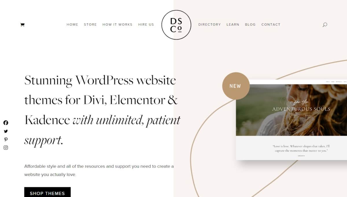
31. The Design Space.Co
URL: https://thedesignspace.co/
The Design Space.Co understands the daunting experience any creative process brings. Tough! A look at their website will show how this designer perfectly knows what a beautiful website is. Their website employs a lovely neutral color scheme and professional layout. While ensuring not to overwhelm website visitors with too much content. Bravo! Do visit them for stunning WordPress website themes.
Things we love about this clean website design
- Clear value proposition
- Very bright and positive color scheme
- Super clean design – very inspiring!
🚀 Here's the website builder I recommend to replicate this website
VIEW THEME / DEMO ▶
VIEW HOST / DEMO ▶
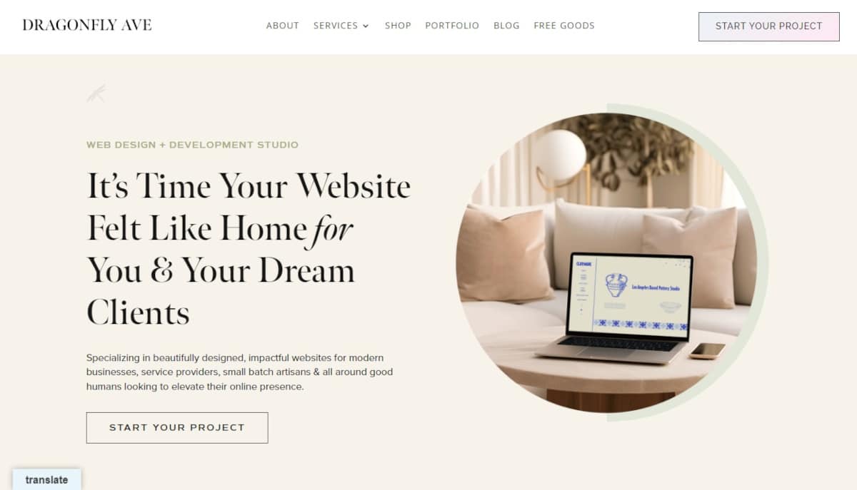
32. Dragonfly Ave
URL: https://dragonflyave.com/
I’m sure you’ll love Dragonfly Ave’s cursor as it is cute, creative, and user-friendly. This is the website to see if you want to learn more about cursors. While they may seem unimportant, cursors are one of the most essential elements of any operating system. They deliver one of the few ways for users to interact with the interface and perform various movements.
Things we love about this clean website design
- Clear value proposition
- Clear call to action
- Clean web design
🚀 Here's the website builder I recommend to replicate this website
VIEW THEME / DEMO ▶
VIEW HOST / DEMO ▶
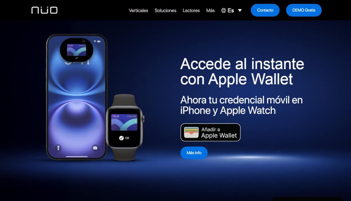
33. Nuo
Sleek is the best word to describe the design of Nuo’s website. It’s as sleek as the design of their products and logo. Though using a black-and-white theme, the website is lively with graphics using colorful backgrounds and sharp product photos.
Things we love about this clean website design
- Clean graphics and layout with glassmorphism effects
- Localization and cool animated features
- Strategically-placed CTA buttons using color in the visual hierarchy
🚀 Here's the website builder I recommend to replicate this website

VIEW THEME / DEMO ▶
VIEW HOST / DEMO ▶
34. Andrew Mccarthy
URL: https://andrevv.com
Andrew McCarthy has a fascinating concept for his website. Looping text that scroll seamless when the homepage is navigated downwards. By looping text, it displays the same set of phrases after some time but changes in the background geometrical shape only. Go check it out for yourself! You won’t be disappointed. So if you want clean, this is surely one clean website because of its very few but witty display of content.
Things we love about this clean website design
- He adds a personal touch to the website (have a look at his skateboarding video)
- Simplistic yet elegant design
- Lots of whitespaces
🚀 Here's the website builder I recommend to replicate this website
VIEW THEME / DEMO ▶
VIEW HOST / DEMO ▶
35. Patrick David
URL: https://bepatrickdavid.com
Italy’s UX/UI Designer and eveloper Patrick David has an impressive website to boot. Besides using elements in the design attributable to his native land, he also integrated awesome animation and effects in it. No wonder his website has received commendations and citations from various online award giving bodies. In addition, he uses great copywriting and great call to action throughout his website.
Things we love about this clean website design
- Unique style
- Great copywriting
- Great call to action
🚀 Here's the website builder I recommend to replicate this website

VIEW THEME / DEMO ▶
VIEW HOST / DEMO ▶
36. Pigment Branding Studio
URL: https://www.pigmentstudio.pl/
A company that loves working with brands, Pigment Branding Solutions sure knows how to make “coherent visual identification systems” as seen in thee design of their website. The use of generous white spaces, organized content, and clean layout paired with stylish typography in their website is a testament to their own brand promise to make “aesthetically refined” designs.The smooth yet simple animations also bear truth to their goal of not overloading a design. Fantastic outcome!
Things we love about this clean website design
- Stunning typography
- Light animations
- Clean layout
🚀 Here's the website builder I recommend to replicate this website

VIEW THEME / DEMO ▶
VIEW HOST / DEMO ▶
37. Julemont
URL: https://julemont-watches.com/en
Julemont not only pushes the boundary of aesthetics on its products but also on its overall design! When you visit this website, you will be warmly greeted with an impressive introduction video that beautifully captures Julemont’s incredible passion! As you continue, you will notice the designer’s effort to incorporate a bold and elegant color scheme, along with smooth scrolling animations, to captivate your interest. Love this!
Things we love about this clean website design
- Bold and elegant color scheme
- Sleek web design
- Smooth scrolling animations
🚀 Here's the website builder I recommend to replicate this website

VIEW THEME / DEMO ▶
VIEW HOST / DEMO ▶
38. Pete Nottage
URL: https://www.petenottage.co.uk/
The website of Pete Nottage is an explosion of brilliant colors that will astound you. It’s like entering a kaleidoscope of originality and creativity. Believe me, you won’t be able to tear your eyes away! It is evident that the designer placed considerable thought into this design! They have gone above and beyond to ensure that the final product appears absolutely polished and flawless. The visuals are extremely captivating!
Things we love about this clean website design
- Unique and creative concept
- Colorful web design
- Stunning visuals
🚀 Here's the website builder I recommend to replicate this website

VIEW THEME / DEMO ▶
VIEW HOST / DEMO ▶
39. Mama Joyce Peppa Sauce
URL: https://www.peppasauce.love/
Mama Joyce’s Peppa Sauce is a great website with a lot of personality. As you scroll down, it’s like a virtual playhouse where you can have a great time exploring and finding all the cool features. Even though there are only two hues in the color scheme, they look great together. They make this beautiful balance that is so nice to look at. I am totally in love with everything about this website. Perfect!
Things we love about this clean website design
- Creative and playful website
- Unique web design
- Great background design
🚀 Here's the website builder I recommend to replicate this website
VIEW THEME / DEMO ▶
VIEW HOST / DEMO ▶
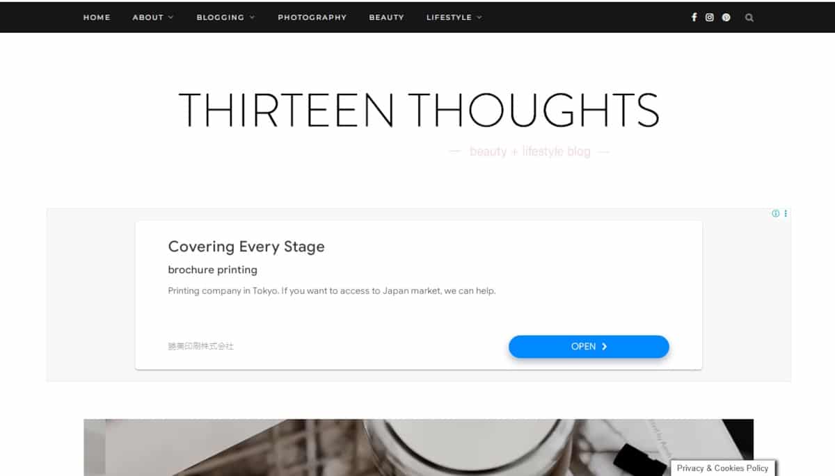
40. Thirteen Thoughts
URL: https://www.thirteenthoughts.com/
This website is an example of simplicity and expertise. The design is basic in style and includes visually appealing photos taken from various angles. Scrolling animations offer a pleasing appearance to the website’s interface. Overall, the designer made a nice outcome.
Things we love about this clean website design
- Lots of whitespaces
- Simple but serves its purpose
- Various content for you to check out
🚀 Here's the website builder I recommend to replicate this website

VIEW THEME / DEMO ▶
VIEW HOST / DEMO ▶
41. Camille Styles
URL: https://camillestyles.com/
Camille Styles’ website is very amazing! It’s wonderfully designed and arranged, making it enjoyable to browse. The pages emanate an enticing air, with magnificent content and images that move before your eyes. I must say, this is quite remarkable!
Things we love about this clean website design
- Various content
- High-quality images
- Lots to learn
🚀 Here's the website builder I recommend to replicate this website
VIEW THEME / DEMO ▶
VIEW HOST / DEMO ▶
42. Megan Ellaby
URL:https://www.meganellaby.com/
Megan Ellaby’s website is a visual delight, resembling an Instagram account with beautiful displays of her fashion, fitness, and lifestyle. You’ll love how she made her platform aligned with her whole personality. Absolutely loved the lively color scheme and the logo she chose!
Things we love about this clean website design
- Fabulous approach to displaying images
- Lively color scheme
- Attractive website logo
🚀 Here's the website builder I recommend to replicate this website

VIEW THEME / DEMO ▶
VIEW HOST / DEMO ▶
43. The Sweet Spot
URL: https://www.sweetspotwhitewater.com/
The Sweet Spot’s website looks calm and well-suited for its name. I am sure you’ll love scrolling down because the color choices and images look easy on the eyes, giving you nothing but a friendly atmosphere. Check this out if you’re into eye-catching designs!
Things we love about this clean website design
- Great use of white spaces
- Sleek web layout
- Simple color palette
🚀 Here's the website builder I recommend to replicate this website
VIEW THEME / DEMO ▶
VIEW HOST / DEMO ▶
44. Samantha Evans
URL: https://samantha-evans.com/
Samantha Evans’ website radiates a vibrant and unique character, capturing the energy and self-assurance of this skilled artist through captivating photos. The sophisticated font style used for Samantha’s name at the top of each webpage adds an extra layer of admiration. Truly, something to adore!
Things we love about this clean website design
- Soft color scheme
- Bubbly and funny visual media
- Lovely typeface
🚀 Here's the website builder I recommend to replicate this website
VIEW THEME / DEMO ▶
VIEW HOST / DEMO ▶
45. Navigate
URL: https://www.navigatecorp.com/
Navigate, the consulting agency based in Wayne, sets a great example for clean web design enthusiasts. The chic and neat color palette adds to its appeal, making it an awesome example to learn from if you’re seeking inspiration!
Things we love about this clean website design
- Nice scrolling animations
- Great web design shapes
- Lots of whitespaces which makes the website pleasant to browse
🚀 Here's the website builder I recommend to replicate this website
VIEW THEME / DEMO ▶
VIEW HOST / DEMO ▶
46. Vinya Cameron
URL: https://vinya-cameron.com/
Vinya Cameron’s website is brilliantly simple yet captivating, thanks to amazing images. The relative simplicity allows her to seamlessly showcase the site in both German and English, making it an excellent choice for international visitors.
Things we love about this clean website design
- Awesome black and white ‘color’ scheme
- Great personal photos
- Simple and effective
🚀 Here's the website builder I recommend to replicate this website
VIEW THEME / DEMO ▶
VIEW HOST / DEMO ▶
47. Lasse Pedersen
URL: https://lassepedersen.biz/
This website is truly impressive. As you scroll down, you’ll find a wealth of diverse layouts showcasing various representations and photographs. The skillful placement of the black and white photograph on the homepage adds a touch of class to the overall design.
Things we love about this clean website design
- Iconic photography
- Aesthetic layouts
- Lovely and unique web design
🚀 Here's the website builder I recommend to replicate this website

VIEW THEME / DEMO ▶
VIEW HOST / DEMO ▶
48. ANIMAL
The playful short animations and interactive design of this agency website are really enjoyable. Every page is filled with interactive elements and animations that showcase ANIMAL’s playful style. I really like the design and I’m sure you will too! Check them out now!
Things we love about this clean website design
- Awesome design
- Colorful palette
- Fun navigation
🚀 Here's the website builder I recommend to replicate this website

VIEW THEME / DEMO ▶
VIEW HOST / DEMO ▶
49. JustCoded
This website is amazing! The mix of orange and black colors creates a pleasing overall look. Using different colors can really bring a page to life, making it more vibrant and engaging. Also, the navigation is incredibly user-friendly, so I’m confident you’ll have a great time here.
Things we love about this clean website design
-
Stunning homepage graphic
- Well-planned design
- Easy navigation
🚀 Here's the website builder I recommend to replicate this website

VIEW THEME / DEMO ▶
VIEW HOST / DEMO ▶
50. WP Viking Agency
Responsive web design is a basic requirement. A responsive website adapts its layout and choices to the size of the device and browser, like WP Viking Agency. Visit the website if you’re looking for help regarding functional websites that will boost your company’s revenue
Things we love about this clean website design
-
Very unique design
- Clear call to action above the fold
- Fun graphics
🚀 Here's the website builder I recommend to replicate this website
VIEW THEME / DEMO ▶
VIEW HOST / DEMO ▶
51. Babylonia
URL: https://www.babylonia-brussels.eu/
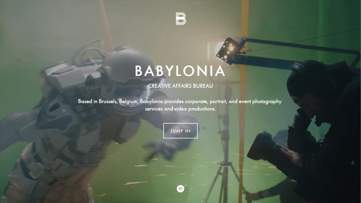
I think this might be one of the favorite website on this list. I just love the homepage of the website because it shows how hardworking the people are behind this company. I love the color grading as well, very amazing! Make sure to check it out now!
Things we love about this clean website design
-
Awesome color grading
- Great website
- Professional design
🚀 Here's the website builder I recommend to replicate this website

VIEW THEME / DEMO ▶
VIEW HOST / DEMO ▶
52. Adchitects
With Adchitects you will be able to experience world-class products and for sure people will love their website design. It is simple but loaded with enough information that will attract the attention of people. The font and simple elements are well-designed. Check it out!
Things we love about this clean website design
-
Clean layout
- Simple design
- Lots of white spaces
🚀 Here's the website builder I recommend to replicate this website
VIEW THEME / DEMO ▶
VIEW HOST / DEMO ▶
53. Belle Epoque
URL: https://agence-belle-epoque.fr/en/
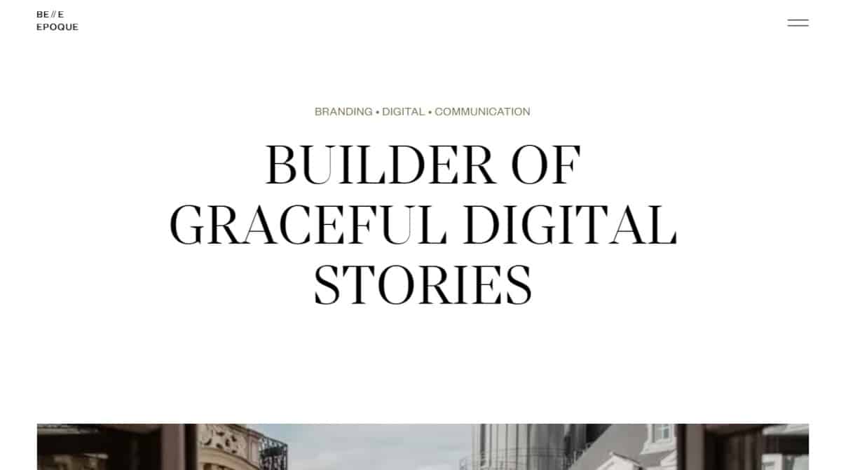
Belle Epoque has a simple website design. The white spaces are making it minimalist but it doesn’t look boring because it’s paired with fancy font that makes the website look elegant and sophisticated. If you are curious about this agency, check it out now!
Things we love about this clean website design
-
White spaces are maximized
- Clean website design
- Stylish font
🚀 Here's the website builder I recommend to replicate this website

VIEW THEME / DEMO ▶
VIEW HOST / DEMO ▶
54. Bite Size
URL: https://bitesizeinc.com/home
Bite Size Entertainment is a new agency that connects businesses and consumers. Their website not only has a stunning homepage graphic, but it also responds to your mouse for a wonderful experience. Don’t miss this one! Visit the website right away to learn more about the agency.
Things we love about this clean website design
-
Stunning homepage graphic
- Wonderful website experience
- Unique web design style
🚀 Here's the website builder I recommend to replicate this website
These are my favourites.
BONUS – Here is my favorite template
Clean Website Template
URL: https://mycodelesswebsite.com/try-theme/life-coach
Why this is such a great template:
- Clean design, great to turn visitors into customers
- Wordpress compatible, easy to customize
- Free download if you’re a Divi member
BONUS: Wix
URL: wix.com
Although this one shouldn't be on the list - I couldn't keep this one from you. Wix has amazing website themes and leads by example. Their own homepage looks stunning.
What can you learn from this great website
- Playful design
- Clear call to actions
- Great user experience
HIGH-END
WEBFLOW EXPERT

Arch Web Design
archcowebdesign.com
We're a Canadian Webflow agency that helps SaaS companies increase their revenue using high-converting websites. We've worked with over 200 SaaS companies and see an average 3.7x increase in website leads.
✓ Top Companies worked with:
Hugo (acquired by Calendly), SmartSuite,
DuxSoup
✓ Our average client increases their conversions by 3.7x in 90 days
✓ We've helped our clients secure $200M in funding

Vrrb
vrrb.com
Vrrb is an award-winning creative agency based in Los Angeles. 14+ years of experience building extraordinary websites, applications, and digital solutions for the world's most recognizable brands.
✓ Our core services include branding, website design/development, mobile apps, digital strategy, and ongoing support
✓ We work with companies (50+ employees) and funded startups to accelerate growth
✓ Clients include Ferrari, Visa, HP, UCLA, and Behr Paint
Checklist: 5 ways to make your clean website beautiful and highly converting
1. Don’t break the 5 second rule
The moment a visitor lands on your website you only have 5 seconds to make a good impression.
That’s 5 short seconds to convince your visitor to stay on your website – and don’t hit the ‘back’ button.
Make sure the text on your website is appealing and gets your visitor excited. Don’t waste the first 5 seconds of somebody’s visit with unnecessary fluff.
2. Don’t confuse your visitor with too many call to actions
Great call to actions draw the attention of your visitors.
That said, you don’t want your call to action buttons fighting for the attention of your visitor. Pick the most important call to action for that page, and go with it.
In case you want to show multiple call to actions anyway, make sure to give them a different design, with your primary call to action being the most notable one.
3. Design mobile-first
Last year over 52% of all the website traffic worldwide came from mobile devices.
More than half of the website visits are on a mobile device.
This percentage will only increase in the coming years, therefore the mobile design of your website is crucial for the success of your website.
When designing your website, think about mobile design before you build your desktop website.
4. Watch people using your website without telling them what to do
Once your website is ready it’s time to launch. Well, almost.
Invite some friends or colleagues and put them in front of a computer. Ask them to pretend to be potential customers and have them visit your website.
Now sit next to them, and don’t say anything (this will be harder than you think).
Do this with at least 5 people and learn from their behavior:
- Did they follow the steps you expected them to?
- Did your website load fast enough?
- Was everything clear to them?
5. Collect real testimonials from real members
By now you probably realized social proof is extremely important when it comes to building a great website. Take it to the next level, and add testimonials from your members.
Don’t write them yourself, don’t ask your friends to write them. Everybody will feel something is off.
Want to go for the perfect score? Include video testimonials. Trust me, this will turn your website into a conversion machine.
Growth hacking: 3 powerful strategies to promote your clean website
1. Go viral with a viral give-away
Imagine.
You send your website to 5 friends. Who each send it to 5 friends.
Now these friends also send it to 5 friends. Oeh la la! Continue this loop for a while, and your website is actually going viral.
Viral Loops is a referral marketing tool which helps you to explode your website with new visitors.
We’ve used Viral loops to create virality with multiple websites. It allows you to build a sustainable referral scheme which helps you to grow your website rapidly.
2. Use local SEO
SEO is a great way to attract local clients. SEO stands for Search Engine Optimization and helps you to get free website traffic through search engines.
Check out these articles about local SEO if you you want to learn more about this:
3. Do a press release
Yaiks! A press release? That’s not for your website, right?
Well. It is actually. Journalists LOVE small businesses and the entrepreneurs behind them. It makes sense – if you’re at a birthday party, friends are probably always asking how your business is doing.
Everybody loves entrepreneurs.
Write a press release about a milestone your company achieved. It doesn’t really matter what it is your company did, just make it juicy and interesting.
Create a list of journalists and reach out to them. The key in this process is the follow-up. If you’re just sending them just one email you’re probably not going to have a lot of success. Remind them at least once within a period of 7 days.
Being featured by local news outlets actually is good for your SEO. The more websites mentioning you on their website, the higher you’ll rank in the search engine.
FAQ
What makes a good clean website?
A clean should have a minimalistic design, be easy to navigate and include a lot of social proof. Have a look at this page for great example websites.
How to create a clean website?
- Analyze the best examples on this page
- Make notes of what you like – and what you don’t like
- Design your own site with this drag & drop website builder
- Publish your website with our recommended hosting platform.
How much does a clean website cost?
A web designer will charge anywhere between $1800 and $4800 for a decent website. However, this article will teach you to do it yourself for less than $100.
What information is needed on a clean website?
Your website will need at least the following pages: ‘Home, About us, Contact, Timetable. To create trust with your visitor it’s important to show lots of pictures and videos of your classes.


