Definitive guide
Best Pink Web Design of 2026 | 38 Examples
Start Building →
View Examples →

👋 How I curated this list
Welcome friendly stranger! You’re looking for some inspiring website examples. You found the right page.
About me
My name is Ralph de Groot. I’m the founder and author at My Codeless Website. Wake me up for a great web design. I love writing about website examples, too!
How I curated this list
Once a year I collect 500 website examples to create/update this article. I create a shortlist which I send to my team of web designers. Together, we vote to determine the order of this list.
Next to that, I always follow our editorial policy when writing my articles, to make sure they are really helpful and useful for you.

VIEW THEME / DEMO ▶
VIEW HOST / DEMO ▶
1. NIIKA
URL: https://www.niika.com.au/
NIIKA is a web design company in Richmond, Australia, specializing in 3D and animation. NIIKA’s website effectively showcases its expertise, utilizing 3D images, a range of special effects, and engaging features. Cute and interactive, the website’s pink theme stands out without becoming unbearable to the eyes since it is generously complemented with pastel colors and white spaces.
What you can learn from this great pink web design
-
Consistent color theme throughout the website
-
Use of glassmorphism for creative assets
-
Very interactive yet quick-loading
🚀 Here's the website builder I recommend to replicate this website

VIEW THEME / DEMO ▶
VIEW HOST / DEMO ▶
2. Bond
URL: https://bond.backerkit.com/
Bond’s designer contrasted the relaxing soft pink of this website with red, blue, and white, resulting in a tight color scheme that runs across the website. If you like to give your pages some personality, nailing the color combinations is a must, just like this one! Click the link to see the whole and witness something amazing.
What you can learn from this great pink web design
- Creative portfolio
- Interesting “About Me”
- Wide range of information and resources to attract target market
🚀 Here's the website builder I recommend to replicate this website

VIEW THEME / DEMO ▶
VIEW HOST / DEMO ▶
3. SE Beauty Studio
URL: https://se-beautystudio.de/
This web design is a great example of how you should leverage a personal touch to create an instant connection with your visitors. I love how the designer split up the pricing section into clear elements. Very convenient! Design-wise, the gradient style of pink and white makes a great color scheme and I definitely love it! Check it out as well.
What you can learn from this great pink web design
- Clear call to action above the fold
- Nice personal image
- Clear site structure
🚀 Here's the website builder I recommend to replicate this website
VIEW THEME / DEMO ▶
VIEW HOST / DEMO ▶
4. National Breast Cancer Foundation
URL: https://www.nationalbreastcancer.org/
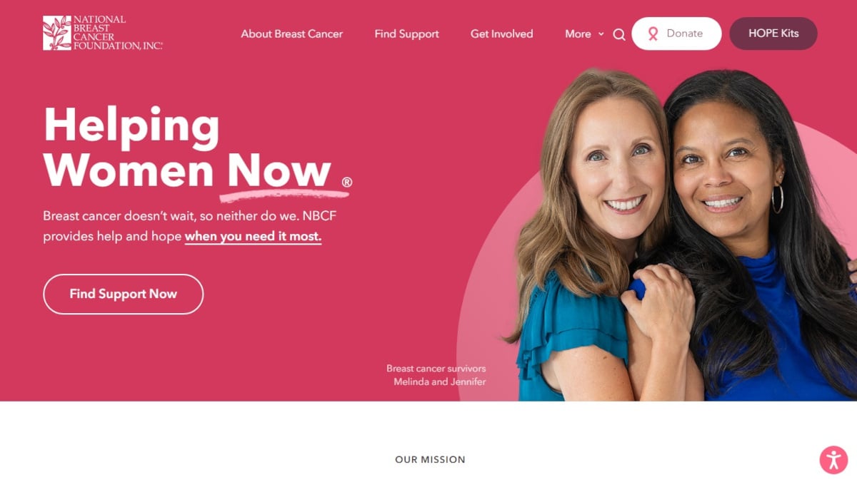
The National Breast Cancer Foundation uses pink, the renowned color that symbolizes breast cancer awareness, consistently for its website theme. The website also uses big photos of women from its main design above the fold to its its image scroller at the bottom for various sections. Overall, the website is clean, easy-to-use, and gives a pleasant vibe to users.
What you can learn from this great pink web design
-
Strong branding
-
Lots of social proofs
-
Strategically-placed CTAs
🚀 Here's the website builder I recommend to replicate this website

VIEW THEME / DEMO ▶
VIEW HOST / DEMO ▶
5. Michelle Christina Larsen
URL:https://fashioncopywriternyc.com/
Michelle Christina Larsen’s website is probably the neatest and cutest example I’ve visited. Her clean website allows visitors to scan through the content with no problem at all. I also love her “About” page, as you will know everything she does and what she can offer. Everything is uncomplicated here!
What you can learn from this great pink web design
- Nice and clean design
- Clear call to action above the fold
- Nice menu structure
🚀 Here's the website builder I recommend to replicate this website
VIEW THEME / DEMO ▶
VIEW HOST / DEMO ▶
6. Victoria’s Secret Pink
URL: https://www.victoriassecret.com/us/pink
Shop PINK’s trendy apparel, activewear, lingerie, and accessories in a vibrant, playful online store. Discover cute hoodies, cozy loungewear, and stylish everyday outfits designed for young women. With intuitive navigation, high-quality images, and fun visuals, PINK makes it easy to explore fashion, lifestyle essentials, and must-have seasonal collections.”
What you can learn from this great pink web design
- Nice scrolling animations
- Great color scheme
- Clean design
🚀 Here's the website builder I recommend to replicate this website

VIEW THEME / DEMO ▶
VIEW HOST / DEMO ▶
7. Susan G. Komen
Susan G. Komen is a website for the foundation set-up under her name when she died of breast cancer. Using a pink color theme, the website uses a background photo of a cancer survivor overlayed with a compelling message above the fold. This powerful imagery perfectly embodies the mission of the foundation and could easily draw visitors to participate in their initiative, which is immediately supported by an opt-in section and “Donate” button.
What you can learn from this great pink web design
-
Strong branding and consistent color theme
-
Lots of social proof, lead magnets, and strategically-placed CTAs
-
Provides plenty of helpful resources for visitors (blog, podcast, online community, etc.)
🚀 Here's the website builder I recommend to replicate this website
VIEW THEME / DEMO ▶
VIEW HOST / DEMO ▶
8. Dunkin Donuts
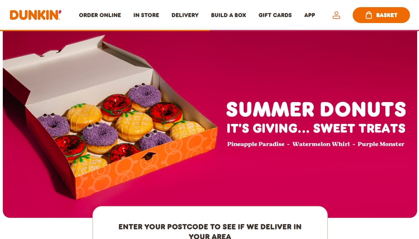
Dunkin Donuts, known for its brand colors of orange and pink, has a very colorful website. The company was able to integrate its identity of being a comforting place to be in even online. The website uses big photos of their products, especially above the fold for its animated image scroller. It is user-centric since it provides online-ordering, branch search for deliveries, online shop for merchandise, newsletter, and interesting reads. Indeed, a well-planned website!
What you can learn from this great pink web design
-
Strong and consistent branding from the typography and copywriting to visuals used
-
Interactive and user-friendly
-
Use of minimalist design with lead magnets
🚀 Here's the website builder I recommend to replicate this website
VIEW THEME / DEMO ▶
VIEW HOST / DEMO ▶
9. Coal & Canary
URL: https://www.coalandcanary.com/
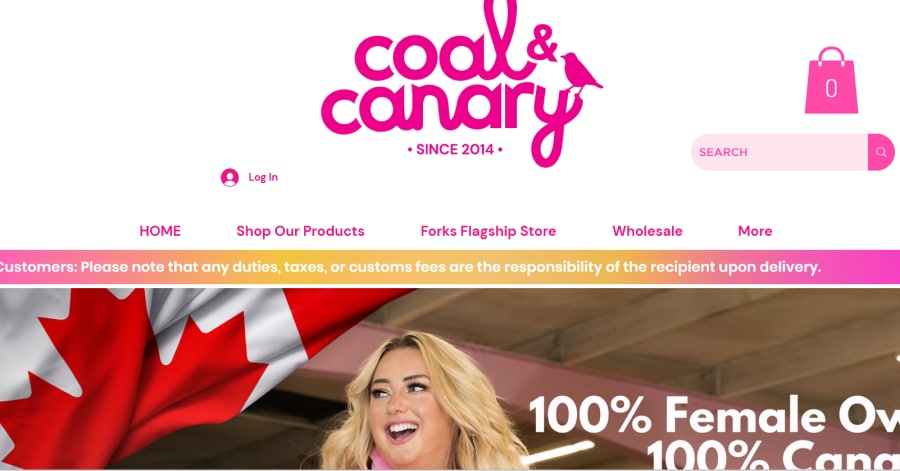
Coal & Canary offers beautifully crafted candles, reed diffusers, and home fragrances in a clean, inviting online store. The site’s simple navigation and vivid product images make shopping effortless, while highlighting artisanal scents, seasonal collections, and eco-conscious ingredients. It’s a cozy, stylish destination for home décor and thoughtful gifts.
What you can learn from this great pink web design
- Clean store design
- Effortless shopping
- Stylish decorations
🚀 Here's the website builder I recommend to replicate this website

VIEW THEME / DEMO ▶
VIEW HOST / DEMO ▶
10. Barbie
URL: https://shop.mattel.com/pages/barbie
Barbie, a product of Mattel, is the number one favorite doll of girls regardless of race. As such, their website is an e-commerce hub for a variety of Barbie merchandise ranging from dolls to doll houses and play sets for babies to even grown-ups! Though the website is available in various languages within the regions of America, Europe, and Oceania, delivery of orders is worldwide.
What you can learn from this great pink web design
-
Lots of content presented in an orderly and clean layout
-
Colorful and playful visuals, product photos, and CTA buttons suitable for its audience
-
Built with localization features, animation, and very helpful menu (products well categorized or easy to find)
🚀 Here's the website builder I recommend to replicate this website

VIEW THEME / DEMO ▶
VIEW HOST / DEMO ▶
11. Pink Products
URL: https://pinkproducts.com/
Well, what can I say about this? This might be the pinkest website we have on the list. As you can see, they didn’t even hesitate to play with different tones of pink and it made the design very aesthetically pleasing. I love how consistent the designer is!
What you can learn from this great pink web design
- Awesome color palette
- Creative web design
- Visually pleasing
🚀 Here's the website builder I recommend to replicate this website

VIEW THEME / DEMO ▶
VIEW HOST / DEMO ▶
12. Alessandra Zanghi
URL: https://alessandrazanghi.studio/
If you are looking for a wedding planner that will make your princess dreams come true, this website is for you. I love the copy on the landing page and once you click start, the calming music will make you feel like a real-life princess. Check it out now! I’m sure you’ll fall in love the pink shades all over.
What you can learn from this great pink web design
- Soft tones
- Calming web design
- Creative navigation
🚀 Here's the website builder I recommend to replicate this website

VIEW THEME / DEMO ▶
VIEW HOST / DEMO ▶
13. Groupe Castor & Pollux
URL: https://rse.castoretpollux.com/en/
If you are looking for a creative agency design that looks stylish and reliable at the same time, this is the website for you! I love the creative ways the designer used to create a lovely outcome. I suggest exploring this one if you’re into charming pages with an uncluttered layout.
What you can learn from this great pink web design
- Clean layout
- Easy navigation
- Great font and colors
🚀 Here's the website builder I recommend to replicate this website

VIEW THEME / DEMO ▶
VIEW HOST / DEMO ▶
14. Pink Car Leasing
URL: https://www.pinkcarleasing.co.uk/
Highly acclaimed in the UK automotive industry, Pink Car Leasing specializes in leasing cars and vans for personal and business use. Their website’s color theme, which is true to their name, is unique and unexpected for their line of business. Those in the automotive industry often use black, blue, and red, which are more masculine colors. Their name and website design, then, have a fresh vibe yet maintains professionalism.
What you can learn from this great pink web design
-
Compelling copywriting and imagery above the fold
-
Use of color in the visual hierarchy (complementing colors for pink such as green, dark blue, and royal blue for CTA buttons, etc.)
-
Very informative website on car leasing (FAQs, blog, eligibility, taxes, etc.)
🚀 Here's the website builder I recommend to replicate this website
VIEW THEME / DEMO ▶
VIEW HOST / DEMO ▶
15. ForH Body Performance
URL: https://forh.jp/
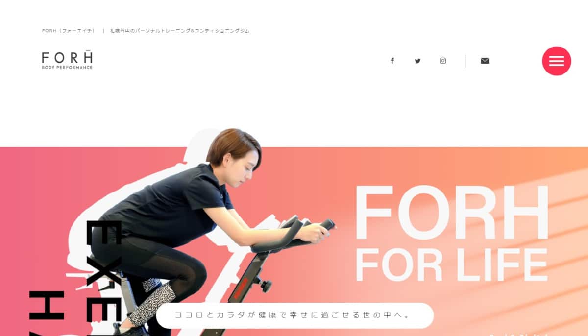
ForH Body Performance is a fitness company in Japan. Their website is simple but with lots of happy people photos that give warmth to the design. The website’s design uniquely integrated sketches of ForH’s clientele as creative assets for its testimonials. The sketches also give visitors an idea of the variety of their customers, which convey everyone is welcome and capable of being a part of their fitness program.
What you can learn from this great pink web design
-
Use of social proofs and scrolling animations
-
Nice typography in various sizes for visual heirarchy
-
Strategically-placed CTAs
🚀 Here's the website builder I recommend to replicate this website
VIEW THEME / DEMO ▶
VIEW HOST / DEMO ▶
16. The Pink Cafe
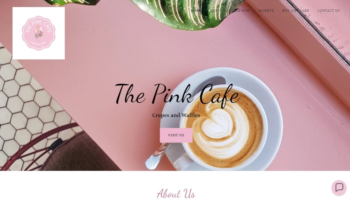
The Pink Cafe is literally colored as such. Thus, it comes as no surprise that their website is designed the same, beginning with the image above the fold of the cafe’s pink table. The aerial shot of the photo of the cafe’s table had a good angle to it, enough to show visitors of the website what to expect to see when they visit their shop. That cozy, sweet vibe is consistently felt as one scrolls down the website because of the tiled photos of the cafe’s other interiors and food offerings. Well done!
What you can learn from this great pink web design
-
Minimalist layout highlighted by beautiful fonts and vibrant photos
-
Simple layout
-
Cool features (chatbot, online reservation, etc.)
🚀 Here's the website builder I recommend to replicate this website

VIEW THEME / DEMO ▶
VIEW HOST / DEMO ▶
17. The Pink
URL: https://www.thepink.com.au/
Chic is the perfect word to describe The Pink’s website with its magazine-style layout and photos. The photos of people wearing this Australian-based boutique convey a happy, carefree life. It’s quite enticing for women of any age, which the website did highlight through a photo of an elderly enjoying their vests and coats. The website also has interactive features beginning with an animated image scroller above the fold, color-changing text on mouseover, online map, and easy-ordering.
What you can learn from this great pink web design
-
Use of color in the visual hierarchy
-
Ample use of lead magnets and personalization features
-
Organized content sorted through a drop-down menu
🚀 Here's the website builder I recommend to replicate this website

VIEW THEME / DEMO ▶
VIEW HOST / DEMO ▶
18. Fybelle
URL: https://fybelle.com/
Fybelle offers high-tech beauty devices for at-home skincare, including IPL hair removal and LED treatments. The website features a clean, modern design with easy navigation, clear product images, and detailed descriptions. It guides users to discover effective, convenient beauty solutions while highlighting quality, safety, and results-driven self-care.”
What you can learn from this great pink web design
- Modern design
- Easy navigations
- Detailed descriptions
🚀 Here's the website builder I recommend to replicate this website

VIEW THEME / DEMO ▶
VIEW HOST / DEMO ▶
19. Donut King
URL: https://www.donutking.com.au/
Donut King is a unique comfort food stop since it offers hotdog sandwiches along with coffee and donuts. Their website has a clearly-seen top header containing its menu, which provides customer-centric options. It is customer-centric because the sections highlighted in the menu allow visitors to quickly find what they need upon page load, which are the food menu, store locator, rewards, franchise, and special events. Really nice!
What you can learn from this great pink web design
-
Gives a fun vibe due to the complementing colors used with their pink theme
-
Great use of color in the visual hierarchy and choice of fonts
-
Equipped with special features for great user experience (chatbot, online ordering, etc.)
🚀 Here's the website builder I recommend to replicate this website
VIEW THEME / DEMO ▶
VIEW HOST / DEMO ▶
20. 808 Studio
URL: https://www.808studio.ph/
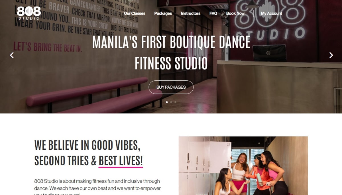
I love how 808 Studio’s web designer decided to go with pink for a dance studio web design! As a result, the pages have an aesthetically pleasing appearance, simultaneously providing comprehensive information pertaining to the studio. Overall, this design appears to be simple yet inviting.
What you can learn from this great pink web design
- Unique and creative concept
- Lovely web design
- Stunning background image
🚀 Here's the website builder I recommend to replicate this website

VIEW THEME / DEMO ▶
VIEW HOST / DEMO ▶
21. Kylie Cosmetics
URL: https://kyliecosmetics.com/
Kylie Cosmetics is the e-commerce website of renowned celebrity Kylie Jenner. The website offers a variety of cosmetic products from make-up to skin care. It also set up an online community through its rewards system for patrons. Using various pale shades of pink, the website emanates a truly feminine, plush vibe.
What you can learn from this great pink web design
-
Great color combination (pinks, white, gray) consistently used in the website
-
Well-categorized huge content neatly and beautifully presented in its drop-down menu
-
Sharp photos, image scrollers, and embedded customer-driven content
🚀 Here's the website builder I recommend to replicate this website

VIEW THEME / DEMO ▶
VIEW HOST / DEMO ▶
22. Peppa Pig
URL: https://www.peppapig.com/en-us/
Using curvy shapes for creative elements and background images, Peppa Pig’s website resonates with the cartoon character’s fun personality and charisma. Animated features are integrated into the design along with lively colors to complement its pink theme. The website is fun to explore and perfect for its target audience, which are children and parents.
What you can learn from this great pink web design
-
Strong branding identity
-
Unique shapes for CTA buttons
-
Minimalist design
🚀 Here's the website builder I recommend to replicate this website

VIEW THEME / DEMO ▶
VIEW HOST / DEMO ▶
23. Green Day
Green Day’s website is extremely stylish! I particularly adore the black-pink color combos. All corners appear dynamic and elegant at the same time. Furthermore, the image placement complements the other features. Overall, a nice outcome! What are you waiting for?
What you can learn from this great pink web design
- Stylish design
- Excellent image placement
- Mesmerizing black-pink color combinations
🚀 Here's the website builder I recommend to replicate this website
VIEW THEME / DEMO ▶
VIEW HOST / DEMO ▶
24. The Pink Crumbb
URL: https://thepinkcrumbb.shop/
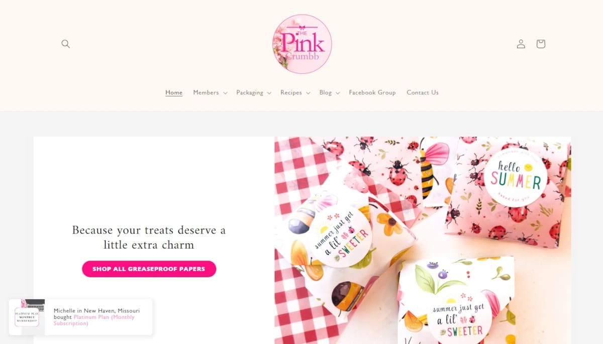
The Pink Crumbb takes a different approach in using pink for a color theme on a website. The website is mostly white but accentuated by pink CTA buttons, pale pink top header, and photos with objects in it. Section images use pink borders and frames, pop-up notifications use pink text, and customer ratings use pink stars. It’s a world of pink here, nonetheless!
What you can learn from this great pink web design
-
Use of color in the visual heirarchy
-
Strategically placed CTA buttons
-
Use of social proofs, notifications employing FOMO for product sales, and lead magnets
🚀 Here's the website builder I recommend to replicate this website

VIEW THEME / DEMO ▶
VIEW HOST / DEMO ▶
25. Pink Bakery By Ange
URL: https://pinkbakerybyange.com/
Another pink-themed website is the Pink Bakery By Ange, which uses huge, close-up photos of luscious products. Using a minimalist layout, the website simply provides the bakery’s product offerings but in a neat layout of two and four columns. It also provides online shopping and login access for patrons.
What you can learn from this great pink web design
-
Simple and straightforward
-
Sharp photos
-
Nice animated image scroller of products above the fold
🚀 Here's the website builder I recommend to replicate this website

VIEW THEME / DEMO ▶
VIEW HOST / DEMO ▶
26. The Knights
URL: https://theknightsnyc.com/
If you’re a fan of elegant and polished websites, this is the one you should definitely explore! As you continue to scroll, you’ll notice the impressive effectiveness of the text and image arrangement. The designer ensures that you are never bombarded with excessive information.
What you can learn from this great pink web design
- Clear call to action
- Big images
- Unique design
🚀 Here's the website builder I recommend to replicate this website

VIEW THEME / DEMO ▶
VIEW HOST / DEMO ▶
27. Moonpig
URL: https://www.moonpig.com/uk/
Moonpig lets you create and send personalised cards, gifts, and flowers for any occasion, from birthdays to holidays. The website is simple and user-friendly, with tools to customise messages and designs. Thoughtful presents, flexible delivery, and creative options make it easy to celebrate loved ones in a meaningful way.
What you can learn from this great pink web design
- User-friendly website layout with intuitive menus
- Easy navigation
- Fun and energetic website atmosphere
🚀 Here's the website builder I recommend to replicate this website

VIEW THEME / DEMO ▶
VIEW HOST / DEMO ▶
28. Pink Cafe
URL: https://www.pinkcafe.co.uk/
Located in Wigan in the United Kingdom, the Pink Cafe website’s layout provides easy access to tasty, satisfying food for breakfast, brunch, and snacks. A CTA button is easily seen at the topmost right corner to allow visitors in a hurry to immediately find the menu and order. Identical buttons could be seen overlayed on the image above the fold and at the bottom menu. Who would possibly miss that and not order outrightly?!
What you can learn from this great pink web design
- Strategically-placed CTA buttons
- Convenient online ordering and user-friendly navigation
- Nice functionality (bigger photo option for menu items, online map, etc)
🚀 Here's the website builder I recommend to replicate this website

VIEW THEME / DEMO ▶
VIEW HOST / DEMO ▶
29. HERoines
URL: https://www.heroinesinc.org/
The HERoines Inc website has a warm and inviting design that reflects its mission to empower women. Soft colors, spacious sections, and friendly visuals make it easy to navigate, while clear headings and event previews highlight workshops, challenges, and resources. The overall vibe feels supportive, approachable, and encouraging, perfectly matching the community-focused purpose of the organization.
What you can learn from this great pink web design
- Inviting layout
- Friendly visuals
- Simple navigation
🚀 Here's the website builder I recommend to replicate this website

VIEW THEME / DEMO ▶
VIEW HOST / DEMO ▶
30. Fine Frenchie
URL: https://www.finefrenchie.com/
The Fine Frenchie website embraces pink throughout its design, from backgrounds to graphics and product highlights, giving it a playful, chic, and cohesive look. Visitors will feel immersed in the brand’s personality, which makes exploring, shopping, or discovering content more engaging.
What you can learn from this great pink web design
- Vibrant pink
- Whimsical layout
- Adorable visuals
🚀 Here's the website builder I recommend to replicate this website

VIEW THEME / DEMO ▶
VIEW HOST / DEMO ▶
31. The Spice Suite
URL: https://www.thespicesuite.com/
The Spice Suite website has a warm and flavorful design that matches its culinary focus. It uses rich colors, appetizing imagery, and well‑organized sections to showcase products, recipes, and spice collections. The layout feels inviting and energetic!
What you can learn from this great pink web design
- Appetizing visuals
- Inviting layout
- Rich color palette
🚀 Here's the website builder I recommend to replicate this website

VIEW THEME / DEMO ▶
VIEW HOST / DEMO ▶
32. Mancini & Co
URL: https://webgi-jewelry.vercel.app/
Visitors can see jewelry pieces in detail and interact with them in a way that feels almost like holding them in real life. The smooth navigation and clear presentation guide users naturally through products and features, making it easy to explore collections and appreciate the craftsmanship.
What you can learn from this great pink web design
- Sleek visuals
- Interactive 3D effects
- Minimal layout
🚀 Here's the website builder I recommend to replicate this website

VIEW THEME / DEMO ▶
VIEW HOST / DEMO ▶
33. Babybauch Shooting
URL: https://www.thespicesuite.com/
People landing on the site can instantly feel the mood and style of the photography just by looking at the visuals. Babybouch Shooting uses gentle colors, big expressive photos, and simple fonts that make each image feel personal and emotional. The layout is clean and organized so visitors can easily see galleries, services, and session information without distraction.
What you can learn from this great pink web design
- Warm visuals
- Soft, elegant layout
- Clear navigation
🚀 Here's the website builder I recommend to replicate this website

VIEW THEME / DEMO ▶
VIEW HOST / DEMO ▶
34. Flowerdose
URL: https://flowerdose.com.au/
The site makes it simple for users to find products, learn about services, and browse floral arrangements. Clear sections and beautiful visuals guide visitors naturally, creating an enjoyable and inspiring shopping experience that reflects the brand’s artistic and personal touch.
What you can learn from this great pink web design
- Elegant visuals
- Warm layout
- Simple navigation
🚀 Here's the website builder I recommend to replicate this website

VIEW THEME / DEMO ▶
VIEW HOST / DEMO ▶
35. Women Tell Women
URL: https://womentellwomen.com/
The Women Tell Women website has a clean and inviting design that highlights its focus on female voices and personal stories. It uses a balanced layout with bold headings, readable text, and engaging visuals that make it easy to explore articles, topics, and features. The overall feel is approachable and community‑oriented, inviting visitors to read, connect, and discover perspectives from women.
What you can learn from this great pink web design
- Clean layout
- Readable content
- Inviting visuals
🚀 Here's the website builder I recommend to replicate this website

VIEW THEME / DEMO ▶
VIEW HOST / DEMO ▶
36. Veepee
URL: https://www.veepee.fr/experiences/octobre-rose2/
The Octobre Rose page on Veepee is bright, caring, and themed around breast cancer awareness. Pink tones are used throughout the design, giving the page a warm, supportive, and visually cohesive look. The clean and organized layout ensures visitors can explore products and understand the impact of their purchases without feeling overwhelmed.
What you can learn from this great pink web design
🚀 Here's the website builder I recommend to replicate this website

VIEW THEME / DEMO ▶
VIEW HOST / DEMO ▶
37. Alpha Kappa Alpha Dorority, Incorporated
URL: https://www.thespicesuite.com/
Visitors can quickly find details about the sorority’s history, initiatives, and upcoming events. The structured layout and clear text make it easy to browse articles and announcements, helping users learn about the organization efficiently and without distraction. Overall, the design feels trendy, minimal, and fashion‑forward.
What you can learn from this great pink web design
- Trendy visuals
- Clean layout
- Easy navigation
🚀 Here's the website builder I recommend to replicate this website
These are my favourites.
BONUS: Wix
URL: wix.com
Although this one shouldn't be on the list - I couldn't keep this one from you. Wix has amazing website themes and leads by example. Their own homepage looks stunning.
What can you learn from this great website
- Playful design
- Clear call to actions
- Great user experience
HIGH-END
WEBFLOW EXPERT

Arch Web Design
archcowebdesign.com
We're a Canadian Webflow agency that helps SaaS companies increase their revenue using high-converting websites. We've worked with over 200 SaaS companies and see an average 3.7x increase in website leads.
✓ Top Companies worked with:
Hugo (acquired by Calendly), SmartSuite,
DuxSoup
✓ Our average client increases their conversions by 3.7x in 90 days
✓ We've helped our clients secure $200M in funding

Vrrb
vrrb.com
Vrrb is an award-winning creative agency based in Los Angeles. 14+ years of experience building extraordinary websites, applications, and digital solutions for the world's most recognizable brands.
✓ Our core services include branding, website design/development, mobile apps, digital strategy, and ongoing support
✓ We work with companies (50+ employees) and funded startups to accelerate growth
✓ Clients include Ferrari, Visa, HP, UCLA, and Behr Paint
FAQ
What makes a good pink web design?
A great pink web design should have a clean design, be easy to navigate and include a lot of social proof. Have a look at this page for great example websites.
How to create a pink web design?
- Analyze the best examples on this page
- Make notes of what you like – and what you don’t like
- Design your own site with this a drag & drop website builder
- Publish your website with our recommended hosting platform.
How much does a pink web design cost?
A web designer will charge anywhere between $2000 and $6000 for a decent website. However, this article will teach you to do it yourself for less than $100.
What information is needed on a pink web design?
Your website will need at least the following pages: ‘Home, About us, Contact, Portfolio’. To create trust with your visitor, you must show lots of pictures of your team and your latest projects.


