
“Please use my website on a desktop, I haven't been able to work on my mobile website yet”.
Ugh.
In 2019 you won’t get away with this kind of attitude. Mobile traffic is increasing every year, last year 51% of the time spent online in the US was on a mobile device.
With phones getting better every year, this number is expected to keep on increasing.
This article gives you 20 tips to build the perfect responsive website. This article will be helpful if you want to know:
- How to make a website responsive
- How to build a responsive website
- How to build a mobile friendly website
- How to build a website for a mobile device

WANT TO DOWNLOAD THIS OVERVIEW IN PDF?
Get the best website examples to inspire you!
Design website responsive tips
To make sure you get the most out of your time, this article is split up in 8 sections.
Feel free to skip ahead to the section you like.
- Before you start to build a responsive website
- The structure of a responsive website
- Styling a responsive website
- Best practices of a responsive website
- Testing a responsive website
- Free templates for a responsive website
- CSS tricks for a responsive website
- Examples of a responsive website
#1 Design mobile first
As mobile website traffic keeps increasing, it’s smart to focus on your mobile visitor during the design process. There are a few ways you can go about this:
- Draw your mobile website on paper before you draw your desktop website
- Look at the mobile versions of the websites of your competitors for inspiration
- Finish your mobile website before you start on your desktop version
#2 Plan your design before you start
Many web designers skip the planning phase and directly start building. It might feel like you’re off to a quick start, but you’ll end up with a weak design in the end. Do some research before you write the first line of code:
- Check the website of your competition
- Decide which colors you’ll use
- Decide your tone of voice
- Decide your main call to actions
I won’t go too much into detail on the planning phase, but you can click here if you want to learn more about general web design strategies.
#3 Think about your navigation
When building a responsive website design you have to think about your navigation. Although you might get away with using the same navigation in the footer, your header navigation should be different for mobile and desktop.
Since you have limited space in your header on a mobile device, many websites use a hamburger menu to navigate through the website.
Although this is a great strategy, some of your visitors won’t recognise the hamburger menu. You can solve this by adding your most important navigation item(s) throughout your pages.
This way you’re sure your visitors will find the pages you want them to find.
#4 Learn CSS media queries
Media queries allow you to show the right styling to your visitor, depending on their device. When you use media queries in your css, the content will respond to different conditions on specific devices.
An example of a media query is:
/* On devices that are smaller than 992px 992px, set the background color red */
@media screen and (max-width: 992px) {
body {
background-color: red;
}
}
Try to change the size of your browser right now to see the media queries in play.
In general, there are 3 types of screen widths you should implement in your media queries. If you want to learn more about break points check out this article on media queries.

#5 Design before you build
I know it can be tempting to start building your website the second you bought your domain name. However, take a moment to draw before you build.
Use a pen and paper and map out how you want to structure your website.
Where is your headline? Where is your call to action? Where are your testimonials?
By drawing your website before you build, you force yourself to think about a good site structure.
#6 Use templates
You might think you’re cheating when you’re using a template to create a responsive website.
The truth is, you might be. But that's okay.
Why reinvent the wheel if others took care of it already?
I’m a big fan of building websites based on templates. Sure, I know how to build a website from scratch and will completely rip apart a template if I think it’s necessary.
That being said, working with a template saves you a lot of time, especially since many templates are responsive already.
Check out the awesome templates from Divi (Wordpress) or Wix (website builder) to see what I’m talking about.
#7 Keep your design minimal
When viewing a website full screen on a desktop, you have lots of space for small details.
However, if you’re viewing the same website on a mobile device you clearly don’t.
Keep the design for small screens a minimalistic as possible. Use media queries to cut out unnecessary items in your design.
Alongside you can use Divi’s responsive tools to hide content blocks on phones or tablets.
#8 Delete as much as possible
Just like you should keep your design as minimal as possible, you should also be careful with the content on your website.
Long texts are fine for a desktop, but 10,000 word blog posts can be painful on a phone.
That being said, if you’re creating a page with a lot of content on it, make use of whitespace to improve the user experience.
#9 Compress images
Many web designers make this mistake: They build a beautiful (responsive) website and think they’re done.
Wrong.
When you’re building a responsive website, you have to make sure your images are compressed.
In other words, your images should have the smallest file size possible. Especially on mobile devices the loading speed of a website is a big deal.
If your phone needs to load big images it will easily take over 10 seconds to load you website. Who is actually willing to wait that long in 2019? 🙂
I’m a big fan of a free tool called Tinypng, it’s a matter of uploading your pictures and this tool will reduce the file sizes up to 90%.
#10 Optimize buttons for mobile
When you’re making your website responsive, it’s a common trap to just make everything smaller for small screens.
Although that’s understandable, you have to pay attention to your buttons.
If you still want your visitor to be able to press the ‘buy’ button (which I’m sure you are), make sure the button is big enough to tap on.
#11 Optimize typography for mobile
Although your font should be easy to read on every device, this is especially important on phones and tablets.
When designing your responsive website, make sure your font is easy to read and is big enough on smaller screens.
#12 Make sure share buttons aren’t blocking your content
In 2019 many websites use share buttons on their website. They’re great for marketing purposes, but can be tricky when designing your responsive website.
Make sure your share buttons don’t block your text or images on a mobile device.
#12 Get rid of videos on small screens
Have you ever seen a website with a background video which automatically play on the homepage? Looks pretty cool right?
When executed properly, this can give you website a great look & feel. There is just one big but.
Don’t use auto playing videos on mobile devices.
The loading speed of many mobile devices is still pretty slow.
Although 4g provides fast internet on many places, chances are your visitor has bad reception and is unable to load your website.
#13 ‘Steal’ from your neighbour
No, I’m not telling you to copy/paste your competitor’s website.
However, it can be helpful to investigate other websites and see what you like or dislike about them.
If you like, you can screenshot their entire website by using this tool.
Print out a few different websites and use the parts you like for your own design.
To help you out I created a few examples for you:
#14 Test your responsive website design with Google
If you’re done building your responsive website design, it’s time to see how you did. You can use the Google Mobile Friendly test to check how you scored.
#15 Test your responsive website design with Screenfly
Although Screenfly doesn’t tell you what to improve, it does give you an overview of how your responsive website design look on different devices. This is the perfect tool to double check your design.
You can check if your website has a responsive design for phones, tablets, laptops, desktops and even large tv screens.
#16 Test your responsive website with Mobiletest.me
Mobiletest.me enables you to check your work on different mobile devices. Perfect if you want to target specific phones with a responsive website design.
#17 Best responsive website free templates
If you’re looking for the best templates for a responsive website, i’ve got a few good ones for you. That said, they’re free if you’re using the framework to build with.
- Wix has a free plan which allows you to build a website, however, if you want to take the website live, you’ll pay a few dollars a month. But once you’re using their builder, you’re in for a good ride. They have hundreds of free themes you can use to build your own responsive website design.
- Divi is a software package you can use to build a drag & drop website on the Wordpress platform. Just like Wix, the templates are only free if you’re using their builder. But boy, their builder is good, just like their hundreds of free templates they’re offering. If you’re serious about building a slick responsive website I would definitely recommend to have a look at Divi.
#18 Set up breakpoints
As you could see in the media queries tip, a responsive website design works with breakpoints. In general your breakpoints should target 3 devices: a phone, a tablet and a desktop.
You can check out this article about break points to learn more about this.
#19 General css tips for responsive website design
I could write hours about cool css tricks for your website, but I won’t bother you with that. If you want to learn more about this you should check out these articles:
https://webdesignerwall.com/tutorials/5-useful-css-tricks-for-responsive-design
https://blog.froont.com/9-basic-principles-of-responsive-web-design/
https://magora-systems.com/tricks-for-your-website-responsive-design/
#20 Concluding thoughts on responsive website design
Building a responsive website can be hard. That is, if you’re reinventing the wheel.
Assuming you’re serious about building a good looking responsive website and you want to launch your website soon, please have a look at the responsive templates from Divi for Wordpress websites.
If you’re not comfortable building a website in Wordpress I would recommend to have a look at the templates of Wix. They’re great for beginners and make it easy to build a responsive website.
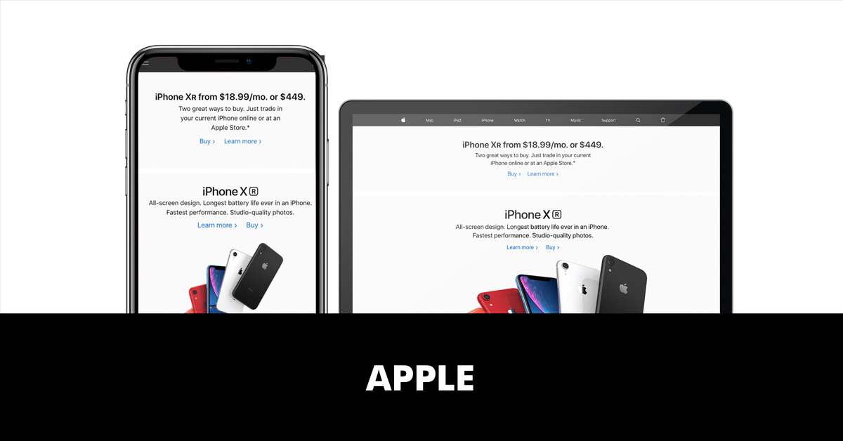
Before you start designing your responsive website design, have a look at the examples of 3 big companies.
3 companies which clearly have all the resources in the world to build a great responsive website. Open their websites and study what happens when you switch from a phone to a tablet, to a desktop.


RESPONSIVE WEBSITE DESIGN TUTORIAL: DIVI
WANT TO DOWNLOAD THIS OVERVIEW IN PDF?
Get the best website examples to inspire you!