Definitive guide
Best Food Websites of 2026 | 52 Examples
Start Building →
View Examples →

👋 My Experience With Food Web Design
Hi – it’s Ralph here 👋 In the past 10 years, I’ve designed 25+ food websites. What I learned over the years building food websites:
1. Menu Display
Make sure that the content is well structured containing specific descriptions of various foods you offer, their prices, and if they are nutritious. I also recommend to also stylize icons with labels such as vegetarian, vegan, gluten-free, etc.
2. Storytelling
Include the origin of the food and imagination of the chefs and all the ingredients used in preparing them. Customers interested in brand history should be given a blog or specific pages to share the information.
3. Customer Reviews
I suggest using customer testimonials and reviews to give the business credibility and gain the trust of potential customers. Some photos may be added to portray happy customers with the food items they have ordered.
Focus on this, and you’ll be fine.
PS: I suggest taking a look at the website examples below. Get inspired by their designs and see which website builders they’ve used. Best of luck!
👋 How I curated this list
Welcome friendly stranger! You’re looking for some inspiring website examples. You found the right page.
About me
My name is Ralph de Groot. I’m the founder and author at My Codeless Website. Wake me up for a great web design. I love writing about website examples, too!
How I curated this list
Once a year I collect 500 website examples to create/update this article. I create a shortlist which I send to my team of web designers. Together, we vote to determine the order of this list.
Next to that, I always follow our editorial policy when writing my articles, to make sure they are really helpful and useful for you.
Home » Blogs » Website Examples »
Best Food Website Examples
- Maer
- BAKE INC
- Guide des menu durables
- Pleesecakes
- John Bateman
- Lunchbox
- Delassus Group
- Dang Foods
- Burny Wild’s
- Tried and True Recipes
- Olly’s Donuts
- Beer & BBQ Festival
- Triple Jay’s Pizza
- Puddin’
- Smokin’ Buttz
- Mac Mart
- The Cinnamon Snail
- Chez Feliz
- Fire and Flour Bread
- The Waffle Bus
- The Little Sicilian
- McDonald’s
- Dairy Queen
- Wendy’s
- SLIDERS
- Pierre Thiam
- Bandits
- Supernatural Kitchen
- Purely Elizabeth
- Boom! Burgers
- Simply Chocolate
- Nobell Foods
- Feastables
- Taco Maria
- Chi Chi
- Dirth Candy
- Nari
- Dishoom
- Maijard Smashburgers
- Burgerbar
- Cafe de Hoek
- Streetfood by Konbu
- Wagyu Kanata
- Pasta Americana
- American Beauty
- Love Dale + Grill
- Appam
- Quay Restaurant
- Jetty Beach
- Kiln Rooftop Restaurant

VIEW THEME / DEMO ▶
VIEW HOST / DEMO ▶
1. Maer
URL: https://www.maerseaweed.com/en/maer/
The Mær Seaweed website features a Nordic minimalist aesthetic. It uses large hero imagery of sea products on a dark background with clean sans serif typography in gentle pastel accents. Navigation is simple and grid-based. Content sections have generous whitespace and subdued color coding per flavor. The overall tone is pure, organic, and refined, consistent with its sustainable brand identity.
What you can learn from this great food website example
-
Clean layout with Scandinavian minimalism
-
Soft color accents for product focus
-
Clear, calm brand messaging through design
🚀 Here's the website builder I recommend to replicate this website

VIEW THEME / DEMO ▶
VIEW HOST / DEMO ▶
2. BAKE INC.
URL: https://bake-jp.com/
Bake Inc’s site features a refined corporate design anchored by diagonal lines and triangular motifs. The page layout uses soft beige and black accents over white space. Subtle animations guide scrolling, while angled elements reinforce brand identity and values. Clean typography and stylized imagery create a harmonious blend between modern transparency and artisanal craftsmanship rooted in their sweets heritage.
What you can learn from this great food website example
-
Diagonal layouts and geometric motifs reinforce branding
-
Angled scroll transitions add visual interest without clutter
-
Minimal color palette with beige and black creates refined tone
🚀 Here's the website builder I recommend to replicate this website

VIEW THEME / DEMO ▶
VIEW HOST / DEMO ▶
3. Guide des menu durables
URL: https://menudurable.ca/en/
Menu Durable’s website features a sleek layout that highlights its culinary tools with polished product photography against a soft pastel backdrop. The design emphasizes grid structure and consistent spacing, paired with clean sans serif typography. Navigation is clear, with category filters and visible menus!
What you can learn from this great food website example
-
Structured grid layout enhances visual organization
-
Clean product photos with generous spacing convey quality
-
Simple navigation with filters improves usability
🚀 Here's the website builder I recommend to replicate this website

VIEW THEME / DEMO ▶
VIEW HOST / DEMO ▶
4. Pleese
URL: https://pleese.com/
Pleese features bold, playful packaging visuals and hand-drawn typography that reflect its irreverent dessert identity. Hero sections show dynamic flavor tubs and animated splash elements. The vertical layout uses high contrast and oversized headlines. Overall, the design feels fun, loud, and refreshingly distinctive for a dessert brand.
What you can learn from this great food website example
-
Brand voice through expressive typographic style
-
Bold visuals and playful layout
-
High contrast CTAs guide attention and clicks
🚀 Here's the website builder I recommend to replicate this website

5. John Bateman
URL: https://www.batemanshootsfood.com
The website by John Bateman will make your mouth water because of the delicious-looking photographs of food. He can make everything look expensive, even a piece of bread can make you hungry because of how good he is at taking photos. This is definitely food heaven, so check them out now!
What you can learn from this great food website example
- Refreshing color scheme
- Lots of white spaces
- Simple web design
🚀 Here's the website builder I recommend to replicate this website

VIEW THEME / DEMO ▶
VIEW HOST / DEMO ▶
6. Lunchbox
URL: https://lunchbox.io/
Lunchbox is one of the most unique and visually appealing food websites I’ve seen. The color scheme reminds me of retro pop art and the animations are beyond good. Everything is personalized to the point where you won’t get bored here. Huge kudos to the designer!
What you can learn from this great food website example
- Top-notch designs
- Responsive website
- Retro pop art color scheme – nice!
🚀 Here's the website builder I recommend to replicate this website

VIEW THEME / DEMO ▶
VIEW HOST / DEMO ▶
7. Delassus Group
My mouth was open the entire time I was on this page! To be honest, I just want to hug its designer and say, “you’re freaking awesome!” Delassus never failed to entertain me from start to finish. Their entire opening introduction has just sealed their position as my favorite food website example!
What you can learn from this great food website example
- Amazing opening introduction
- Fruity color scheme
- Easy to navigate!
🚀 Here's the website builder I recommend to replicate this website

VIEW THEME / DEMO ▶
VIEW HOST / DEMO ▶
8. Dang Foods
Whenever I’m on a budget but wanted to get something to eat, I always say “dang, foods!” Who can say NO to them? However, I’ve said “dang” countless times because this website is simply extraordinary. In comparison to other food website examples that are no-frills and minimalistic, their homepage is highly dynamic.
What you can learn from this great food website example
- Highly dynamic homepage
- Colorful website
- Clean and professional
🚀 Here's the website builder I recommend to replicate this website

VIEW THEME / DEMO ▶
VIEW HOST / DEMO ▶
9. Burny Wild’s
The website of Burny Wild’s is like a marketing strategy! The style is incredibly modern, and the colors simply energize each page. I have this feeling that every visitor will just a have a good time choosing their feast of the day. Spice up your next meal here without hesitation!
What you can learn from this great food website example
- Lively colors
- Modern design trends
- Good menu structure
🚀 Here's the website builder I recommend to replicate this website

VIEW THEME / DEMO ▶
VIEW HOST / DEMO ▶
10. Tried and True Recipes
URL: https://www.triedandtruerecipe.com/
Tried & True’s website is uncluttered and professional! Also, the recipe section is very instructive. Absolute YUM suggestions. Thank you for helping us! Just Like Marilyn Wann said, life is too short for self-hatred and celery sticks.
What you can learn from this great food website example
- Clean and professional
- YUMMY recipes
- Responsive site
🚀 Here's the website builder I recommend to replicate this website

VIEW THEME / DEMO ▶
VIEW HOST / DEMO ▶
11. Olly’s Donuts
URL: https://www.ollysdonuts.com/
The color scheme of Olly’s Donuts is lovely. Every age group that purchases their donuts enjoys the black and yellow color scheme. Since this is a straightforward website with nothing sophisticated about it, its menu structure is simple to use. Everyone interested in learning more about them will be drawn in by the huge font that serves as their brand’s name.
What you can learn from this great food website example
- Stunning color scheme
- Large text for emphasis
- Great business for food truck
🚀 Here's the website builder I recommend to replicate this website

VIEW THEME / DEMO ▶
VIEW HOST / DEMO ▶
12. Beer & BBQ Festival
URL: https://beerbbqfest.com.au/
This website is a personal favorite! The colors orange and yellow popped out, giving Beer & BBQ Festival some energetic feel! Orange may not as aggressive as red, but it’s a powerful design element, as seen in this food website example!
What you can learn from this great food website example
- Bold but effective color choice!
- Entertaining design
- Cool logo
🚀 Here's the website builder I recommend to replicate this website

VIEW THEME / DEMO ▶
VIEW HOST / DEMO ▶
13. Triple Jay’s Pizza
URL: https://www.triplejayspizza.com/
When you visit the website for Triple Jay’s Pizza, your mouth will undoubtedly water. Everyone adores their handmade pizza, which looks quite good. They are also a top pizza restaurant in the area, so you know their goods are fantastic and delectable. Everything is perfectly polished and coordinated in terms of appearance, right down to the typeface they chose.
What you can learn from this great food website example
- Great use of white spaces
- Mouthwatering photograph
- High-quality pizza place
🚀 Here's the website builder I recommend to replicate this website

VIEW THEME / DEMO ▶
VIEW HOST / DEMO ▶
14. Puddin’
URL: https://www.dcpuddin.com/
Puddin’ offers sweets, one of the best comfort foods we all enjoy. Their website is as vivid and vibrant with color options as their products are delectable. The softly groomed, black background of the homepage shot pairs beautifully with the wonderful pink hues. You should check out the excellent food truck website Puddin’.
What you can learn from this great food website example
- Trendy font style
- Awesome color scheme
- High-quality visual image
🚀 Here's the website builder I recommend to replicate this website

VIEW THEME / DEMO ▶
VIEW HOST / DEMO ▶
15. Smokin’ Buttz
URL: https://www.smokinbuttzbbq.com/
The greatest slow-smoked BBQ in Middle Tennessee can be found at Smokin’ Buttz Food Truck. They serve wonderful food and have been featured on some local news networks, so I’m sure many people are familiar with them because of this. Their website has a bright, stunning hue that works nicely with the style they went with.
What you can learn from this great food website example
- Memorable color palette
- Delicious food menu
- Stunning visual image
🚀 Here's the website builder I recommend to replicate this website

VIEW THEME / DEMO ▶
VIEW HOST / DEMO ▶
16. Mac Mart
The first mac and cheese-specific restaurant and food truck in Philadelphia is called Mac Mart. They give a brand-new spin on traditional mac & cheese. Since everyone like mac and cheese and this is an easy product to advertise, I’m confident that their business is a success. They have a simple, elegant website, and the usage of cursive fonts really makes everything look polished.
What you can learn from this great food website example
- Lots of white spaces
- Stylish and modern font
- Delicious food menu
🚀 Here's the website builder I recommend to replicate this website

VIEW THEME / DEMO ▶
VIEW HOST / DEMO ▶
17. The Cinnamon Snail
URL: https://www.cinnamonsnail.com/
In NYC, there is a vegan and kosher food truck and restaurant called The Cinnamon Snail. For those who are having trouble locating the ideal restaurant for them, this website and food truck are really useful. Because of the typeface and design choices used, the website is incredibly original and up to date.
What you can learn from this great food website example
- Creative and unique web design
- Stunning font style
- Great food menu and place
🚀 Here's the website builder I recommend to replicate this website

VIEW THEME / DEMO ▶
VIEW HOST / DEMO ▶
18. Chez Felix
URL: https://www.chezfelixgourmet.com/
Chez Felix’s website is created with the help of our trusted website, Wix. Once you visit their website, the pop of colors will instantly put you in a good mood and you’ll love to scroll and browse the website for more. I like how colorful yet still easy on the eyes the website it. Make sure to check this out!
What you can learn from this great food website example
- Great color palette
- Very lively website
- Creative design
🚀 Here's the website builder I recommend to replicate this website

VIEW THEME / DEMO ▶
VIEW HOST / DEMO ▶
19. Fire and Flour Bread
URL: https://www.fireandflourbread.com/
This website belongs to a bakery where the bread is crafted by hand! The photos and videos are breathtaking to witness. Furthermore, the colors in the background look quite calming and appropriate for the website. I’m hungry! Overall, this is a nice web design to explore.
What you can learn from this great food website example
- Big pictures
- Clear call to actions
- Playful design
🚀 Here's the website builder I recommend to replicate this website

VIEW THEME / DEMO ▶
VIEW HOST / DEMO ▶
20. The Waffle Bus
URL: https://www.thewafflebus.com/
The Waffle Bus has a very modern and trendy design on their website. I love the typography and effects that they used to highlight the name of the brand. It gives a very youthful and fun aura to the website. The color palette is striking yet fun to look at. Experience it yourself and click the link now!
What you can learn from this great food website example
- Modern design
- Striking color palette
- Visually pleasing style
🚀 Here's the website builder I recommend to replicate this website

VIEW THEME / DEMO ▶
VIEW HOST / DEMO ▶
21. The Little Sicilian
URL: https://thelittlesicilian.net/
If you are craving authentic Italian food, The Little Sicilian is here to the rescue. I love the unique color combination of green and red as their color palette. They also did a great job in maximizing the white spaces, it made the website look neat and slick. Your mouth will surely water once you visit the website!
What you can learn from this great food website example
- Nice color scheme
- Simple design
- Aesthetically pleasing
🚀 Here's the website builder I recommend to replicate this website

VIEW THEME / DEMO ▶
VIEW HOST / DEMO ▶
22. McDonald’s
URL: https://www.mcdonalds.com/
This website looks clean and well serves it purpose. I am pretty sure everyone knows McdoDonald’s! With that, they made sure to create a website worth your time and visit. The color palette is something we’re all familiar already, so it’s remarkable and nice. I love how the designer made everything easy to grasp and access.
What you can learn from this great food website example
- Famous franchise brand
- Neat web design
- Easy to remember
🚀 Here's the website builder I recommend to replicate this website

VIEW THEME / DEMO ▶
VIEW HOST / DEMO ▶
23. Dairy Queen
URL: https://www.dairyqueen.com/
Dairy Queen’s website looks heavenly with all the menu products displayed on the homepage. I love how the designer made everything balanced despite putting various visuals. Furthermore, the iconic color palette is something I really love, paired with modern typography.
What you can learn from this great food website example
- Amazing web layout
- Well-polished content
- High-quality image
🚀 Here's the website builder I recommend to replicate this website

VIEW THEME / DEMO ▶
VIEW HOST / DEMO ▶
24. Wendy’s
Wendy’s provides you with a comfortable setting and laid-back vibe. The header of this website is another significant aspect. The shop’s address and contact information are also prominently displayed, along with the logo! Visit them now and have a good browsing experience!
What you can learn from this great food website example
- Nice images
- Clear headline
- Nice menu structure
🚀 Here's the website builder I recommend to replicate this website

VIEW THEME / DEMO ▶
VIEW HOST / DEMO ▶
25. SLIDERS
Honestly, Sliders’ whole website will make you crave for a flame-grilled beef patty because of the homepage visuals. I love how the designer displayed the whole menu with a black background! Try visiting this one if you’re into nice branding and easy to navigate layouts! Nice.
What you can learn from this great food website example
- Nice branding
- Typical burger/patty website
- Delicious looking images! Very interesting menu!
🚀 Here's the website builder I recommend to replicate this website

VIEW THEME / DEMO ▶
VIEW HOST / DEMO ▶
26. Pierre Thiam
URL: https://www.pierrethiam.com/
Pierre Thiam’s website is refreshing to explore. The homepage looks like a menu from a cooking book. If you’re into clean aesthetics, I suggest visiting this one when you have the time. Both text and image placement are a sight to see. What are you waiting for?
What you can learn from this great food website example
- Clean appearance
- Lovely fonts
- You’ll love the aesthetics
🚀 Here's the website builder I recommend to replicate this website

VIEW THEME / DEMO ▶
VIEW HOST / DEMO ▶
27. Bandits NYC
URL: https://www.pierrethiam.com/
I love the vibes on this one. As soon as you visit, the homepage welcomes you with the liveliest animations you’ll ever see. A good approach for hooking someone’s attention! In addition, the orange-white color combination really does make a solid impression.
What you can learn from this great food website example
- Nice color choices
- Lively animation
- Refreshing vibe
🚀 Here's the website builder I recommend to replicate this website

VIEW THEME / DEMO ▶
VIEW HOST / DEMO ▶
28. Supernatural Kitchen
URL: https://www.supernaturalkitchen.com/
Stepping into Super Natural Kitchen’s website feels like entering a serene, sunlit kitchen where wellness and design meet in harmony. The clean, airy layout paired with soft neutrals and organic textures gives the entire space a calming, almost meditative vibe.
What you can learn from this great food website example
- Pastel-ish palette
- Nice visuals
- Easy to navigate
🚀 Here's the website builder I recommend to replicate this website

VIEW THEME / DEMO ▶
VIEW HOST / DEMO ▶
29. Purely Elizabeth
URL: https://purelyelizabeth.com/
Purely Elizabeth presents a clean, airy design that reflects its natural and organic brand. It uses earthy tones, vibrant product photography, and storytelling focused on health and wellness. Simple navigation, calming white space, and transparent product highlights make the website feel trustworthy and appealing to health-conscious consumers.
What you can learn from this great food website example
-
Clean, wellness-inspired layout builds trust
-
Earthy palette reinforces brand values
-
Ingredient-focused storytelling boosts credibility
🚀 Here's the website builder I recommend to replicate this website
VIEW THEME / DEMO ▶
VIEW HOST / DEMO ▶
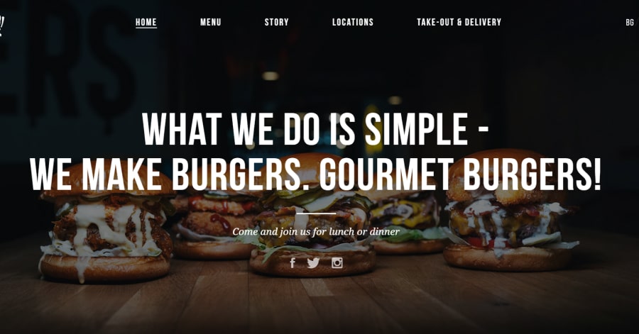
30. Boom! Burgers
Boom Burgers delivers a bold, fun design full of energy. Bright photos, animated elements, and large typography emphasize personality and appetite appeal. Visitors are quickly guided toward key actions like viewing the menu or placing orders. The layout feels modern, playful, and perfectly suited for a casual gourmet brand.
What you can learn from this great food website example
-
Fun visuals capture attention instantly
-
Clear CTAs support fast ordering
-
Animated layout reflects brand vibe
🚀 Here's the website builder I recommend to replicate this website
VIEW THEME / DEMO ▶
VIEW HOST / DEMO ▶
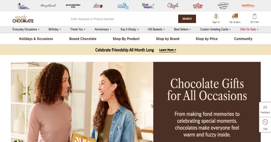
31. Simply Chocolate
URL: https://www.simplychocolate.com/
Simply Chocolate uses Scandinavian design with rich visuals, clean fonts, and elegant spacing. The brown and neutral palette enhances its premium look. Products are center stage, supported by a minimalist structure and calm UX. The brand identity comes across as refined, modern, and rooted in quality without being overwhelming.
What you can learn from this great food website example
-
Neutral tones enhance luxury appeal
-
Minimalism keeps user flow simple
-
Premium vibe through calm design choices
🚀 Here's the website builder I recommend to replicate this website

VIEW THEME / DEMO ▶
VIEW HOST / DEMO ▶
32. Nobell Foods
URL: https://www.nobellfoods.com/
Nobell Foods grabs attention with a playful, science-meets-food design. Horizontal scroll, quirky illustrations, and bold storytelling create a fresh, engaging experience. The innovative layout reflects their mission to reinvent cheese with plants. It’s memorable, informative, and different from standard food websites.
What you can learn from this great food website example
-
Scroll effects create engagement
-
Design reflects innovation
-
Fun visuals make the brand unforgettable
🚀 Here's the website builder I recommend to replicate this website
VIEW THEME / DEMO ▶
VIEW HOST / DEMO ▶
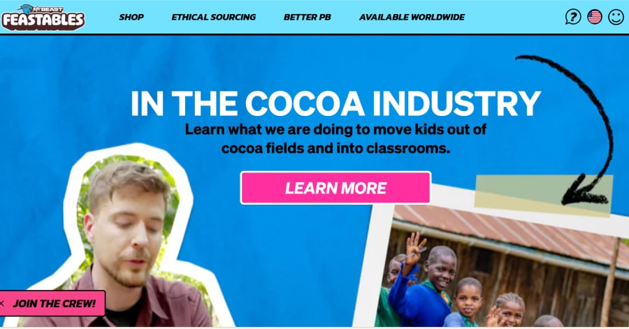
33. Feastables
Feastables showcases a highly interactive, colorful design full of movement. Playful icons, hover animations, and gamified effects bring a sense of fun. The site appeals to a younger audience with energetic visuals and storytelling. Navigation is simple, but the design keeps you entertained and curious throughout the browsing journey.
What you can learn from this great food website example
-
Gamified interactions drive engagement
-
Strong branding through movement
-
Vibrant layout!
🚀 Here's the website builder I recommend to replicate this website

VIEW THEME / DEMO ▶
VIEW HOST / DEMO ▶
34. Taco Maria
URL: https://www.tacomaria.com/
Taco Maria combines clean layout and vibrant food photography to highlight its modern Mexican cuisine. The site balances chef storytelling with intuitive booking and menu display. Full-width imagery and a simple color palette reflect culinary authenticity and accessibility. It’s inviting, visually rich, and easy to use!
What you can learn from this great food website example
-
Balanced visuals
-
Mobile-friendly design
-
Easy access to the reservation and menu boosts conversion
🚀 Here's the website builder I recommend to replicate this website
VIEW THEME / DEMO ▶
VIEW HOST / DEMO ▶
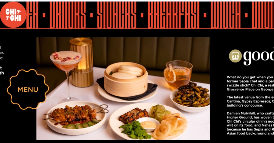
35. Chi Chi
URL: https://www.chichidining.com.au/
Chichi Dining breaks convention with horizontal scrolling and dynamic CTAs that pair well with their lively branding. Scrolling text and bold buttons appear throughout the layout, inviting exploration in a fun and unconventional way. It’s bold, memorable, and instantly communicates the restaurant’s energetic personality.
What you can learn from this great food website example
- Unique scroll direction grabs attention
- Bold moving elements reinforce brand energy
- Creative layout encourages user curiosity
🚀 Here's the website builder I recommend to replicate this website
VIEW THEME / DEMO ▶
VIEW HOST / DEMO ▶
36. Dirt Candy
URL: https://www.dirtcandynyc.com/
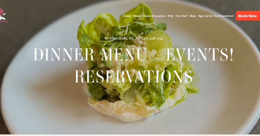
Dirt Candy offers a vibrant, playful site full of bold patterns, quirky font choices, and scrolling micro-interactions. The interface invites exploration through animations linked to vegetarian dishes and brand personality. Though whimsical, the layout always highlights menu, reservations, and delivery options cleanly.
What you can learn from this great food website example
-
Bold identity woven into UX animations
-
Function and fun can coexist
-
Clean CTAs maintain usability
🚀 Here's the website builder I recommend to replicate this website

VIEW THEME / DEMO ▶
VIEW HOST / DEMO ▶
37. Nari
Chichi Dining breaks convention with horizontal scrolling and dynamic CTAs that pair well with their lively branding. Scrolling text and bold buttons appear throughout the layout, inviting exploration in a fun and unconventional way. It’s bold, memorable, and instantly communicates the restaurant’s energetic personality.
What you can learn from this great food website example
- Unique scroll direction grabs attention
- Bold moving elements reinforce brand energy
- Creative layout encourages user curiosity
🚀 Here's the website builder I recommend to replicate this website

VIEW THEME / DEMO ▶
VIEW HOST / DEMO ▶
38. Dishoom
Dishoom captures vibrant Bombay café culture through rich visuals, bold typography, and a lively color palette. The site combines stories, history, and menu seamlessly, with easy access to locations and reservations. Subtle scroll effects bring sections to life without clutter. The personality is bold yet refined.
What you can learn from this great food website example
-
Design echoes cultural and brand identity
-
Clean navigation enhances multi-location functionality
-
Storytelling integrated visually and textually
🚀 Here's the website builder I recommend to replicate this website

VIEW THEME / DEMO ▶
VIEW HOST / DEMO ▶
39. Maijard Smashburgers
URL: https://maijardsmashburgers.com/
Maijard Smashburgers uses a bold, modern aesthetic with high-impact food photography and repeating branding text on a light background. The layout prioritizes menu, locations, and order links prominently. While visuals are appetizing and urban, the design relies heavily on scrolling repetition and minimal navigation structure.
What you can learn from this great food website example
-
Eye-catching food imagery
-
Prioritizes core info like menu and location above the fold
-
Repetitive design patterns
🚀 Here's the website builder I recommend to replicate this website

VIEW THEME / DEMO ▶
VIEW HOST / DEMO ▶
40. Burgerbar
URL: https://www.burgerbar.nl/
BurgerBar uses bold typography and simple blocks to communicate menu, locations, and ordering features. The homepage features strong hero text on gradient backgrounds that clash with the logo’s red tones. Navigation is hidden behind a hamburger menu and lacks visual hierarchy.
What you can learn from this great food website example
-
Consistent contrast improves readability and accessibility
- Vibrant colors
- Nice choice of visuals
🚀 Here's the website builder I recommend to replicate this website
VIEW THEME / DEMO ▶
VIEW HOST / DEMO ▶
41. Café de Hoek
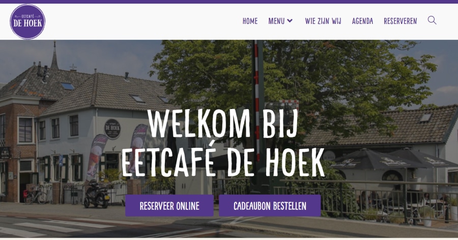
Café de Hoek embraces a warm, inviting layout with rich, moody imagery of coffee, pastries, and interior ambiance. The color palette pairs deep browns and off-white backgrounds. Menus and location info are organized into scroll-based panels.
What you can learn from this great food website example
-
Nice, atmospheric visuals build emotional brand tone
-
Clean panel scrolling guides visual storytelling
-
Neat design elements
🚀 Here's the website builder I recommend to replicate this website
VIEW THEME / DEMO ▶
VIEW HOST / DEMO ▶
42. Streetfood by Konbu
URL: https://streetfood.konbu.nl/
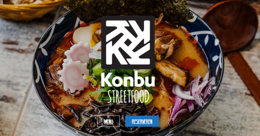
Streetfood by Konbu features a bold and energetic aesthetic, with vibrant food visuals and modern typography against a dark theme. The homepage delivers high-impact images of Asian fusion cuisine, enhanced by animated transitions and dynamic section layering.
What you can learn from this great food website example
-
Strong contrast makes visuals pop
-
Animated transitions
-
Focused content hierarchy
🚀 Here's the website builder I recommend to replicate this website
VIEW THEME / DEMO ▶
VIEW HOST / DEMO ▶
43. Wagyu Kanata
URL: https://www.wagyukanata.com/
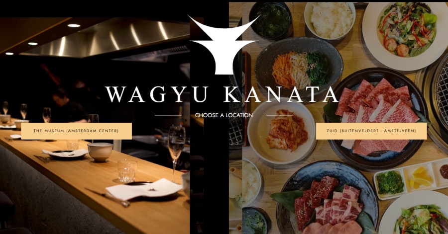
Wagyu Kanata’s website uses stylish minimalism enhanced by high-contrast photography of premium Wagyu beef on dark overlays. The homepage features a location selector, essential dining info, and reservation CTAs. Navigation is streamlined but can feel repetitive.
What you can learn from this great food website example
-
High-contrast visuals elevate food quality and brand prestige
-
Central CTAs
-
Simplistic layout
🚀 Here's the website builder I recommend to replicate this website
VIEW THEME / DEMO ▶
VIEW HOST / DEMO ▶
44. Pasta Americana
URL: https://www.pastaamericana.com/
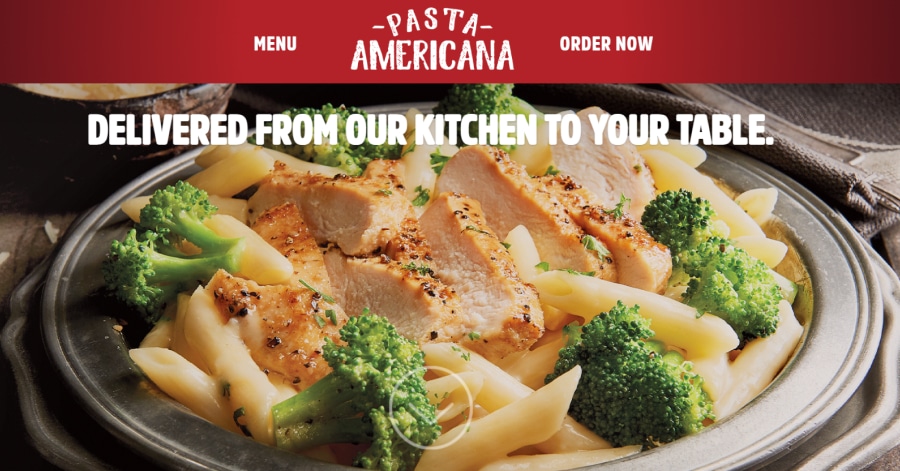
Pasta Americana presents a no-frills online experience designed to support delivery operations. The homepage focuses on a branded copy block explaining ghost kitchen origins, with basic CTA to order via partner apps instead of in‑site ordering. Visual content is scarce, navigation is limited. Function trumps form—useful for quick conversion, but it leaves aesthetic and storytelling value behind.
What you can learn from this great food website example
-
Amazing choice of colors
-
Food photography drives the emotional appeal
-
Clean structure makes browsing feel effortless
🚀 Here's the website builder I recommend to replicate this website
VIEW THEME / DEMO ▶
VIEW HOST / DEMO ▶
45. American Beauty
URL: https://www.americanbeauty.com/
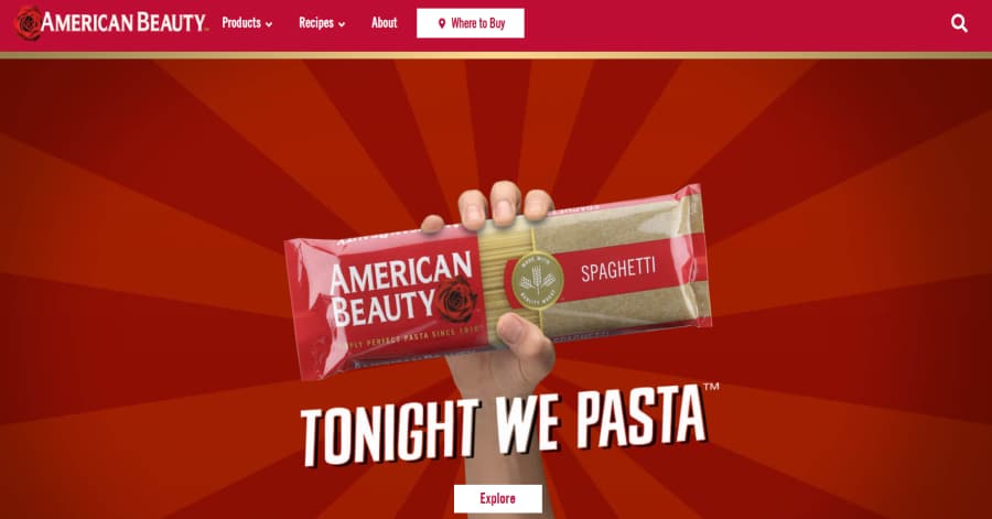
Pasta Americana’s website features a warm and inviting layout that highlights their pasta-focused comfort food. The homepage combines appetizing visuals, soft color tones, and clean fonts to create a cozy feel. Navigation is smooth and user-friendly, making it easy for customers to explore the menu or place an order.
What you can learn from this great food website example
-
Balanced and appealing layout
-
Soft, appetizing color palette
-
Clear and simple navigation
🚀 Here's the website builder I recommend to replicate this website
VIEW THEME / DEMO ▶
VIEW HOST / DEMO ▶
46. Love Dale Bar + Grill
URL: https://lovedalebargrill.com/
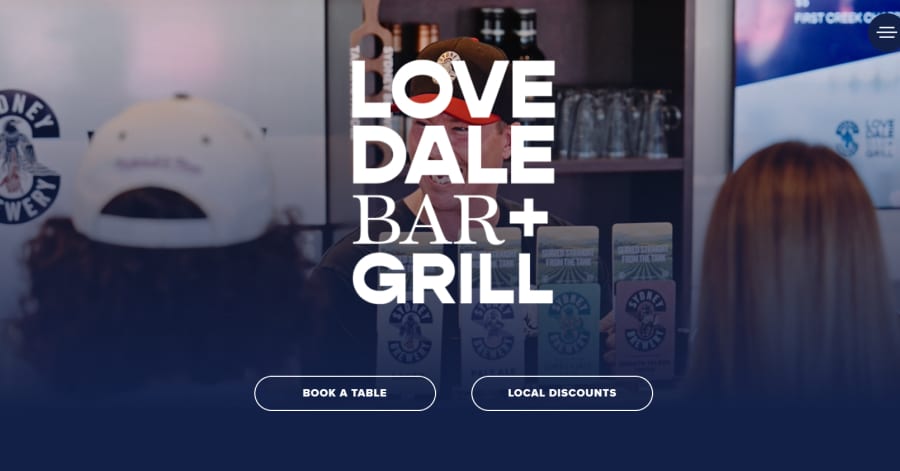
Lovedale Bar & Grill showcases a warm, rustic design with textured backgrounds and rich food photography. High‑contrast buttons and bold headlines enhance usability. The layout frames menu highlights, venue info, and reservations with purpose. Together, visuals and structure evoke friendly hospitality and casual dining comfort.
What you can learn from this great food website example
-
Cozy layout with textured elements
-
Bold headlines
-
Balanced visuals and clear navigation
🚀 Here's the website builder I recommend to replicate this website

VIEW THEME / DEMO ▶
VIEW HOST / DEMO ▶
47. Appam
URL: https://www.appam.com.au/
Appam’s website offers a warm, authentic feel reminiscent of its Kerala roots. Gentle earth tones, rice-based hero imagery, and traditional textures set the mood. The layout centers on quick ordering and event catering, supported by clear headings and simple menus. The site balances cultural identity with streamlined usability.
What you can learn from this great food website example
-
Authentic visuals
-
Simple, purpose-driven layout helps users find info quickly
-
Consistent heritage fonts and textures
🚀 Here's the website builder I recommend to replicate this website
VIEW THEME / DEMO ▶
VIEW HOST / DEMO ▶
48. Quay Restaurant
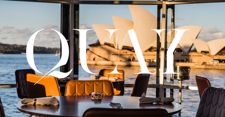
Quay’s website mirrors its world-class culinary prestige with full-screen video and high-resolution imagery foregrounding food, harbor views, and fine details. A transparent navigation bar features a reserved “Reservations” CTA that reappears as you scroll. Subtle hover effects and deep-scroll transitions reflect curated luxury and seamless UX.
What you can learn from this great food website example
-
Stunning hero visuals
-
Persistent, high-visibility reservation CTA
-
Hover-driven menus guide attention smoothly
🚀 Here's the website builder I recommend to replicate this website

VIEW THEME / DEMO ▶
VIEW HOST / DEMO ▶
49. Jetty Beach
URL: https://www.jettybeachhouse.com/
Jetty Beach House features a coastal-chic interface that pairs panoramic beach photography with bold, clean CTA buttons. The top navigation includes events, menu, and booking links while full-width slides emphasize atmosphere and dining. The design reflects its seaside location, balancing vibrant food visuals with fresh, relaxed branding
What you can learn from this great food website example
-
Coastal imagery and wide layouts
-
Prominent “Book Now” CTA supports reservations efficiently
-
Clear style
🚀 Here's the website builder I recommend to replicate this website
VIEW THEME / DEMO ▶
VIEW HOST / DEMO ▶
50. Kiln Rooftop Restaurant
URL: https://www.kilnsydney.com/
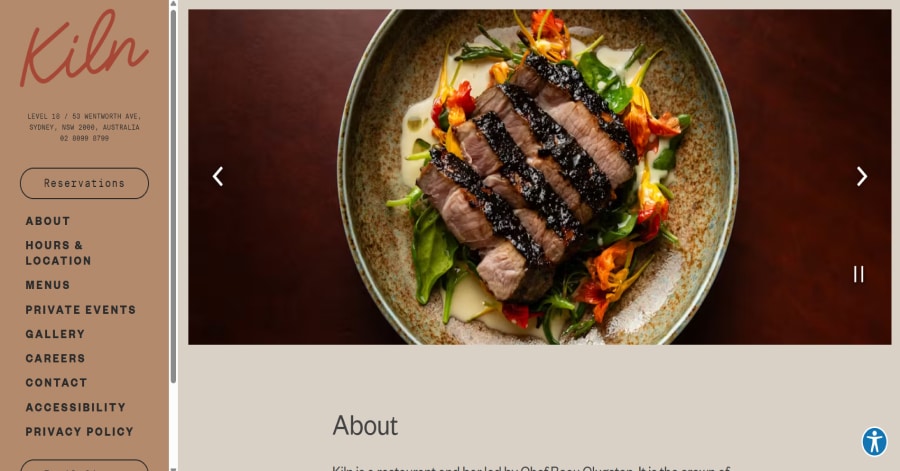
The design balances panoramic city views with rich textures—Australian stone, leather, brass and timber reflect local craftsmanship. A muted color palette of dusky pinks, greens, blues creates warmth and sophistication, while bold structural lighting and natural materials evoke an earthy, upscale ambiance.
What you can learn from this great food website example
-
Balanced and appealing layout
-
Cohesive color palette
-
Clear and simple navigation
🚀 Here's the website builder I recommend to replicate this website
These are my favourites.
BONUS – Here is my favorite template
Food Website Template
URL: https://mycodelesswebsite.com/try-theme/food-bank
Why this is such a great template
- Clean design, great to turn visitors into customers
- Wordpress compatible, easy to customize
- Free download if you’re a Divi member
BONUS: Wix
URL: wix.com
Although this one shouldn't be on the list - I couldn't keep this one from you. Wix has amazing website themes and leads by example. Their own homepage looks stunning.
What can you learn from this great website
- Playful design
- Clear call to actions
- Great user experience
HIGH-END
WEBFLOW EXPERT

Arch Web Design
archcowebdesign.com
We're a Canadian Webflow agency that helps SaaS companies increase their revenue using high-converting websites. We've worked with over 200 SaaS companies and see an average 3.7x increase in website leads.
✓ Top Companies worked with:
Hugo (acquired by Calendly), SmartSuite,
DuxSoup
✓ Our average client increases their conversions by 3.7x in 90 days
✓ We've helped our clients secure $200M in funding

Vrrb
vrrb.com
Vrrb is an award-winning creative agency based in Los Angeles. 14+ years of experience building extraordinary websites, applications, and digital solutions for the world's most recognizable brands.
✓ Our core services include branding, website design/development, mobile apps, digital strategy, and ongoing support
✓ We work with companies (50+ employees) and funded startups to accelerate growth
✓ Clients include Ferrari, Visa, HP, UCLA, and Behr Paint
FAQ
What makes a good food website?
A great food website should have a clean design, be easy to navigate and include a lot of social proof. Have a look at this page for great example websites.
How to create a food website?
- Analyze the best examples on this page
- Make notes of what you like – and what you don’t like
- Design your own site with this a drag & drop website builder
- Publish your website with our recommended hosting platform.
How much does a food website cost?
A web designer will charge anywhere between $2000 and $6000 for a decent website. However, this article will teach you to do it yourself for less than $100.
What information is needed on a food website?
Your website will need at least the following pages: ‘Home, About us, Contact, Portfolio’. To create trust with your visitor it’s important to show lots of pictures of your team and your latest projects.


