Definitive guide
Best Review Websites | 24 Examples
Start Building →
View Examples →

👋 How I curated this list
Welcome friendly stranger! You’re looking for some inspiring website examples. You found the right page.
About me
My name is Ralph de Groot. I’m the founder and author at My Codeless Website. Wake me up for a great web design. I love writing about website examples, too!
How I curated this list
Once a year I collect 500 website examples to create/update this article. I create a shortlist which I send to my team of web designers. Together, we vote to determine the order of this list.
Next to that, I always follow our editorial policy when writing my articles, to make sure they are really helpful and useful for you.
Home » Blogs » Website Examples »

VIEW THEME / DEMO ▶
VIEW HOST / DEMO ▶
1. Trustpilot
URL: https://www.trustpilot.com/
Trustpilot’s website keeps it simple and user-friendly, sporting a clean white background, blue accents, and easy-to-follow navigation. The homepage shines a spotlight on customer reviews, and the layout is neatly organized, providing smooth access to search, categories, and business profiles. In essence, it prioritizes transparency and trust with a straightforward yet powerful interface.
What you can learn from this great website design
- Reliable reviews from people
- Easy navigation
- Clean and sleek web design
🚀 Here's the website builder I recommend to replicate this website

VIEW THEME / DEMO ▶
VIEW HOST / DEMO ▶
2. TripAdvisor
URL: https://www.tripadvisor.com/
TripAdvisor’s vibrant site features a clean design in white with green and orange accents. It emphasizes user reviews, creating a community feel. The straightforward layout showcases travel destinations, hotels, and restaurants, providing an intuitive and interactive experience for travelers seeking recommendations.
What you can learn from this great website design
- Lots of white spaces
- Trusted website especially for travelers
- Clean and neat web design
🚀 Here's the website builder I recommend to replicate this website

VIEW THEME / DEMO ▶
VIEW HOST / DEMO ▶
3. Yelp
Yelp’s website blends red and white tones, spotlighting user-generated reviews. The homepage highlights local businesses, events, and trends. Clear navigation facilitates easy exploration of diverse categories for business reviews. With a clean layout, user engagement thrives through photos and comments, creating a vibrant platform for discovering and sharing local experiences.
What you can learn from this great website design
- Calm color scheme
- Visually pleasing elements
- Easy menu navigation
🚀 Here's the website builder I recommend to replicate this website

VIEW THEME / DEMO ▶
VIEW HOST / DEMO ▶
4. Consumer Affairs
URL: https://www.consumeraffairs.com/
ConsumerAffairs’ site boasts a clean and simple design with a white background and blue accents. The homepage highlights consumer reviews, top-rated products, and popular categories. Clear navigation directs users to specific industries and brands, prioritizing transparency and trust. It serves as a platform for consumers to share and access information on various products and services.
What you can learn from this great website design
- Great website for reviews
- Simple color palette
- Neat and sleek web design
🚀 Here's the website builder I recommend to replicate this website

VIEW THEME / DEMO ▶
VIEW HOST / DEMO ▶
5. FourSquare
URL: https://foursquare.com/ Foursquare’s website rocks a modern design, predominantly white with stylish orange accents. The homepage flaunts personalized recommendations, trending spots, and popular check-ins. Its layout invites exploration across categories like food, nightlife, and shopping. Emphasizing location-based experiences, Foursquare’s user-friendly design encourages discovering new places and activities tailored to individual preferences.What you can learn from this great website design
- Easy navigation of the website
- Calm color palette
- User-friendly web design
🚀 Here's the website builder I recommend to replicate this website

VIEW THEME / DEMO ▶
VIEW HOST / DEMO ▶
6. TrustRadius
URL: https://www.trustradius.com/
TrustRadius flaunts a sleek website design, employing a clean white backdrop with stylish blue accents. The homepage showcases trending software categories, customer reviews, and trusted vendors. With intuitive navigation, users can explore products by industry and delve into in-depth reviews. Prioritizing authenticity, the design empowers businesses with genuine user insights, aiding informed decisions about diverse software solutions.
What you can learn from this great website design
- Adorable graphic visuals
- Creative logo design
- Well-researched reviews
🚀 Here's the website builder I recommend to replicate this website

VIEW THEME / DEMO ▶
VIEW HOST / DEMO ▶
7. G2
URL: https://www.g2.com/
G2’s website features a sleek design with a dark background, white, and orange accents. The homepage highlights trending products and software categories, encouraging interactive exploration. It prioritizes dynamic, data-driven insights, offering a visually appealing platform for businesses to make informed decisions based on real-time user reviews and ratings.
What you can learn from this great website design
- Unique color palette
- Great use of white space
- Easy web navigation
🚀 Here's the website builder I recommend to replicate this website

VIEW THEME / DEMO ▶
VIEW HOST / DEMO ▶
8. GoodFirms
URL: https://www.goodfirms.co/
GoodFirms’ website rocks a professional, clean design with a white background and green accents. The homepage showcases top categories, featured companies, and client reviews. Its organized layout simplifies navigation through service categories, providing detailed business profiles. Focused on client feedback and transparency, GoodFirms helps users find reliable service providers across diverse industries.
What you can learn from this great website design
- Real and trusted reviews from people
- Simple and clean web design
- Well-polished layout
🚀 Here's the website builder I recommend to replicate this website

VIEW THEME / DEMO ▶
VIEW HOST / DEMO ▶
9. Top Ten Reviews
URL: https://www.toptenreviews.com/
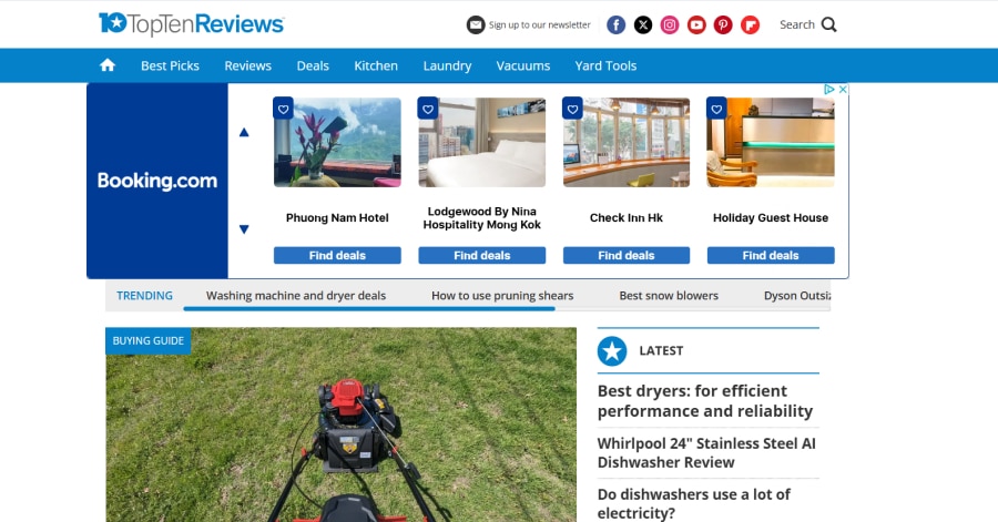
Top Ten Reviews’ website boasts a straightforward design, incorporating a white background with blue accents. The homepage prominently displays top-rated products and reviews across various categories. Intuitive navigation facilitates easy exploration and comparison of products. The design focuses on delivering comprehensive and reliable reviews, aiding users in making informed decisions across a broad spectrum of consumer products and services.
What you can learn from this great website design
- Great use of white space
- Clean and neat layout
- Straightforward and elegant design
🚀 Here's the website builder I recommend to replicate this website

VIEW THEME / DEMO ▶
VIEW HOST / DEMO ▶
10. Choice
URL: https://www.choice.com.au/
Choice’s website blends a clean, informative design in white with blue accents. The homepage spotlights consumer advocacy, product reviews, and research articles. Clear navigation allows users to explore categories and stay updated on the latest consumer news. The design reflects Choice’s dedication to unbiased information, empowering Australian consumers to make informed decisions about products and services.
What you can learn from this great website design
- Great advocacy and platform
- Informative website
- Well-polished layout
🚀 Here's the website builder I recommend to replicate this website

VIEW THEME / DEMO ▶
VIEW HOST / DEMO ▶
11. Glassdoor
URL: https://www.glassdoor.com/
Glassdoor’s website features a professional design with a white background and green accents. The homepage spotlights job search functionality, company reviews, and salary insights. Intuitive navigation allows users to explore job listings and research employers. Focused on transparency, Glassdoor’s design empowers users to make informed career decisions by providing insights into company culture, salaries, and reviews.
What you can learn from this great website design
- Professional-looking
- Trustworthy reviews
- Organized layout
🚀 Here's the website builder I recommend to replicate this website

VIEW THEME / DEMO ▶
VIEW HOST / DEMO ▶
12. Facebook
URL: https://www.facebook.com/
Facebook’s website, known for its blue theme and clean layout, presents a homepage with the iconic news feed, friend updates, and interactive features. Intuitive navigation enables exploration of groups, pages, and personalized content. Prioritizing social connections, engagement, and multimedia sharing, Facebook’s design crafts a dynamic and user-friendly platform for communication and networking.
What you can learn from this great website design
- Engaging layout
- Well-known website for communication
- Easy on the eyes color scheme
🚀 Here's the website builder I recommend to replicate this website
VIEW THEME / DEMO ▶
VIEW HOST / DEMO ▶
13. Quora
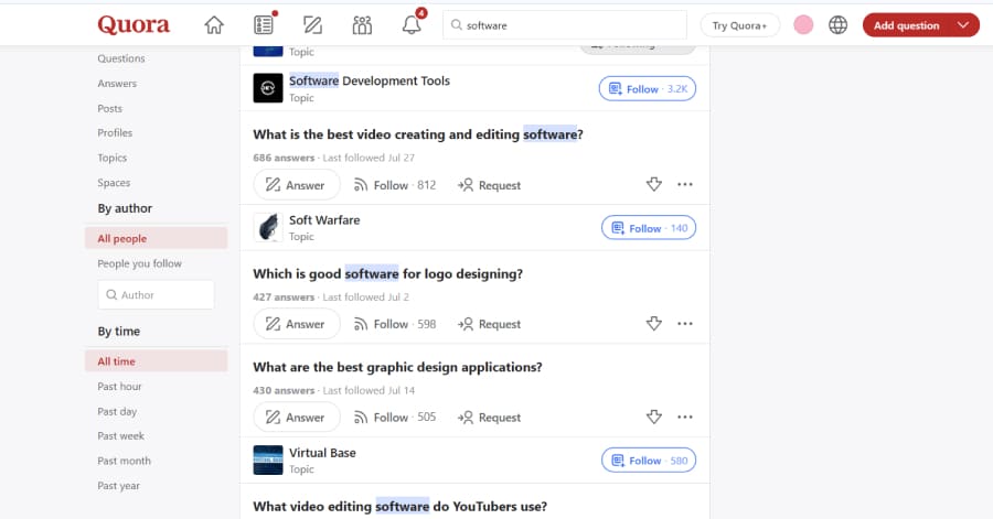
Quora’s design is clean and text-focused, using whitespace and simple typography to make reading comfortable. The question-and-answer layout is straightforward, with smooth navigation between topics. However, the review section experience can feel cluttered when ads and related links interrupt the flow, slightly affecting how easily users stay focused on content.
What you can learn from this great website design
🚀 Here's the website builder I recommend to replicate this website

VIEW THEME / DEMO ▶
VIEW HOST / DEMO ▶
14. First Round Review
URL: https://review.firstround.com/
First Round Review features a clean, editorial-style design that highlights its depth of storytelling. The layout uses ample white space, clear headings, and subtle imagery to help readers dive directly into content. The review section balances readability and authority, making long-form articles both approachable and visually grounded.
What you can learn from this great website design
-
Scannable layout
-
Typography that supports comfort
-
Clean, uncluttered sections
🚀 Here's the website builder I recommend to replicate this website
VIEW THEME / DEMO ▶
VIEW HOST / DEMO ▶
15. TestFreaks
URL: https://www.testfreaks.com/
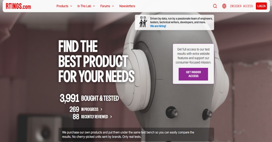
TestFreaks serves up a modern, minimal interface built around user feedback. The review section features clean lines, intuitive widgets, and a well-organized layout that makes it easy to skim ratings, dive into user submissions, or explore Q&A. It blends functionality with clarity, keeping the spotlights firmly on customer voices.
What you can learn from this great website design
-
Review widgets are clean
-
Ratings and Q&A are clearly organized
-
Layout keeps everything focused
🚀 Here's the website builder I recommend to replicate this website
VIEW THEME / DEMO ▶
VIEW HOST / DEMO ▶
16. RTINGS
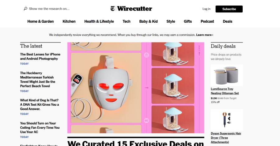
RTINGS.com uses a precise, data-driven design that reflects its commitment to objective reviews. The clean interface, organized charts, and clear rating visuals make complex information easy to understand. Its layout reinforces trust, showing that accuracy, transparency, and clarity are central to the brand’s identity.
What you can learn from this great website design
🚀 Here's the website builder I recommend to replicate this website
VIEW THEME / DEMO ▶
VIEW HOST / DEMO ▶
17. Wirecutter
URL: https://www.nytimes.com/wirecutter
Wirecutter presents product reviews through a sleek, focused layout that emphasizes clarity. The single-column design keeps readers looking straight at the content, while clean fonts and generous spacing reinforce authority. Visual cues and structured formatting ensure each recommendation is easy to digest, supporting trust and usability.
What you can learn from this great website design
-
Simple, centered layout
-
Clean typography
-
Structured format supports clear, trustworthy recommendations
🚀 Here's the website builder I recommend to replicate this website
VIEW THEME / DEMO ▶
VIEW HOST / DEMO ▶
18. PCMAG
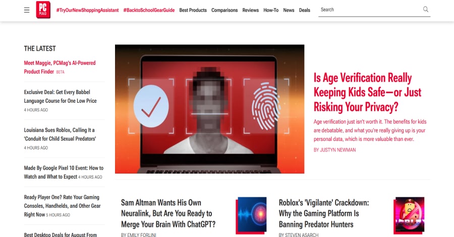
PCMag.com delivers tech reviews with a structured, authoritative feel. The review pages use organized layouts with spec tables, clear headings, and comparison boxes that help users digest deep technical info effortlessly. These pages balance lab precision with reader clarity, reinforcing trust through a transparent and performance-focused design.
What you can learn from this great website design
🚀 Here's the website builder I recommend to replicate this website

VIEW THEME / DEMO ▶
VIEW HOST / DEMO ▶
19. Techradar
URL: https://www.techradar.com/reviews
TechRadar’s review pages pair clarity with visual structure. The layout uses side-by-side comparison tables, clear pros and cons, and concise summaries to help readers grasp key points quickly. Consistent use of headlines, blocks, and rating visuals keeps each review neat and approachable, reinforcing TechRadar’s reputation for informed guidance.
What you can learn from this great website design
-
Comparison tables make insights easy to digest
-
Pros and cons are cleanly separated
-
Bold headings and layout support quick scanning
🚀 Here's the website builder I recommend to replicate this website
VIEW THEME / DEMO ▶
VIEW HOST / DEMO ▶
20. Top Ten Reviews
URL: https://www.toptenreviews.com/
TopTenReviews uses a neat, professional layout with blue accents and generous white space. Its review pages are organized for easy comparison of top-rated products across various categories. The straightforward navigation and clean visuals emphasize clarity and credibility, making browsing feel focused and user-friendly.
What you can learn from this great website design
-
Well-organized layout
-
Blue accents and ample white space
-
Navigation and review presentation feel clean and trustworthy
🚀 Here's the website builder I recommend to replicate this website
VIEW THEME / DEMO ▶
VIEW HOST / DEMO ▶
21. Tom’s Guide
URL: https://www.tomsguide.com/
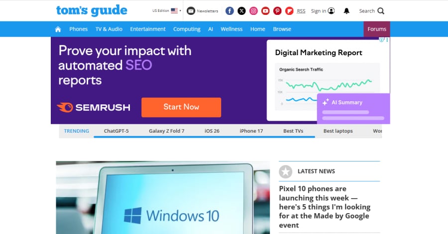
Tom’s Guide presents reviews with a modern, content-rich design. Clean typography and well-structured sections guide readers through in-depth analysis without feeling overwhelming. Images, ratings, and quick pros and cons offer clarity while bold headings keep navigation smooth.
What you can learn from this great website design
-
Pros and cons are visually distinct for easy scanning
-
Bold headings help guide readers
-
Ratings and visuals break up dense content
🚀 Here's the website builder I recommend to replicate this website

VIEW THEME / DEMO ▶
VIEW HOST / DEMO ▶
22. Which?
Which? features a serviceable, content-driven layout with a clean typographic system and structured information hierarchy. Clear navigation highlights product testing and campaigns. While the site projects professionalism and trust, some sections feel dense. Overall, the design supports credibility through clarity and straightforward presentation.
What you can learn from this great website design
-
Organized layout
-
Clear headings and structure
-
No-nonsense styling reinforces its authoritative role
🚀 Here's the website builder I recommend to replicate this website
VIEW THEME / DEMO ▶
VIEW HOST / DEMO ▶
23. Sitejabber
URL: https://www.sitejabber.com/
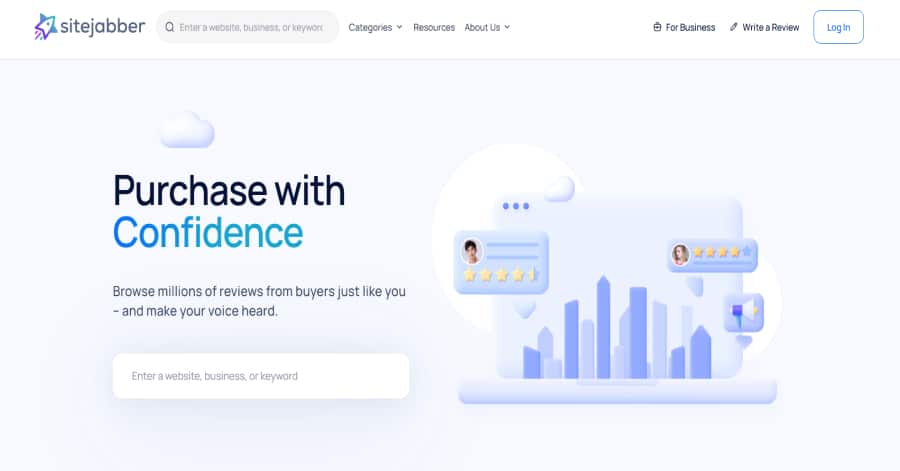
Sitejabber adopts a straightforward, community-focused layout centered on consumer reviews. Its review pages emphasize star ratings and commentary, supported by filters and clear navigation. While not design-forward, it feels practical and accessible!
What you can learn from this great website design
-
Review filters and clear ratings help users find relevant feedback efficiently
-
Simple layout
-
Practical and accessible setup
🚀 Here's the website builder I recommend to replicate this website
These are my favourites.
BONUS: Wix
URL: wix.com
Although this one shouldn't be on the list - I couldn't keep this one from you. Wix has amazing website themes and leads by example. Their own homepage looks stunning.
What can you learn from this great website
- Playful design
- Clear call to actions
- Great user experience
HIGH-END
WEBFLOW EXPERT

Arch Web Design
archcowebdesign.com
We're a Canadian Webflow agency that helps SaaS companies increase their revenue using high-converting websites. We've worked with over 200 SaaS companies and see an average 3.7x increase in website leads.
✓ Top Companies worked with:
Hugo (acquired by Calendly), SmartSuite,
DuxSoup
✓ Our average client increases their conversions by 3.7x in 90 days
✓ We've helped our clients secure $200M in funding

Vrrb
vrrb.com
Vrrb is an award-winning creative agency based in Los Angeles. 14+ years of experience building extraordinary websites, applications, and digital solutions for the world's most recognizable brands.
✓ Our core services include branding, website design/development, mobile apps, digital strategy, and ongoing support
✓ We work with companies (50+ employees) and funded startups to accelerate growth
✓ Clients include Ferrari, Visa, HP, UCLA, and Behr Paint
FAQ
What makes a good website review design?
A great website review design should have a clean design, be easy to navigate and include a lot of social proof. Have a look at this page for great example websites.
How to create a website review design?
- Analyze the best examples on this page
- Make notes of what you like – and what you don’t like
- Design your own site with this a drag & drop website builder
- Publish your website with our recommended hosting platform.
How much does a website review design cost?
A web designer will charge anywhere between $500 and $800 for a decent website. However, this article will teach you to do it yourself for less than $100.
What information is needed on a website review?
Your website will need at least the following: honest opinion, and rating. To create trust with your visitor, it’s important to show lots of pictures of your brand.


