Definitive guide
Best Vintage Websites of 2026 | 11 Examples
Start Building →
View Examples →

👋 How I curated this list
Welcome friendly stranger! You’re looking for some inspiring website examples. You found the right page.
About me
My name is Ralph de Groot. I’m the founder and author at My Codeless Website. Wake me up for a great web design. I love writing about website examples, too!
How I curated this list
Once a year I collect 500 website examples to create/update this article. I create a shortlist which I send to my team of web designers. Together, we vote to determine the order of this list.
Next to that, I always follow our editorial policy when writing my articles, to make sure they are really helpful and useful for you.
Home » Blogs » Website Examples »
Best Vintage Website Examples
VIEW THEME / DEMO ▶
VIEW HOST / DEMO ▶
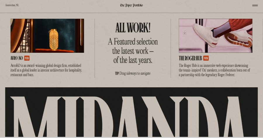
1. Niccolò Miranda
https://www.niccolomiranda.com/
Niccolò Miranda’s website carries a refined vintage energy through muted tones, serif typography, and smooth scroll animations. Each portfolio tile feels like a page from an old design journal, blending nostalgia with modern interactivity. The subtle grainy textures and timeless typography elevate its artistic sophistication.
Things we love about this web design
🚀 Here's the website builder I recommend to replicate this website
VIEW THEME / DEMO ▶
VIEW HOST / DEMO ▶
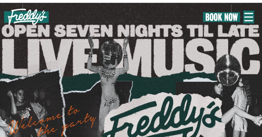
2. Freddy’s Edinburgh
Things we love about this web design
-
Immersive hero visuals that instantly set the mood
-
Cohesive palette and type choices reflecting nightlife elegance
-
Well-structured flow from discovery to booking
🚀 Here's the website builder I recommend to replicate this website
VIEW THEME / DEMO ▶
VIEW HOST / DEMO ▶
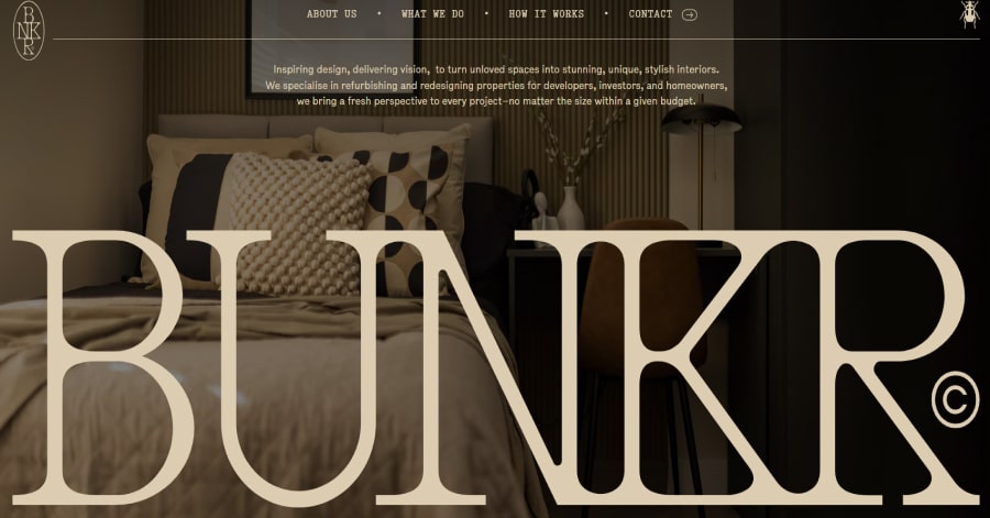
3. BUNKR Design
https://www.bunkrdesign.co.uk/
Things we love about this web design
-
Elegant font choices
-
Smooth scrolling effects
-
Well-structured layout
🚀 Here's the website builder I recommend to replicate this website

VIEW THEME / DEMO ▶
VIEW HOST / DEMO ▶
4. Hit Pause
Things we love about this web design
-
Warm, earthy tones
-
Smooth scrolling animations
-
High-quality imagery
🚀 Here's the website builder I recommend to replicate this website
VIEW THEME / DEMO ▶
VIEW HOST / DEMO ▶
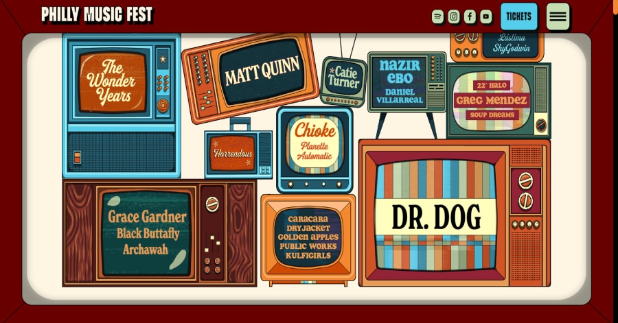
5. Philly Music Fest
https://www.phillymusicfest.com/
Philly Music Fest’s website embodies its vibrant community spirit through bold, retro-inspired visuals and intuitive navigation. The homepage features a dynamic lineup grid, vintage TV-style animations, and a color palette that reflects the festival’s energetic atmosphere. Smooth scrolling transitions enhance user experience!
Things we love about this web design
-
Retro TV-inspired animations
-
Intuitive navigation layout
-
Vibrant color palette reflecting festival energy
🚀 Here's the website builder I recommend to replicate this website
VIEW THEME / DEMO ▶
VIEW HOST / DEMO ▶
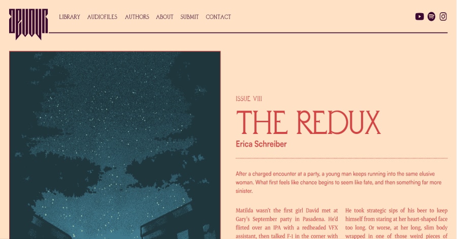
6. Devour Journal
https://www.devour-journal.com/
Devour Journal’s website immediately draws you into its dark, moody aesthetic with rich imagery and dramatic lighting effects. Scrolling feels cinematic, revealing text and visuals with subtle animations that enhance immersion. Layout and typography are carefully balanced, reflecting the journal’s literary sophistication and edgy personality.
Things we love about this web design
🚀 Here's the website builder I recommend to replicate this website

VIEW THEME / DEMO ▶
VIEW HOST / DEMO ▶
7. AYVAN
AYVAN’s website uses a striking modular layout that guides the eye naturally from one section to the next. Each block is carefully balanced with white space and imagery, creating a rhythm that feels intentional and sophisticated. Scrolling reveals content progressively, making exploration smooth and engaging.
Things we love about this web design
🚀 Here's the website builder I recommend to replicate this website

VIEW THEME / DEMO ▶
VIEW HOST / DEMO ▶
8. The Windermere Ascot
https://www.thewindermere.com.au/
Things we love about this web design
-
Vintage-inspired visuals
-
Warm, inviting tones
-
Clear, structured layout
🚀 Here's the website builder I recommend to replicate this website
VIEW THEME / DEMO ▶
VIEW HOST / DEMO ▶
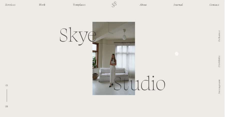
9. Skye Creative Studio
https://www.skyecreativestudio.com/
Skye Creative Studio uses animations to enhance the vintage charm of the site. Text and images gently fade and slide into view, mimicking the feel of old printed material being revealed. Section transitions are smooth and deliberate, creating a rhythm that complements the handcrafted, nostalgic design style.
Things we love about this web design
-
Fade-in content reveals
-
Gentle slide transitions
-
Rhythmic, storytelling scroll effects
🚀 Here's the website builder I recommend to replicate this website
VIEW THEME / DEMO ▶
VIEW HOST / DEMO ▶
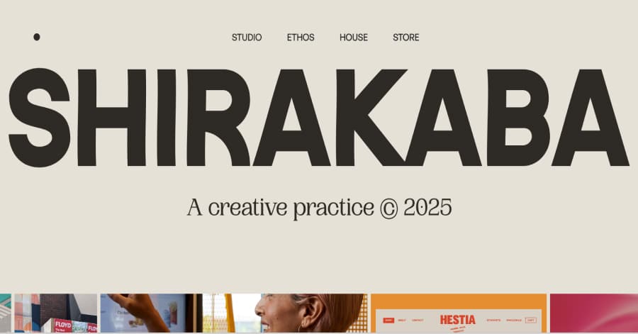
10. Shirakaba Studio
Shirakaba Studio’s website feels like stepping into a quiet creative workshop. Each scroll reveals layers of the studio’s work with subtle motion, from images sliding in to text gently fading. The combination of clean sections and playful micro-interactions makes the site feel alive, intimate, and intentionally crafted, inviting you to linger and explore.
Things we love about this web design
-
Playful micro-interactions
-
Layered content reveal
-
Inviting, workshop-like atmosphere
🚀 Here's the website builder I recommend to replicate this website
These are my favourites.
BONUS: Wix
URL: wix.com
Although this one shouldn't be on the list - I couldn't keep this one from you. Wix has amazing website themes and leads by example. Their own homepage looks stunning.
What can you learn from this great website
- Playful design
- Clear call to actions
- Great user experience
HIGH-END
WEBFLOW EXPERT

Arch Web Design
archcowebdesign.com
We're a Canadian Webflow agency that helps SaaS companies increase their revenue using high-converting websites. We've worked with over 200 SaaS companies and see an average 3.7x increase in website leads.
✓ Top Companies worked with:
Hugo (acquired by Calendly), SmartSuite,
DuxSoup
✓ Our average client increases their conversions by 3.7x in 90 days
✓ We've helped our clients secure $200M in funding

Vrrb
vrrb.com
Vrrb is an award-winning creative agency based in Los Angeles. 14+ years of experience building extraordinary websites, applications, and digital solutions for the world's most recognizable brands.
✓ Our core services include branding, website design/development, mobile apps, digital strategy, and ongoing support
✓ We work with companies (50+ employees) and funded startups to accelerate growth
✓ Clients include Ferrari, Visa, HP, UCLA, and Behr Paint
FAQ
What makes a good vintage website?
A vintage website should have a minimalistic design, be easy to navigate and include a lot of social proof. Have a look at this page for great example websites.
How to create a vintage website?
- Analyze the best examples on this page
- Make notes of what you like – and what you don’t like
- Design your own site with this drag & drop website builder
- Publish your website with our recommended hosting platform.
How much does a vintage website cost?
A web designer will charge anywhere between $1800 and $4800 for a decent website. However, this article will teach you to do it yourself for less than $100.
What information is needed on a vintage website?
Your website will need at least the following pages: ‘Home, About us, Contact, Timetable. To create trust with your visitor it’s important to show lots of pictures and videos of your classes.


