Definitive guide
Best Fluid Websites of 2026 | 11 Examples
Start Building →
View Examples →

👋 How I curated this list
Welcome friendly stranger! You’re looking for some inspiring website examples. You found the right page.
About me
My name is Ralph de Groot. I’m the founder and author at My Codeless Website. Wake me up for a great web design. I love writing about website examples, too!
How I curated this list
Once a year I collect 500 website examples to create/update this article. I create a shortlist which I send to my team of web designers. Together, we vote to determine the order of this list.
Next to that, I always follow our editorial policy when writing my articles, to make sure they are really helpful and useful for you.
Home » Blogs » Website Examples »
Best Fluid Website Examples
VIEW THEME / DEMO ▶
VIEW HOST / DEMO ▶
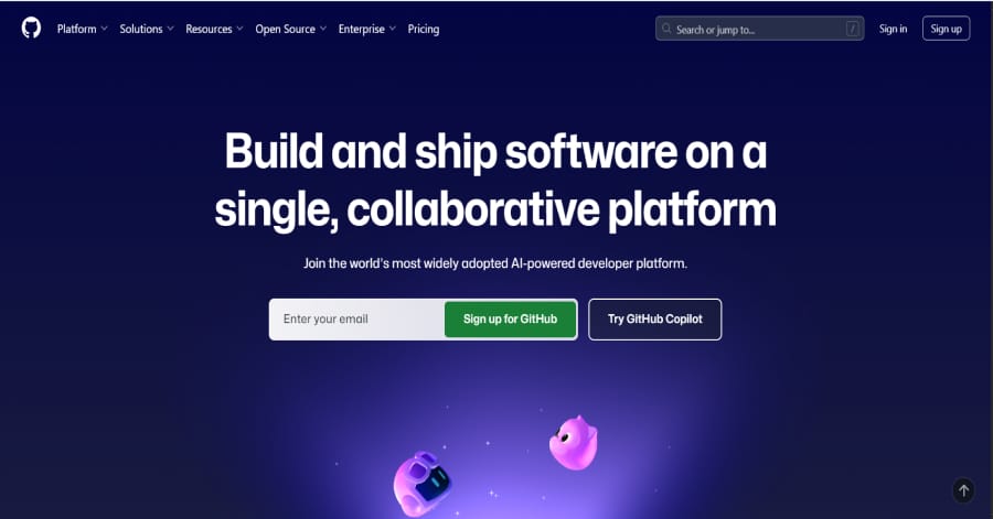
1. GitHub
GitHub’s homepage uses a fluid design with flexible grids and scalable containers that adapt proportionally to any screen. The elements shift smoothly while maintaining balance, ensuring consistency across desktops, tablets, and phones. This approach improves usability and readability without breaking the overall structure.
Things we love about this web design
🚀 Here's the website builder I recommend to replicate this website
VIEW THEME / DEMO ▶
VIEW HOST / DEMO ▶
🚀 Here's the website builder I recommend to replicate this website
VIEW THEME / DEMO ▶
VIEW HOST / DEMO ▶
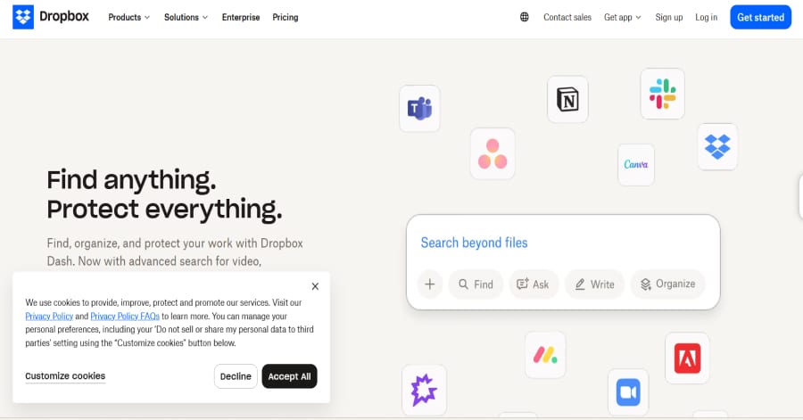
3. Dropbox
Things we love about this web design
-
Design that flows naturally across devices
-
A layout that feels tidy yet flexible
-
Text and visuals that scale with clarity
🚀 Here's the website builder I recommend to replicate this website
VIEW THEME / DEMO ▶
VIEW HOST / DEMO ▶
🚀 Here's the website builder I recommend to replicate this website

VIEW THEME / DEMO ▶
VIEW HOST / DEMO ▶
5. Apple
Apple showcases a clean, minimalist web design with stunning visuals and intuitive navigation. Bold imagery, consistent spacing, and subtle animations create a premium feel. Every element works together to guide users effortlessly while maintaining brand identity, making the website both functional and visually captivating.
Things we love about this web design
-
Smooth navigation that feels natural
-
Crisp visuals and elegant spacing
-
Typography that embodies modern sophisticatio
🚀 Here's the website builder I recommend to replicate this website
VIEW THEME / DEMO ▶
VIEW HOST / DEMO ▶
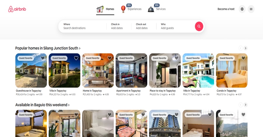
6. Airbnb
Airbnb’s homepage combines inviting visuals with a clean layout, guiding users toward booking with ease. High-quality images, intuitive navigation, and a prominent search bar create a seamless experience. The design balances functionality with aesthetics, enhancing user engagement and encouraging exploration.
Things we love about this web design
-
Inviting visuals that inspire travel
-
Intuitive navigation
-
Prominent search bar
🚀 Here's the website builder I recommend to replicate this website
VIEW THEME / DEMO ▶
VIEW HOST / DEMO ▶
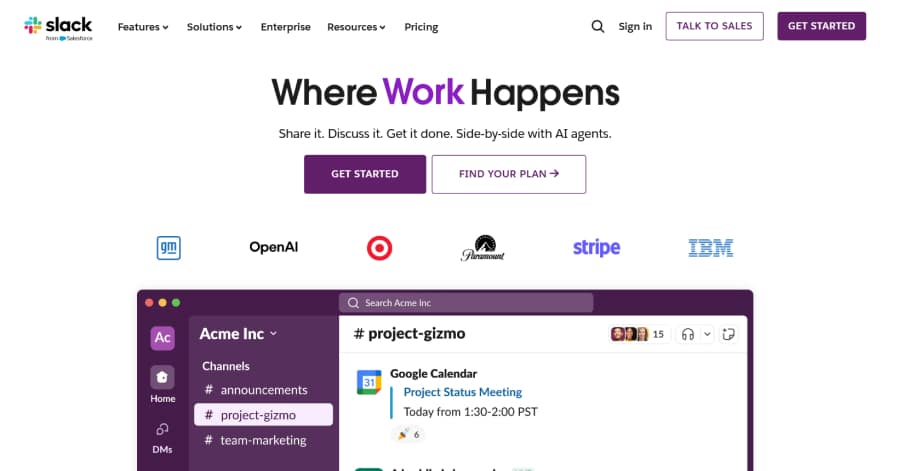
7. Slack
Slack combines clean layout, clear hierarchy, and smooth interactions. The soft purple and white color scheme creates a friendly yet professional feel, while subtle accent colors highlight key features. Custom illustrations and graphics guide attention and complement the content, maintaining visual interest across devices.
Things we love about this web design
-
Navigation that flows naturally
-
Graphics and illustrations that enhance comprehension
-
Balanced color scheme
🚀 Here's the website builder I recommend to replicate this website
VIEW THEME / DEMO ▶
VIEW HOST / DEMO ▶
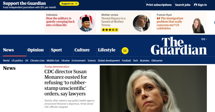
8. The Guardian – International Edition
https://www.theguardian.com/international
Things we love about this web design
-
Clear and concise content presentation
-
Intuitive navigation for global news exploration
-
Balanced integration of text and visuals
🚀 Here's the website builder I recommend to replicate this website

VIEW THEME / DEMO ▶
VIEW HOST / DEMO ▶
9. Smashing Magazine
https://blumeskintreatment.com/
Smashing Magazine uses a vibrant yet balanced color palette to highlight sections and guide the reader’s eye. Bright accent colors distinguish headings, links, and call-to-actions, while the neutral background maintains readability. The combination of color and clean layout makes the content visually engaging and easy to navigate.
Things we love about this web design
-
Strategic use of color
-
Layout that balances visuals and text
-
Readable typography
🚀 Here's the website builder I recommend to replicate this website

VIEW THEME / DEMO ▶
VIEW HOST / DEMO ▶
10. Etsy
Etsy’s homepage employs a collage-style design, featuring overlapping images and layered elements that create a dynamic, scrapbook-like aesthetic. This approach highlights curated collections and seasonal themes, guiding users through a visually rich experience that encourages exploration and discovery.
Things we love about this web design
-
Dynamic, layered visuals
-
Curated collections that inspire exploration
-
Seasonal themes that engage users
🚀 Here's the website builder I recommend to replicate this website
These are my favourites.
BONUS: Wix
URL: wix.com
Although this one shouldn't be on the list - I couldn't keep this one from you. Wix has amazing website themes and leads by example. Their own homepage looks stunning.
What can you learn from this great website
- Playful design
- Clear call to actions
- Great user experience
HIGH-END
WEBFLOW EXPERT

Arch Web Design
archcowebdesign.com
We're a Canadian Webflow agency that helps SaaS companies increase their revenue using high-converting websites. We've worked with over 200 SaaS companies and see an average 3.7x increase in website leads.
✓ Top Companies worked with:
Hugo (acquired by Calendly), SmartSuite,
DuxSoup
✓ Our average client increases their conversions by 3.7x in 90 days
✓ We've helped our clients secure $200M in funding

Vrrb
vrrb.com
Vrrb is an award-winning creative agency based in Los Angeles. 14+ years of experience building extraordinary websites, applications, and digital solutions for the world's most recognizable brands.
✓ Our core services include branding, website design/development, mobile apps, digital strategy, and ongoing support
✓ We work with companies (50+ employees) and funded startups to accelerate growth
✓ Clients include Ferrari, Visa, HP, UCLA, and Behr Paint
FAQ
What makes a good fluid website?
A fluid website should have a minimalistic design, be easy to navigate and include a lot of social proof. Have a look at this page for great example websites.
How to create a fluid website?
- Analyze the best examples on this page
- Make notes of what you like – and what you don’t like
- Design your own site with this drag & drop website builder
- Publish your website with our recommended hosting platform.
How much does a fluid website cost?
A web designer will charge anywhere between $1800 and $4800 for a decent website. However, this article will teach you to do it yourself for less than $100.
What information is needed on a fluid website?
Your website will need at least the following pages: ‘Home, About us, Contact, Timetable. To create trust with your visitor it’s important to show lots of pictures and videos of your classes.


