Definitive guide
Best Checkout Designs of 2026 | 23 Examples
Start Building →
View Examples →

👋 My Experience With Checkout Web Design
Hi – it’s Ralph here 👋 In the past 10 years, I’ve designed 20+ checkout pages. What I learned over the years building Checkout Pages for websites:
1. Simplicity and Clarity
A clean design for the site should be adopted so that it is easy to follow typing instructions with minimal design. I recommend avoiding unnecessary elements that might clutter the site and distract the customers from purchasing their items.
2. Progress Indicators
I advise you to employ progress bars, or step indicators so that the users would know or be reminded of the particular checkout phase they are on. This way, the anxiety level is kept to a minimum and they are always informed.
2. Error Handling
To ensure that users do not get stuck or annoyed when encountering a problem, I encourage you to make sure to give prompt and clear error messages that inform on how the error can be fixed. I recommend adding real-time prompts, which means that it will frequently highlight errors and avoid further problems.
Focus on this, and you’ll be fine.
PS: I suggest taking a look at the website examples below. Get inspired by their designs and see which website builders they’ve used. Best of luck!
👋 How I curated this list
Welcome friendly stranger! You’re looking for some inspiring website examples. You found the right page.
About me
My name is Ralph de Groot. I’m the founder and author at My Codeless Website. Wake me up for a great web design. I love writing about website examples, too!
How I curated this list
Once a year I collect 500 website examples to create/update this article. I create a shortlist which I send to my team of web designers. Together, we vote to determine the order of this list.
Next to that, I always follow our editorial policy when writing my articles, to make sure they are really helpful and useful for you.
Home » Blogs » Website Examples »
Best Checkout Website Examples

VIEW THEME / DEMO ▶
VIEW HOST / DEMO ▶
1. Nike
Nike’s checkout design is easy to navigate and provides all the details you could possibly want about the brand’s wares. The ubiquitous check logo, clean design, and user-friendly layout are immediately apparent upon arrival. I have no doubt that you will have nothing but pleasant shopping experiences here.
What you can learn from this great checkout website design
- Very well-known logo
- Clean and minimalist layout
- Easy checkout navigation
🚀 Here's the website builder I recommend to replicate this website

VIEW THEME / DEMO ▶
VIEW HOST / DEMO ▶
2. Brandless
Brandless’ checkout design is absolutely mind-blowing! Every item steals the spotlight, basking in its well-deserved glory, thanks to the captivating layout and vibrant background colors. The pastel-themed choices are like a soothing balm for the eyes. Overall, every corner is oozing simplicity.
What you can learn from this great checkout website design
- Great product design
- Pastel-themed products are very easy on the eyes
- Simple and clean layout
🚀 Here's the website builder I recommend to replicate this website

VIEW THEME / DEMO ▶
VIEW HOST / DEMO ▶
3. Samsung
I’m sure we’ve all had the pleasure of crossing paths with Samsung at some point in our lives. Their checkout design is sleek and sophisticated, boasting a clean white backdrop with a dash of elegant gray. It exudes an air of luxury that instantly captivates me. I absolutely adore it, so you’ve got to check them out too!
What you can learn from this great checkout website design
- Minimalist layout
- Well-matched fonts
- Modern design
🚀 Here's the website builder I recommend to replicate this website
VIEW THEME / DEMO ▶
VIEW HOST / DEMO ▶
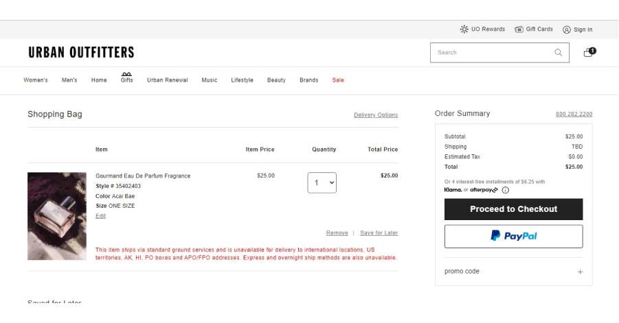
4. Urban Outfitters
URL: https://www.urbanoutfitters.com/
The checkout page of Urban Outfitters is minimal and straightforward. Who doesn’t like a set of simple guidelines? There is a lot of white space on each page, and the fonts all go together nicely. The simplicity of Urban Outfitters belies the high quality of its wares. Overall, this is one of the best checkout designs out there!
What you can learn from this great checkout website design
- Stylish font
- Great use of whitespace
- Easy instruction
🚀 Here's the website builder I recommend to replicate this website
VIEW THEME / DEMO ▶
VIEW HOST / DEMO ▶
5. ZARA
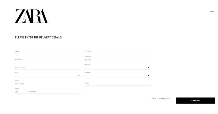
Zara, the iconic brand that everyone knows and loves, boasts a website with a sleek and chic minimalist layout that is sure to catch your eye! The designer’s black-and-white concept is absolutely chic and cutting-edge! I’m absolutely smitten with it! Plus, the checkout page is super user-friendly, making your purchase a breeze!
What you can learn from this great checkout website design
- Minimalist layout
- The black and white concept is very stylish
- Easy navigation
🚀 Here's the website builder I recommend to replicate this website
VIEW THEME / DEMO ▶
VIEW HOST / DEMO ▶
6. Tommy Hilfiger
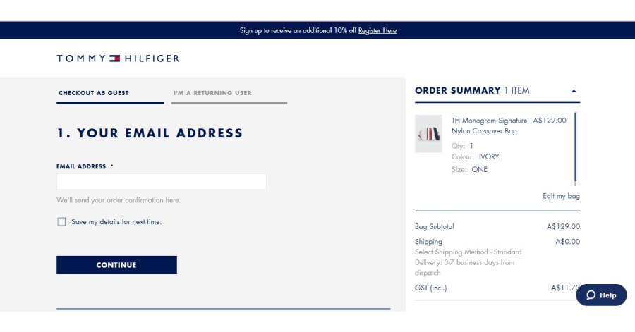
Tommy Hilfiger screams luxury and sophistication. Their checkout design has an elegant menu structure, a streamlined color palette, and complementary fonts. The designer did such a good job! Don’t pass up your chance to purchase the finest goods on the planet!
What you can learn from this great checkout website design
- Fancy menu layout
- Clean color scheme
- Well-matched font and color
🚀 Here's the website builder I recommend to replicate this website
VIEW THEME / DEMO ▶
VIEW HOST / DEMO ▶
7. Nordstrom
URL: https://www.nordstrom.com/
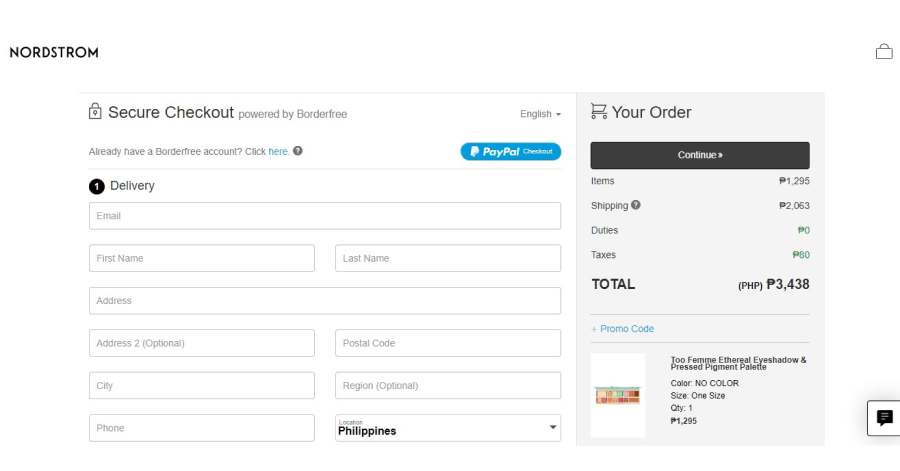
Navigating through Nordstrom’s checkout is a breeze! It’s as easy as pie! Just pick out the product that tickles your fancy, and when you’re all set to make it yours, simply give that cart a satisfying click. In a flash, you’ll be whisked away to the checkout section, ready to seal the deal! Just fill out the form and you’re all set!
What you can learn from this great checkout website design
- Easy menu navigation
- Simple aesthetic
- Colorful menu
🚀 Here's the website builder I recommend to replicate this website
VIEW THEME / DEMO ▶
VIEW HOST / DEMO ▶
8. Myntra
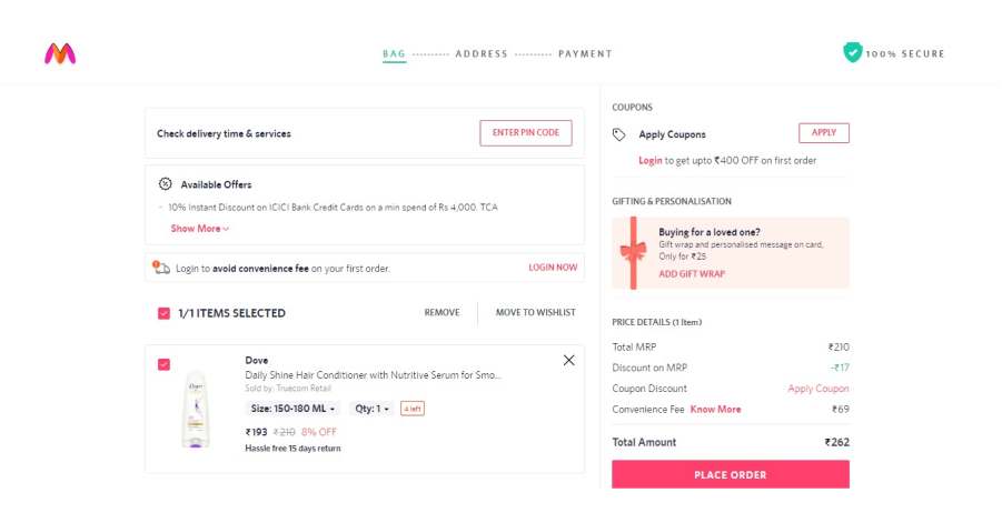
Myntra’s outstanding array of fashionable options is enough to make your heart race. The site’s color scheme is so vibrant that it virtually begs you to shop till you drop. Also, the checkout page is designed with a user-friendly interface, ensuring a seamless and intuitive experience, hence minimizing any potential challenges or difficulties encountered during the process!
What you can learn from this great checkout website design
- Great color palette
- Friendly style of aesthetic
- Lots of whitespace
🚀 Here's the website builder I recommend to replicate this website
VIEW THEME / DEMO ▶
VIEW HOST / DEMO ▶
9. Etsy
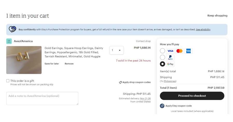
Compared to other checkout designs, Etsy is a visual delight. As you visit, you’ll appreciate the designers’ approach to presenting information because everything is skillfully executed and strategically distributed throughout the entirety of the space. This is the best spot to look for a present. The checkout page is lightning-fast and delightfully straightforward!
What you can learn from this great checkout website design
- Easy navigation
- Great platform for local artist
- Simple layout
🚀 Here's the website builder I recommend to replicate this website
VIEW THEME / DEMO ▶
VIEW HOST / DEMO ▶
10. Couture Candy
URL: https://www.couturecandy.com/
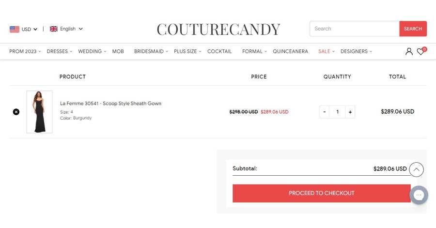
Browsing through Couture Candy’s website is like stepping into a world of simple and chic elegance. It’s a delightful experience that keeps you entertained from start to finish. As soon as you touch down, get ready to be dazzled by a stunning array of high-quality images that beautifully showcase their incredible products. The checkout page is also super sleek and impeccably organized! No worries at all!
What you can learn from this great checkout website design
- Great variety of design
- Classy font style
- Nice color palette
🚀 Here's the website builder I recommend to replicate this website

VIEW THEME / DEMO ▶
VIEW HOST / DEMO ▶
11. Byredo
Based on the visual aesthetic of Byredo’s website, the checkout design appears to exude an air of sophistication and luxury. The utilization of a cool tone color scheme, the incorporation of an expensive font style, and the implementation of a straightforward layout collectively contribute to the creation of a visually appealing result. In general, this is one of the finest checkout designs available!
What you can learn from this great checkout website design
- Cool tone color scheme
- Expensive font style
- Simple layout
🚀 Here's the website builder I recommend to replicate this website
VIEW THEME / DEMO ▶
VIEW HOST / DEMO ▶
12. Helly Hansen
URL: https://www.hellyhansen.com/
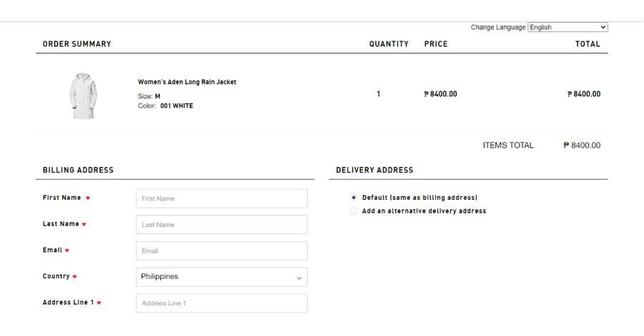
Helly Hansen’s checkout design is well-structured and easy on the eyes. Every element is straightforward, making shopping a breeze. The convenience of visiting and leaving will impress you. Check out the website for a wide range of jaw-dropping products!
What you can learn from this great checkout website design
- Minimalist layout
- Variety of designs to choose from
- Easy-to-read menu
🚀 Here's the website builder I recommend to replicate this website
VIEW THEME / DEMO ▶
VIEW HOST / DEMO ▶
13. Sigma
URL: https://www.sigmabeauty.com/
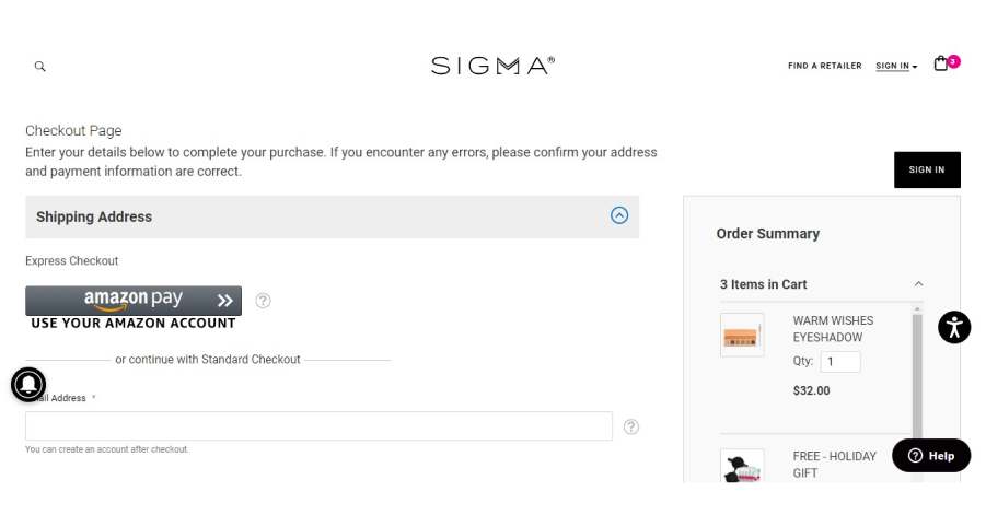
Sigma’s checkout design absolutely crushes a sleek and stylish vibe. Prepare to be blown away by the designer’s jaw-dropping choice of a mesmerizing cool-toned color scheme and an impeccably neat layout. Overall, this is among the best checkout designs out there!
What you can learn from this great checkout website design
- Clean menu layout
- Plain yet trendy aesthetic
- Cool-toned color scheme
🚀 Here's the website builder I recommend to replicate this website

VIEW THEME / DEMO ▶
VIEW HOST / DEMO ▶
14. Harvey Nichols
URL: https://www.harveynichols.com/
The website of Harvey Nichols exudes an air of luxury and exclusivity. The products offered by the company exhibit a high level of sophistication, seen in both their appearance and the checkout process. Try to check their site and maybe shop ‘til you drop!
What you can learn from this great checkout website design
- Black and white is very classy
- Simplicity at its finest
- Easy menu navigation
🚀 Here's the website builder I recommend to replicate this website

VIEW THEME / DEMO ▶
VIEW HOST / DEMO ▶
15. Walmart
Walmart sells a variety of products, so it is not surprising that its website contains numerous images and pieces of text. However, the designer ensured that everything is aesthetically pleasing. Even the checkout procedure was designed for your convenience.
What you can learn from this great checkout website design
- Variety of products to choose from
- Simple and clean layout
- Easy checkout navigation
🚀 Here's the website builder I recommend to replicate this website
VIEW THEME / DEMO ▶
VIEW HOST / DEMO ▶
16. Best Buy
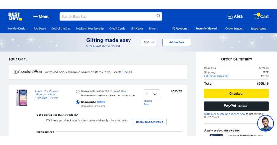
You won’t believe the incredible variety of things you can find on Best Buy’s website! It’s like a treasure trove of must-have items just waiting to be discovered. The overall website design and checkout page are absolutely flawless! You’ll be able to snag anything your heart desires in a flash because of the consistent layout! Overall, this is among the best checkout designs out there!
What you can learn from this great checkout website design
- Blue color is calming
- Great color scheme
- Consistent design and layout
🚀 Here's the website builder I recommend to replicate this website
VIEW THEME / DEMO ▶
VIEW HOST / DEMO ▶
17. Happy Socks
URL: https://www.happysocks.com/us/
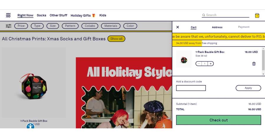
If you have a serious sock obsession, you will enjoy looking through Happy Socks’ website. Their website is a sock lover’s paradise, filled with vibrant colors, funky patterns, and all the sock styles you could ever dream of. The pages, including the checkout, are bursting with a riot of vibrant colors!
What you can learn from this great checkout website design
- Colorful scheme
- Playful theme
- Fun font style
🚀 Here's the website builder I recommend to replicate this website
VIEW THEME / DEMO ▶
VIEW HOST / DEMO ▶
18. Bed Bath & Beyond
URL: https://www.bedbathandbeyond.com/
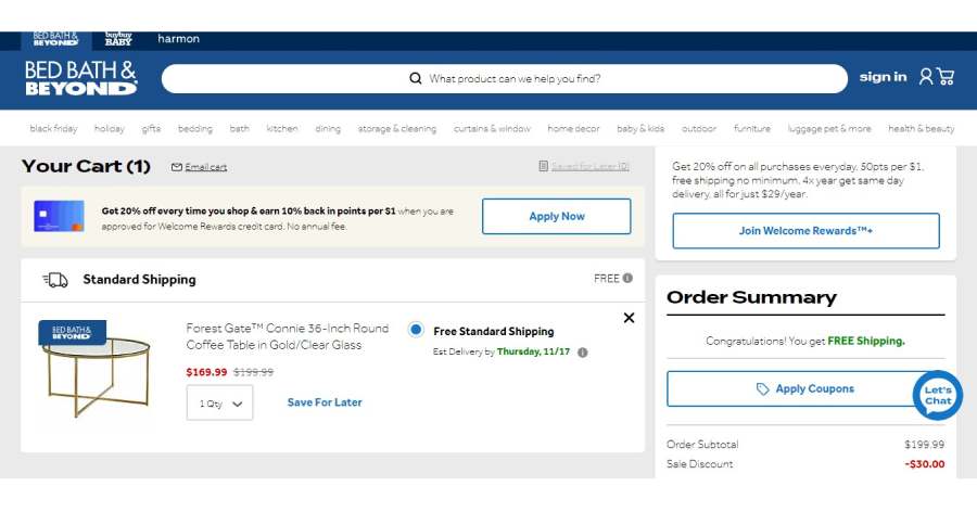
If you happen to have a preference for checkout designs that offer effortless navigation, you might find this particular one quite delightful! Bed Bath & Beyond’s designer knows how to make your life easier by carefully putting texts and images where they belong, so you can just enjoy shopping!
What you can learn from this great checkout website design
- Expensive and classy theme
- Easy menu navigation
- Great variety of products
🚀 Here's the website builder I recommend to replicate this website
VIEW THEME / DEMO ▶
VIEW HOST / DEMO ▶
19. FWRD
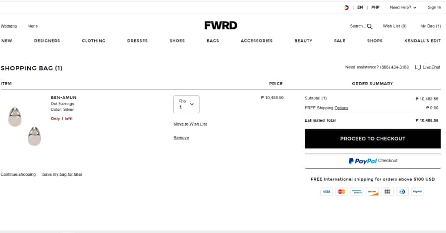
The FWRD checkout page feels polished and high-end. Layout is clean with clearly labeled sections for shipping, billing, and order summary. Font choices are modern and easy to scan. Soft neutral tones and subtle lines guide the user. It’s smooth, mobile-friendly, and built for a seamless buying experience.
What you can learn from this great checkout website design
-
Clear step-by-step flow
-
Secure payment
-
Mobile-optimized layout for effortless checkout anywhere
🚀 Here's the website builder I recommend to replicate this website
VIEW THEME / DEMO ▶
VIEW HOST / DEMO ▶
20. Tobys
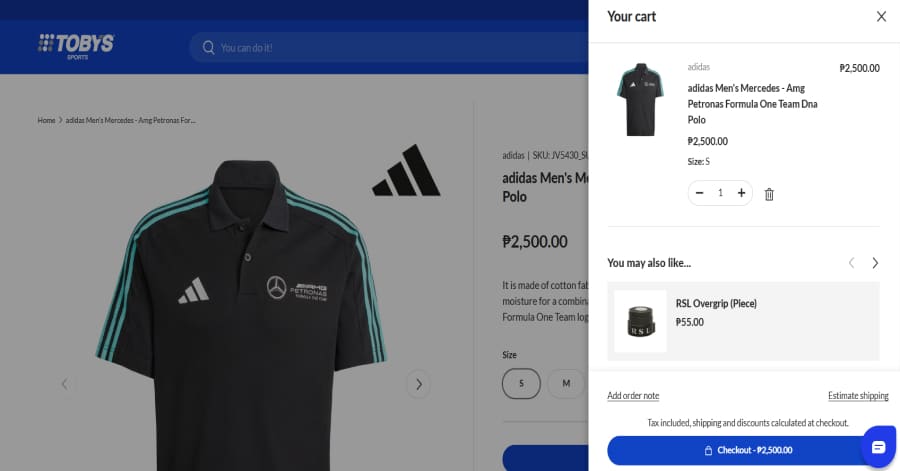
The Toby’s cart drawer is clean, modern, and efficient. It slides in smoothly from the right, showing a product summary with image, price, and quantity controls. Suggested add-ons appear below, keeping users engaged. Checkout and shipping options are clearly placed, creating a straightforward and mobile-responsive experience.
What you can learn from this great checkout website design
-
Quick-access side cart for real-time product updates
-
Smart product recommendations boost upselling potential
-
Streamlined CTA button with visible tax/shipping notes
🚀 Here's the website builder I recommend to replicate this website
VIEW THEME / DEMO ▶
VIEW HOST / DEMO ▶
21. Uniqlo PH
URL: https://www.uniqlo.com/ph/en/
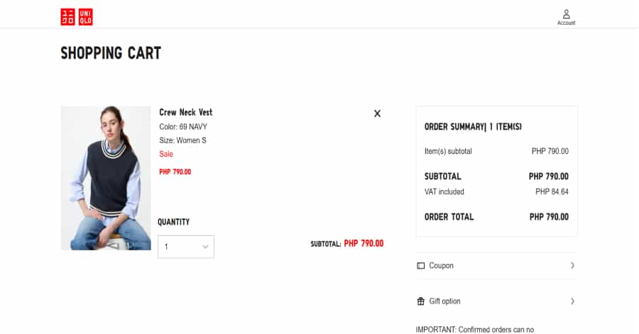
The Uniqlo checkout interface feels minimalistic and clean. Form fields for shipping, billing, and payment stack with ample spacing. Headers use a clear font, and key details stand out in red. It’s mobile-optimized and functional, though navigation to checkout feels detached from earlier browsing logic.
What you can learn from this great checkout website design
-
Single-column layout keeps focus and readability high
-
Payment options and order summary appear clearly before final confirmation
-
Red buttons for emphasis
🚀 Here's the website builder I recommend to replicate this website
These are my favourites.
BONUS – Here is my favorite template
Futuristic Website Template
URL: https://mycodelesswebsite.com/try-theme/sightseeing
Why this is such a great template
- Clean design, great to turn visitors into customers
- WordPress compatible, easy to customize
- Free download if you’re a Divi member
BONUS: Wix
URL: wix.com
Although this one shouldn't be on the list - I couldn't keep this one from you. Wix has amazing website themes and leads by example. Their own homepage looks stunning.
What can you learn from this great website
- Playful design
- Clear call to actions
- Great user experience
More website examples

Modern Examples

Startup Examples

Divi Examples
3 Award Winning Web Designers I recommend
I highly recommend you to have a look at their portfolios!
UNIQUE DESIGNS
WEBFLOW EXPERTS
CONVERTING WEB DESIGN

Max Sher – Sher Agency
We’re a team of 20 designers, developers, and marketers helping our clients create beautiful websites. I can’t wait to meet you – take a look at the video on my home page to learn about how I work! 😃
✓ This web design agency specializes in custom designs built using WordPress
✓ This agency focuses on medium-sized businesses and usually doesn’t work for freelancers. They built over 300 websites

Pulkit Jain – Mostli
We build custom websites with Webflow that help you achieve your goals. From Brand Communication to Fundraising. From Lead generation to Conversion. Have a look at our portfolio to see what we build!
✓ Working with Seed, Series-A funded SaaS & Tech Startups around the globe
✓ 2 years building +100 projects with No-code & Low-code technologies saving months of development and money
Lovepixel Agency
We Build Highly Converting Funnels / Brands / Websites that people fall in Love with. Personal Brands, Authors, Speakers, Influencers, Coaches, Consultants. Check my video to see how we work 👋
✓ This web design agency specializes in custom websites using WordPress
✓ They focus on a personal touch that allows the visitor to connect with the website. Great for personal brands!
1
Website hosting that I recommend.
Where should I host my Ecommerce website?
❤ Great for hosting multiple websites
❤ Free migrations


2
Selecting the right page builder.
Analyze the best examples on this page and select a page builder that is powerful and isn’t buggy.
Here is the one I recommend.
3
Grab my install guide.
Analyze the best examples on this page and select a page builder that is powerful and isn’t buggy.
Here is the one I recommend.


4
Best Practices (BONUS).
Claim the right domain before it’s gone
Spend your money wisely.
We recommend Divi, it’s great for beginners and allows you to customize everything.

About the author
Ralph de Groot loves great web design. In fact, you can wake him up at night if you found an inspiring website. Besides writing at My Codeless Website he also loves to read and to travel.
FAQ
What makes a good checkout design?
A great checkout design website should have a clean design, be easy to navigate, and include a lot of social proof. Have a look at this page for great example websites.
How to create a checkout design?
- Analyze the best examples on this page
- Make notes of what you like – and what you don’t like
- Design your own site with this a drag & drop website builder
- Publish your website with our recommended hosting platform.
How much does a checkout design cost?
A web designer will charge anywhere between $1000 and $2000 for a decent website. However, this article will teach you to do it yourself for less than $100.
What information is needed on a checkout design?
Your website will need at least the following pages: ‘Home, Total Amount, Payment Options, and Address.’ To create trust with your visitor, it’s important to show lots of pictures of your brand.


