Definitive guide
Best Catering Website Examples
Start Building →
View Examples →

👋 How I curated this list
Welcome friendly stranger! You’re looking for some inspiring website examples. You found the right page.
About me
My name is Ralph de Groot. I’m the founder and author at My Codeless Website. Wake me up for a great web design. I love writing about website examples, too!
How I curated this list
Once a year I collect 500 website examples to create/update this article. I create a shortlist which I send to my team of web designers. Together, we vote to determine the order of this list.
Next to that, I always follow our editorial policy when writing my articles, to make sure they are really helpful and useful for you.
Home » Blogs » Website Examples »
Best Catering Website Examples

VIEW THEME / DEMO ▶
VIEW HOST / DEMO ▶
1. Certé NYC
Certé NYC’s website presents itself as a professional catering service with a polished and structured layout. It highlights both large and small events with organized sections, clear photos of dishes, and easy access to their menus. The overall design feels elegant and straightforward, making it easy to explore their services.
Things we love about this web design
-
Clear and neat layout
-
Easy access to menus
-
Elegant food presentation
🚀 Here's the website builder I recommend to replicate this website
VIEW THEME / DEMO ▶
VIEW HOST / DEMO ▶
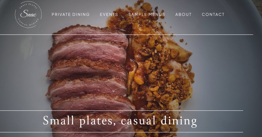
2. Snac Casual
Things we love about this web design
-
Smart image placement
-
Lively yet clean layout
-
Modern, relaxed atmosphere
🚀 Here's the website builder I recommend to replicate this website
VIEW THEME / DEMO ▶
VIEW HOST / DEMO ▶
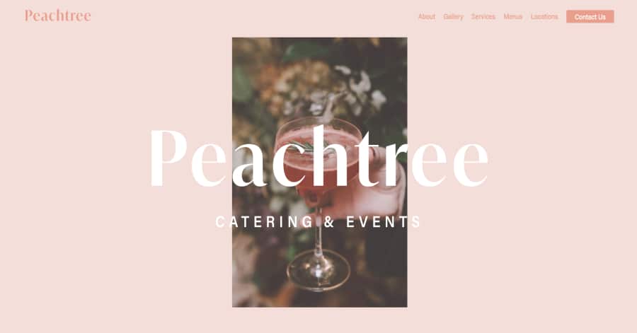
3. Peachtree Catering and Events
https://www.peachtreecatering.com/
Things we love about this web design
🚀 Here's the website builder I recommend to replicate this website
VIEW THEME / DEMO ▶
VIEW HOST / DEMO ▶
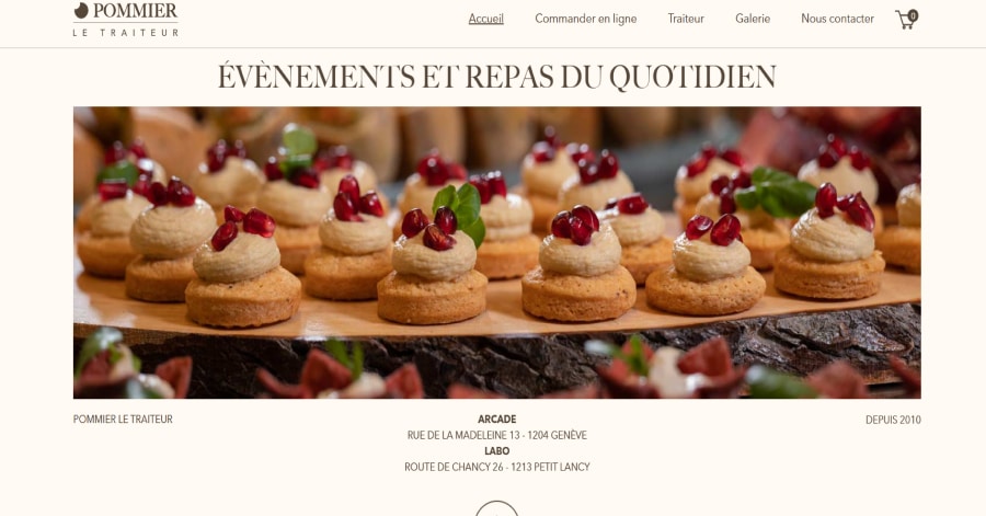
4. Pommier le Traiteur
https://www.pommierletraiteur.ch/
Things we love about this web design
-
Large hero food image
-
Alternating image‑text sections
-
Visual clarity of service offering
🚀 Here's the website builder I recommend to replicate this website

VIEW THEME / DEMO ▶
VIEW HOST / DEMO ▶
5. Marquet
Marquet’s website uses large hero visuals and subtle zooming and animation effects to bring life to each section. Text appears gently as images shift slightly, making each scroll feel dynamic and refined. The interplay of movement and stillness creates a polished experience that matches the high‑end catering brand.
Things we love about this web design
🚀 Here's the website builder I recommend to replicate this website
VIEW THEME / DEMO ▶
VIEW HOST / DEMO ▶
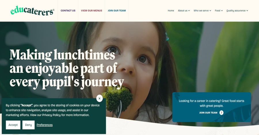
6. Educaterers
Educaterers’ website opens with a friendly headline and bright imagery of children enjoying meals, instantly giving a welcoming tone. The layout is clean and well‑structured, guiding visitors through their services for primary, secondary, SEN schools, and catering events with ease.
Things we love about this web design
-
Welcoming visuals of children and meals
-
Clear sectioning by service type
-
Clean, easy‑to‑read layout
🚀 Here's the website builder I recommend to replicate this website
VIEW THEME / DEMO ▶
VIEW HOST / DEMO ▶
7. Pyramid Catering
https://www.pyramidcatering.com/
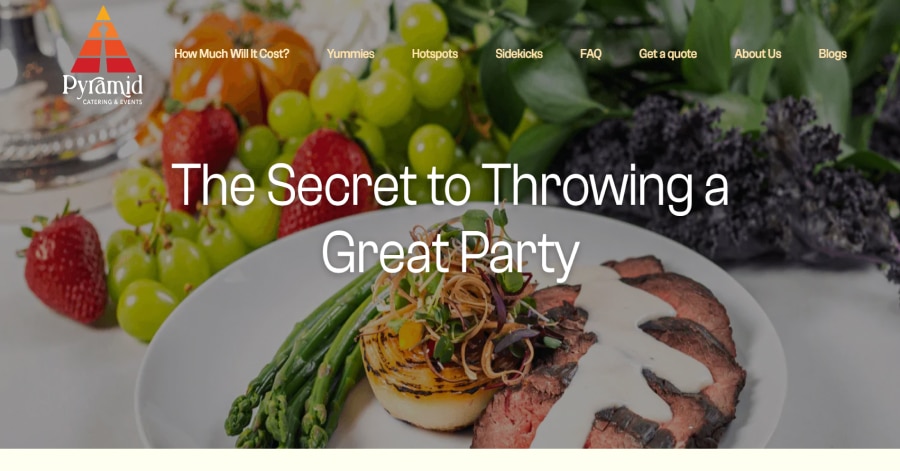
Pyramid Catering’s website starts strong with large, crisp food photography that instantly tells you what services they offer. The layout alternates between big dish visuals and short supportive headlines, making it quick to grasp their event catering focus. The clean structure highlights menus, service levels, and a call‑to‑action for quotes.
Things we love about this web design
🚀 Here's the website builder I recommend to replicate this website

VIEW THEME / DEMO ▶
VIEW HOST / DEMO ▶
8. VIVO! Bayside
Things we love about this web design
-
Large venue imagery
-
Text‑light visuals first
-
Feel of premium event space
🚀 Here's the website builder I recommend to replicate this website
VIEW THEME / DEMO ▶
VIEW HOST / DEMO ▶
9. The Party Kitchen
https://www.thepartykitchen.co.uk/
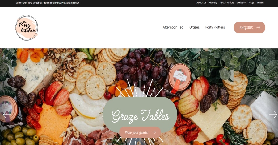
The Party Kitchen’s website uses soft pastel tones and gentle photography to create a playful and charming atmosphere. Images of delicious treats are arranged with white space and friendly headings, making the design feel cute yet professional. The visual style aligns with fun celebrations and light‑hearted gatherings.
Things we love about this web design
-
Soft pastel color scheme
-
Friendly, charming visuals
-
Light and inviting layout
🚀 Here's the website builder I recommend to replicate this website
VIEW THEME / DEMO ▶
VIEW HOST / DEMO ▶
10. BOLD Catering & Design
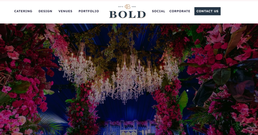
BOLD Catering & Design’s website has a lot of text across its pages, which can make it feel heavy to read. Large blocks of paragraphs appear alongside big event‑photos, and while the visuals are strong, the amount of content may overwhelm visitors looking for quick info.
Things we love about this web desig
🚀 Here's the website builder I recommend to replicate this website
These are my favourites.
BONUS: Wix
URL: wix.com
Although this one shouldn't be on the list - I couldn't keep this one from you. Wix has amazing website themes and leads by example. Their own homepage looks stunning.
What can you learn from this great website
- Playful design
- Clear call to actions
- Great user experience
HIGH-END
WEBFLOW EXPERT

Arch Web Design
archcowebdesign.com
We're a Canadian Webflow agency that helps SaaS companies increase their revenue using high-converting websites. We've worked with over 200 SaaS companies and see an average 3.7x increase in website leads.
✓ Top Companies worked with:
Hugo (acquired by Calendly), SmartSuite,
DuxSoup
✓ Our average client increases their conversions by 3.7x in 90 days
✓ We've helped our clients secure $200M in funding

Vrrb
vrrb.com
Vrrb is an award-winning creative agency based in Los Angeles. 14+ years of experience building extraordinary websites, applications, and digital solutions for the world's most recognizable brands.
✓ Our core services include branding, website design/development, mobile apps, digital strategy, and ongoing support
✓ We work with companies (50+ employees) and funded startups to accelerate growth
✓ Clients include Ferrari, Visa, HP, UCLA, and Behr Paint
FAQ
What makes a good catering website example?
A catering website example should have a minimalistic design, be easy to navigate, and include a lot of social proof. Have a look at this page for great example websites.
How to create a catering website example?
- Analyze the best examples on this page
- Make notes of what you like – and what you don’t like
- Design your own site with this drag & drop website builder
- Publish your website with our recommended hosting platform.
How much does a catering website example cost?
A web designer will charge anywhere between $1800 and $4800 for a decent website. However, this article will teach you to do it yourself for less than $100.
What information is needed on a catering website example?
Your website will need at least the following pages: ‘Home, About us, Contact, Timetable. To create trust with your visitor it’s important to show lots of pictures and videos of your classes.


