Definitive guide
Best Brown Websites of 2026 | 21 Examples
Start Building →
View Examples →

👋 How I curated this list
Welcome friendly stranger! You’re looking for some inspiring website examples. You found the right page.
About me
My name is Ralph de Groot. I’m the founder and author at My Codeless Website. Wake me up for a great web design. I love writing about website examples, too!
How I curated this list
Once a year I collect 500 website examples to create/update this article. I create a shortlist which I send to my team of web designers. Together, we vote to determine the order of this list.
Next to that, I always follow our editorial policy when writing my articles, to make sure they are really helpful and useful for you.
Home » Blogs » Website Examples »
Best Brown Website Examples
- Wookmama Color Visualizer
- Global Leathers
- Clint Agency
- Lucid Motors
- Joe & Monroe
- Noni Ceramica
- Helft & Pinta
- Beaujuor
- Monk & Anna
- Ami Cole
- Grand Central Bakery Cafe
- Dezeynne Studio
- Ze Tan Design
- Brick Canvas
- Virtual Creative Co.
- Xiao by Crustz
- Sierra Hull
- Meals by Genet
- Pophams Bakery
- Zion Adventure Photog Blog
VIEW THEME / DEMO ▶
VIEW HOST / DEMO ▶
1. Wookmama Color Visualizer
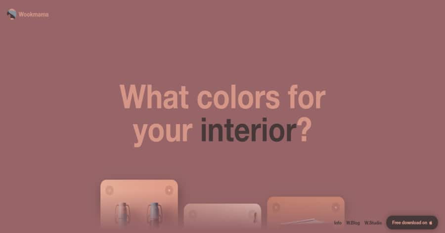
Wookmama’s web design embodies modern creativity with a minimalist aesthetic. Using earthy brown accents and clean layouts, the interface guides users seamlessly through color selection and palette visualization. Real-time previews and high-quality graphics make experimenting with colors intuitive and engaging, making it both a practical and inspiring tool for designers.
What we love about this web design
-
High-quality, interactive color visualizations
-
User-friendly, intuitive interface
-
Easy export of color palettes for projects
🚀 Here's the website builder I recommend to replicate this website

VIEW THEME / DEMO ▶
VIEW HOST / DEMO ▶
2. Global Leathers
https://www.globalleathers.com/
Global Leathers’ website exudes timeless elegance, seamlessly blending tradition with modernity. The design showcases rich, earthy tones that evoke the warmth and luxury of premium leather. High-quality imagery and subtle animations guide users through their extensive offerings, emphasizing craftsmanship and attention to detail. The intuitive layout ensures a smooth browsing experience, reflecting the company’s commitment to quality and customer satisfaction.
What we love about this web design
-
Elegant brown color palette
-
Easy-to-use navigation
-
High-quality product images
🚀 Here's the website builder I recommend to replicate this website
VIEW THEME / DEMO ▶
VIEW HOST / DEMO ▶
3. Clint Agency
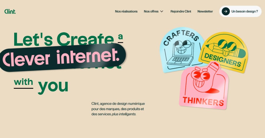
Clint Agency’s website showcases a vibrant and dynamic design, reflecting their innovative approach to digital product and service design. The use of bold colors, playful illustrations, and engaging animations creates an inviting atmosphere. The layout is clean and intuitive, guiding users through their offerings seamlessly.
What we love about this web design
-
Bold and vibrant colors
-
Playful illustrations
-
Easy-to-use navigation
🚀 Here's the website builder I recommend to replicate this website
VIEW THEME / DEMO ▶
VIEW HOST / DEMO ▶
4. Lucid Motors
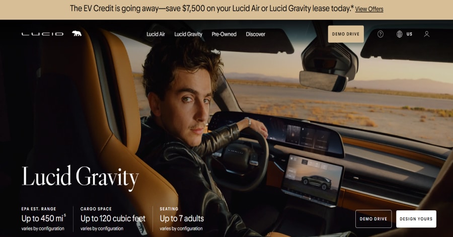
Lucid Motors’ website radiates modern luxury, perfectly reflecting their high-end electric vehicles. Crisp, full-width images highlight the sleek designs, while subtle interactive elements add sophistication without overwhelming the user. The layout strikes a balance between information and visuals, creating an immersive experience that conveys innovation and elegance.
Things we love about this web design
-
Stunning full-width car visuals
-
Subtle interactive elements
-
Clean, modern layout
🚀 Here's the website builder I recommend to replicate this website
VIEW THEME / DEMO ▶
VIEW HOST / DEMO ▶
5. Joe & Monroe
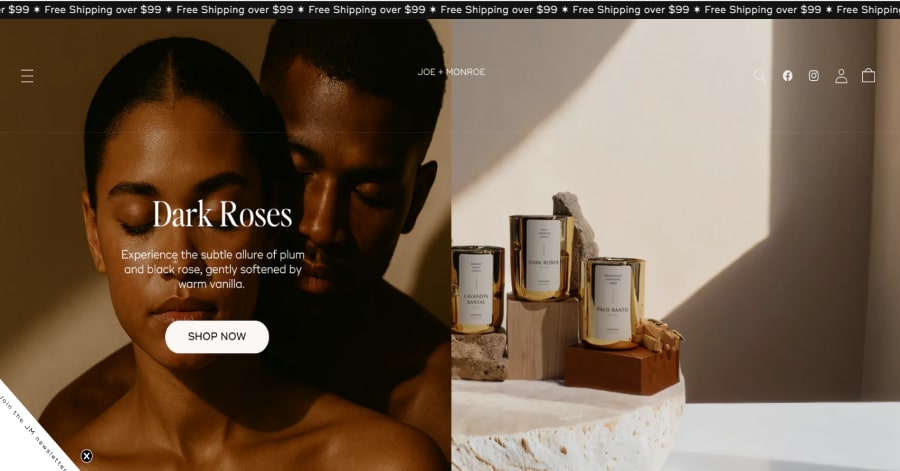
Joe & Monroe’s site blends sophistication with simplicity. Warm, earthy tones paired with sharp, high-resolution product shots highlight the elegance of their candles. Thoughtful spacing, clean typography, and gentle animations create a calm browsing experience that balances aesthetics and functionality while keeping the user engaged.
Things we love about this web design
-
Warm, earthy color scheme
-
Crisp product photography
-
Clean, uncluttered layout
🚀 Here's the website builder I recommend to replicate this website

VIEW THEME / DEMO ▶
VIEW HOST / DEMO ▶
6. Noni Cerâmica
Noni Cerâmica’s website offers a serene, tactile browsing experience that mirrors the handcrafted elegance of its ceramic pieces. The design employs a muted, earthy color palette, allowing the products to take center stage. High-quality images and subtle animations enhance user engagement, creating an immersive environment that reflects the brand’s commitment to artisanal craftsmanship.
Things we love about this web design
-
Earthy, muted color palette
-
High-quality product imagery
-
Subtle animations enhancing user engagement
🚀 Here's the website builder I recommend to replicate this website
VIEW THEME / DEMO ▶
VIEW HOST / DEMO ▶
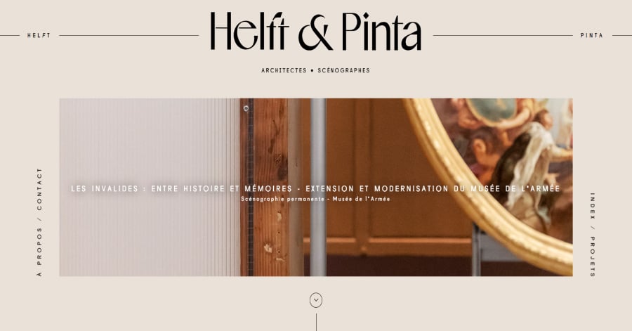
7. Helft & Pinta
Helft & Pinta’s website is a masterclass in restrained elegance. The design employs a muted, earthy color palette, allowing the content to take center stage. Subtle animations and transitions guide the user experience without distraction, while the layout maintains a clean, organized structure that reflects the firm’s architectural ethos.
Things we love about this web design
-
Muted, earthy color palette
-
Subtle animations and transitions
-
Clean, organized layout
🚀 Here's the website builder I recommend to replicate this website

VIEW THEME / DEMO ▶
VIEW HOST / DEMO ▶
8. Beaujour
Beaujour’s website uses typography as a core design element. Large, elegant serif fonts paired with smaller sans-serif text create a clear hierarchy and sophistication. The layout balances rectangular and rounded shapes to guide the eye naturally through content. Generous white space enhances readability and reinforces a luxurious, minimalist feel.
Things we love about this web design
-
Strong typographic hierarchy
-
Balanced use of shapes in layout
-
Generous white space for clarity
🚀 Here's the website builder I recommend to replicate this website

VIEW THEME / DEMO ▶
VIEW HOST / DEMO ▶
9. Monk & Anna
Monk & Anna’s website embodies a minimalist aesthetic, emphasizing clean lines and thoughtful design. The layout utilizes a grid system to organize products, ensuring a balanced and harmonious presentation. Typography is understated yet elegant, with ample white space enhancing readability and allowing the products to take center stage.
What we love about this web design
-
Structured grid layout
-
Elegant, understated typography
-
Ample white space enhancing readability
🚀 Here's the website builder I recommend to replicate this website
VIEW THEME / DEMO ▶
VIEW HOST / DEMO ▶
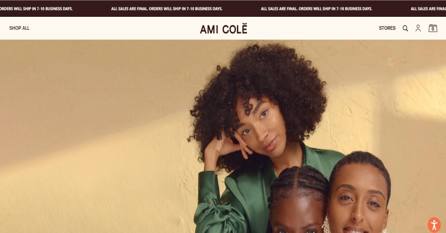
10. Ami Colé
Ami Colé’s website embodies a harmonious blend of modern minimalism and cultural richness. The design utilizes a modular grid layout, ensuring content is organized and visually appealing. Typography is elegant yet functional, with a mix of serif and sans-serif fonts that create a balanced hierarchy. The use of ample white space allows each element to breathe, enhancing readability and user experience.
Things we love about this web design
-
Modular grid layout for organized content
-
Elegant serif and sans-serif typography mix
-
Ample white space enhancing readability
🚀 Here's the website builder I recommend to replicate this website
VIEW THEME / DEMO ▶
VIEW HOST / DEMO ▶
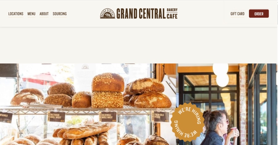
11. Grand Central Bakery
https://www.grandcentralbakery.com/
Grand Central Bakery’s website marries rustic charm with a modern, user-friendly interface. The design employs a clean grid layout, allowing products to be showcased in an organized manner. Typography is straightforward and legible, enhancing readability. High-quality images of baked goods are prominently featured, inviting customers to indulge in the offerings.
Things we love about this web design
-
Clean grid layout for product organization
-
Legible and straightforward typography
-
High-quality product imagery
🚀 Here's the website builder I recommend to replicate this website

VIEW THEME / DEMO ▶
VIEW HOST / DEMO ▶
12. Dezeynne Studio
Dezeynne Studio’s website exemplifies refined minimalism through its deliberate use of organic shapes and spatial design. The layout features soft, rounded corners and subtle curves, creating a sense of approachability and fluidity. Generous white space enhances clarity and focus, allowing each element to breathe and contribute to the overall aesthetic.
What we love about this web design
-
Organic shapes and rounded corners
-
Generous use of white space
-
High-quality, cohesive imagery
🚀 Here's the website builder I recommend to replicate this website
VIEW THEME / DEMO ▶
VIEW HOST / DEMO ▶
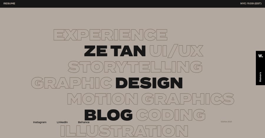
13. Ze Tan Design
Ze Tan Design’s website uses a structured, grid-based layout that organizes content cleanly and logically. Sections are clearly defined, guiding users through the portfolio and services effortlessly. The balanced alignment of text, images, and whitespace creates a sense of order and clarity, making the browsing experience smooth and visually appealing.
What we love about this web design
-
Clear, structured grid layout
-
Balanced alignment of content
-
Logical flow between sections
🚀 Here's the website builder I recommend to replicate this website

VIEW THEME / DEMO ▶
VIEW HOST / DEMO ▶
14. Brick Canvas
Brick Canvas’ website uses a modular grid layout that clearly organizes its wellness services into separate sections. Each block features consistent imagery and subtle hover effects. The structured layout guides users naturally through the offerings, creating a visually balanced and engaging browsing experience that reflects the brand’s holistic approach.
What we love about this web design
-
Modular grid layout for services
-
Consistent imagery within blocks
-
Subtle hover effects
🚀 Here's the website builder I recommend to replicate this website
VIEW THEME / DEMO ▶
VIEW HOST / DEMO ▶
15. Virtual Creative Co.
https://virtualcreativeco.com/
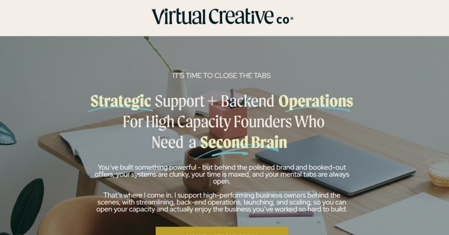
Virtual Creative Co.’s website utilizes strategic image placement to enhance user engagement and brand storytelling. Hero images are thoughtfully positioned to draw attention immediately, while supporting visuals are interspersed throughout the content to maintain visual interest. This deliberate arrangement guides users through the site, reinforcing the brand’s message and services.
Things we love about this web design
-
Strategic hero image placement
-
Interspersed supporting visuals
-
Deliberate arrangement enhancing user engagement
🚀 Here's the website builder I recommend to replicate this website

VIEW THEME / DEMO ▶
VIEW HOST / DEMO ▶
16. Xiao by Crustz
Xiao by Crustz highlights its cake designs through prominent, high-quality images placed throughout the site. Each cake is framed thoughtfully with ample white space, making the details and textures stand out. The layout guides the viewer naturally from one creation to the next, emphasizing craftsmanship and creativity.
Things we love about this web design
-
Prominent, high-quality cake images
-
Thoughtful framing with white space
-
Layout highlights craftsmanship and creativity
🚀 Here's the website builder I recommend to replicate this website
VIEW THEME / DEMO ▶
VIEW HOST / DEMO ▶
17. Sierra Hull
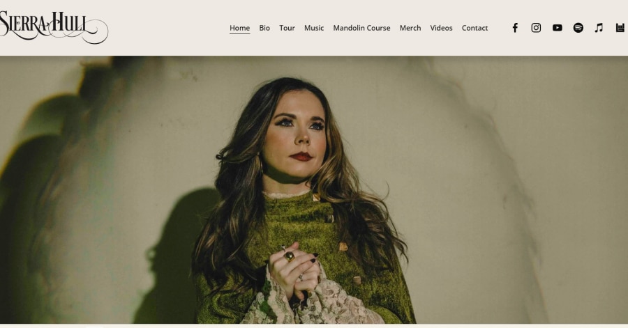
Sierra Hull’s website employs gradient background colors to create a dynamic and immersive atmosphere. The subtle transitions between hues add depth and dimension to the pages, enhancing the visual experience without overwhelming the content. This thoughtful use of color gradients reflects the artist’s evolving style and musical journey.
Things we love about this web design
-
Subtle gradient background transitions
-
Enhances visual depth and dimension
-
Reflects the artist’s evolving style
🚀 Here's the website builder I recommend to replicate this website

VIEW THEME / DEMO ▶
VIEW HOST / DEMO ▶
18. Meals by Genet
https://www.mealsbygenetla.com/
Meals by Genet’s website employs a straightforward, user-friendly design that emphasizes clarity and accessibility. The layout features a clean, grid-based structure, allowing for easy navigation through the menu, story, and reservation sections. High-quality images are strategically placed to showcase the vibrant dishes, enhancing the visual appeal without overwhelming the content.
Things we love about this web design
-
Clear, grid-based layout
-
Strategic placement of high-quality images
-
User-friendly navigation
🚀 Here's the website builder I recommend to replicate this website
VIEW THEME / DEMO ▶
VIEW HOST / DEMO ▶
19. Pophams Bakery
https://www.pophamsbakery.com/
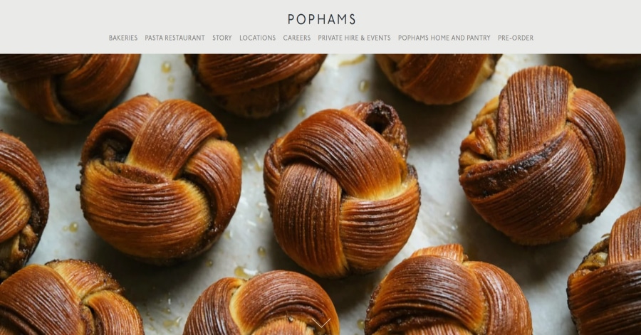
Pophams Bakery’s website features a collage-style layout that artfully arranges high-quality images of their pastries, ceramics, and interiors. This approach creates a dynamic and engaging visual experience, reflecting the artisanal quality of their offerings. The collage design effectively showcases the variety and craftsmanship of their products, inviting users to explore further.
Things we love about this web design
-
Dynamic collage-style layout
-
High-quality, engaging imagery
-
Showcases variety and craftsmanship
🚀 Here's the website builder I recommend to replicate this website
VIEW THEME / DEMO ▶
VIEW HOST / DEMO ▶
20. Zion Adventure Photog Blog
https://www.zionadventurephotog.com/blog
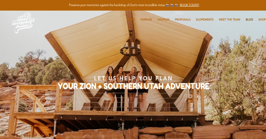
Zion Adventure Photog’s blog employs a warm, earthy color palette dominated by rich browns and golds. This choice evokes the natural hues of Zion National Park’s landscapes, creating a rustic yet inviting atmosphere. The consistent use of these tones across headings, buttons, and accents reinforces the brand’s connection to the outdoors and adventure!
Things we love about this web design
-
Earthy brown and gold color scheme
-
Consistent use across design elements
-
Evokes warmth and authenticity
🚀 Here's the website builder I recommend to replicate this website
These are my favourites.
BONUS: Wix
URL: wix.com
Although this one shouldn't be on the list - I couldn't keep this one from you. Wix has amazing website themes and leads by example. Their own homepage looks stunning.
What can you learn from this great website
- Playful design
- Clear call to actions
- Great user experience
HIGH-END
WEBFLOW EXPERT

Arch Web Design
archcowebdesign.com
We're a Canadian Webflow agency that helps SaaS companies increase their revenue using high-converting websites. We've worked with over 200 SaaS companies and see an average 3.7x increase in website leads.
✓ Top Companies worked with:
Hugo (acquired by Calendly), SmartSuite,
DuxSoup
✓ Our average client increases their conversions by 3.7x in 90 days
✓ We've helped our clients secure $200M in funding

Vrrb
vrrb.com
Vrrb is an award-winning creative agency based in Los Angeles. 14+ years of experience building extraordinary websites, applications, and digital solutions for the world's most recognizable brands.
✓ Our core services include branding, website design/development, mobile apps, digital strategy, and ongoing support
✓ We work with companies (50+ employees) and funded startups to accelerate growth
✓ Clients include Ferrari, Visa, HP, UCLA, and Behr Paint
FAQ
What makes a good brown website?
A brown website should have a minimalistic design, be easy to navigate and include a lot of social proof. Have a look at this page for great example websites.
How to create a brown website?
- Analyze the best examples on this page
- Make notes of what you like – and what you don’t like
- Design your own site with this drag & drop website builder
- Publish your website with our recommended hosting platform.
How much does a brown website cost?
A web designer will charge anywhere between $1800 and $4800 for a decent website. However, this article will teach you to do it yourself for less than $100.
What information is needed on a brown website?
Your website will need at least the following pages: ‘Home, About us, Contact, Timetable. To create trust with your visitor it’s important to show lots of pictures and videos of your classes.


