Definitive guide
Best Boutique Websites of 2026 | 11 Examples
Start Building →
View Examples →

👋 How I curated this list
Welcome friendly stranger! You’re looking for some inspiring website examples. You found the right page.
About me
My name is Ralph de Groot. I’m the founder and author at My Codeless Website. Wake me up for a great web design. I love writing about website examples, too!
How I curated this list
Once a year I collect 500 website examples to create/update this article. I create a shortlist which I send to my team of web designers. Together, we vote to determine the order of this list.
Next to that, I always follow our editorial policy when writing my articles, to make sure they are really helpful and useful for you.
Home » Blogs » Website Examples »
Best Boutique Website Examples

VIEW THEME / DEMO ▶
VIEW HOST / DEMO ▶
1. MESHKI
MESHKI’s website uses a bold, fashion-driven grid layout, often featuring four or more product images per row. The clean white background and crisp photography keep the focus on texture and fit. Smooth hover effects and seamless transitions add energy, mirroring the brand’s confident, luxurious tone.
Things we love about this web design
🚀 Here's the website builder I recommend to replicate this website
VIEW THEME / DEMO ▶
VIEW HOST / DEMO ▶
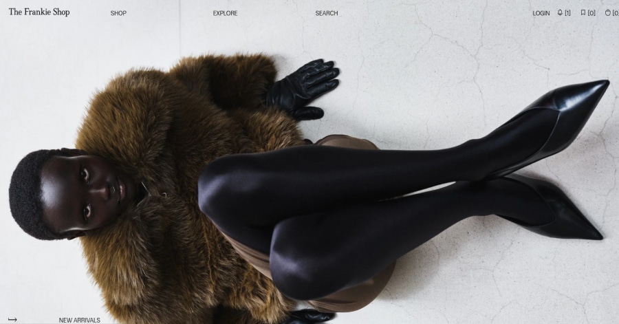
2. The Frankie Shop
Things we love about this web design
-
Full-screen hero photo with impact
-
High contrast and clean visual framing
-
Clear, strong brand tone at first glance
🚀 Here's the website builder I recommend to replicate this website
VIEW THEME / DEMO ▶
VIEW HOST / DEMO ▶
🚀 Here's the website builder I recommend to replicate this website
VIEW THEME / DEMO ▶
VIEW HOST / DEMO ▶
🚀 Here's the website builder I recommend to replicate this website

VIEW THEME / DEMO ▶
VIEW HOST / DEMO ▶
5. REVOLVE
REVOLVE’s website uses expansive full-portrait imagery that immediately captures attention, placing models and products in bold, vertical frames. This layout elevates each hero shot into a statement, while strategic image placement throughout the site creates a cohesive, immersive shopping narrative.
Things we love about this web design
🚀 Here's the website builder I recommend to replicate this website
VIEW THEME / DEMO ▶
VIEW HOST / DEMO ▶
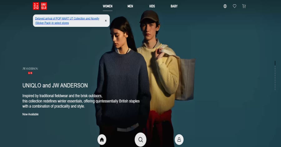
6. UNIQLO (Philippines)
The website’s scrolling experience is impressively smooth, with sections gliding naturally into view and visuals transitioning cleanly. Each movement feels seamless and measured, creating a calm browsing rhythm that mirrors UNIQLO’s minimalist aesthetic and commitment to effortless functionality.
Things we love about this web design
-
Smooth scrolling
-
Clean visual transitions
-
Calm, minimalist rhythm
🚀 Here's the website builder I recommend to replicate this website
VIEW THEME / DEMO ▶
VIEW HOST / DEMO ▶
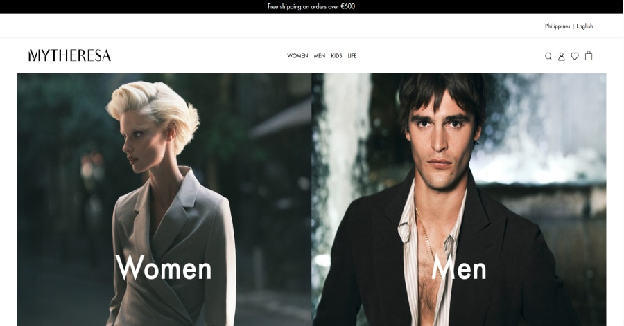
7. Mytheresa
Mytheresa’s opening screen uses two striking, full-bleed hero images that appear sequentially, instantly setting a high-luxury tone. The seamless transition between the images draws in the viewer, establishes mood before product detail appears, and reinforces the brand’s editorial-style presence.
Things we love about this web design
-
Dramatic dual hero visuals
-
Full-screen image immersion
-
Editorial-grade luxury presentation
🚀 Here's the website builder I recommend to replicate this website
VIEW THEME / DEMO ▶
VIEW HOST / DEMO ▶
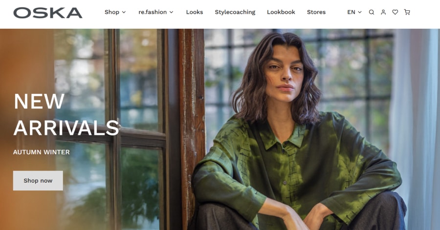
8. OSKA Netherlands
Things we love about this web design
-
Content-rich brand narrative
-
Emphasis on materials and purpose
-
Textual storytelling paired with clean layout
🚀 Here's the website builder I recommend to replicate this website
VIEW THEME / DEMO ▶
VIEW HOST / DEMO ▶
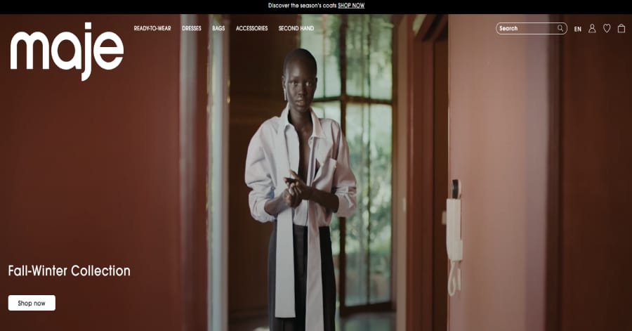
9. Maje
The website opens with a full-screen, mood-rich video reel that immediately immerses you in the brand’s aesthetic. The clip uses fluid camera movement, subtle lighting shifts, and soft transitions to set a stylish, cinematic tone before any products appear.
Things we love about this web design
🚀 Here's the website builder I recommend to replicate this website
VIEW THEME / DEMO ▶
VIEW HOST / DEMO ▶
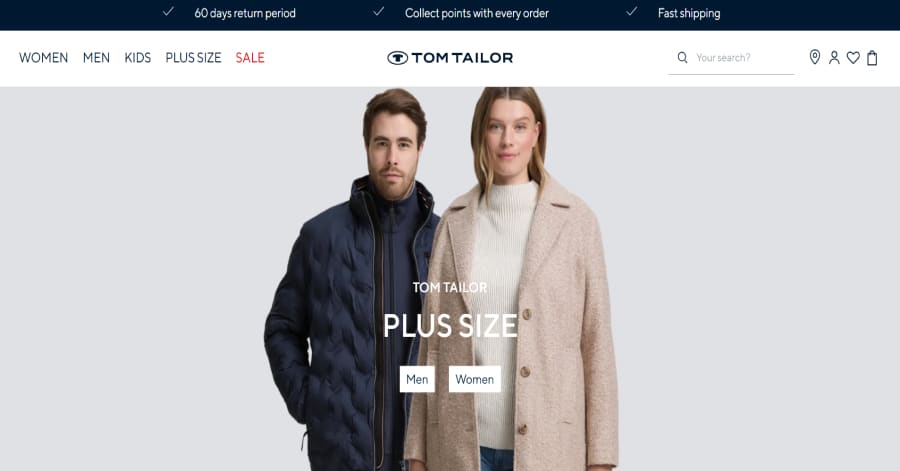
10. TOM TAILOR (EU)
The website features a clean imagery-driven scroll where full-width lifestyle shots transition into product grids. Images are placed in large, full-bleed rows, then tighten into tighter rows, providing rhythm and visual breaks. The layout balances branding visuals and catalogue clarity beautifully.
Things we love about this web design
🚀 Here's the website builder I recommend to replicate this website
These are my favourites.
BONUS: Wix
URL: wix.com
Although this one shouldn't be on the list - I couldn't keep this one from you. Wix has amazing website themes and leads by example. Their own homepage looks stunning.
What can you learn from this great website
- Playful design
- Clear call to actions
- Great user experience
HIGH-END
WEBFLOW EXPERT

Arch Web Design
archcowebdesign.com
We're a Canadian Webflow agency that helps SaaS companies increase their revenue using high-converting websites. We've worked with over 200 SaaS companies and see an average 3.7x increase in website leads.
✓ Top Companies worked with:
Hugo (acquired by Calendly), SmartSuite,
DuxSoup
✓ Our average client increases their conversions by 3.7x in 90 days
✓ We've helped our clients secure $200M in funding

Vrrb
vrrb.com
Vrrb is an award-winning creative agency based in Los Angeles. 14+ years of experience building extraordinary websites, applications, and digital solutions for the world's most recognizable brands.
✓ Our core services include branding, website design/development, mobile apps, digital strategy, and ongoing support
✓ We work with companies (50+ employees) and funded startups to accelerate growth
✓ Clients include Ferrari, Visa, HP, UCLA, and Behr Paint
FAQ
What makes a good boutique website?
A boutique website should have a minimalistic design, be easy to navigate and include a lot of social proof. Have a look at this page for great example websites.
How to create a boutique website?
- Analyze the best examples on this page
- Make notes of what you like – and what you don’t like
- Design your own site with this drag & drop website builder
- Publish your website with our recommended hosting platform.
How much does a boutique website cost?
A web designer will charge anywhere between $1800 and $4800 for a decent website. However, this article will teach you to do it yourself for less than $100.
What information is needed on a boutique website?
Your website will need at least the following pages: ‘Home, About us, Contact, Timetable. To create trust with your visitor it’s important to show lots of pictures and videos of your classes.


