
Definitive guide
Best Architect Websites of 2026 | 60 Examples
How to create a mind-blowing architect website with/without a web designer

👋 My Experience With Architect Web Design
Hi – it's Ralph here 👋 In the past 10 years, I've designed 15+ websites for architects. What I learned over the years building websites for architecture firms:
1. Focus on showing portfolio projects
As an architect, your whole focus should be on showcasing your portfolio and visuals. I recommend displaying a portfolio that establishes trust and credibility for your firm as it presents proof of your experience and talents. Don't be afraid to present a portfolio that differs from other architecture firms as it also gives you the advantage of being unique.
2. Clearly show what sets you apart
Setting your unique value propositions as an architecture firm is important as it shows your value to the clients early on. I suggest elaborating on this by presenting your expertise and experiences that put you at an advantage over other firms.
3. Balance between aesthetics and functionality
As a web designer, I can say that your website should present a creative layout design while also seamlessly providing a good user experience. This significantly affects user engagement as the aesthetics attract your potential clients such as house owners, and functionality helps retain them.
Focus on this, and you'll be fine.
PS: I suggest taking a look at the website examples below. Get inspired by their designs and see which website builders they've used. Best of luck!
👋 How I curated this list
Welcome friendly stranger! You're looking for some inspiring website examples. You found the right page.
About me
My name is Ralph de Groot. I'm the founder and author at My Codeless Website. Wake me up for a great web design. I love writing about website examples, too!
How I curated this list
Once a year I collect 500 website examples to create/update this article. I create a shortlist which I send to my team of web designers. Together, we vote to determine the order of this list.
Next to that, I always follow our editorial policy when writing my articles, to make sure they are really helpful and useful for you.
Home » Blogs » Website Examples »
This article was updated on 13 October 2026
The best architect websites of 2026.
Best Architecture Website Examples
- Elegant Inc. Architects
- Chestnut Living
- The Little Architecture Company
- AM - ARC Design Studio
- Andon WWW
- Fabio Fantolino
- True Design
- Ark Shelter
- Eskew Dumez Ripple
- Pelizzari
- United Network Studio
- C3D Architecture
- Handel Architects
- Freecell Architecture
- HTO Architects
- Kenny Payero
- Robert M. Gurney
- Amanda Martocchio
- Sergison Bates
- KREOR
- Appel Architecten
- Studio Buil
- Another Kind
- SignalWorks
- Delve Architects
- Olson Kundig
- GLUCK +
- BIG
- VMDO
- Cooper Carry
- DSFN Architect
- Arko Landscape Transformations
- Clarke Design Group
- 1100 Architect
- William Rawn Associates
- B2 Architecture
- Moody Nolan
- JCJ Architecture
- MLA
- Yellow House Architects

1. Elegant Inc Architects
URL: https://mycodelesswebsite.com/architect-website-example/
The website of Elegant Inc Architects is sleek that's sure to captivate your admiration. The white backgrounds are complemented by the strategic use of black and gray, resulting in a visually stunning design scheme. If you prefer websites with minimal design, then this is the one you should choose!
What you can learn from this great architecture website
- Clean design
- Great, relaxed color scheme
- Clear call-to-action buttons
2. Alpex Architecture
URL: https://www.alpexarchitecture.com/
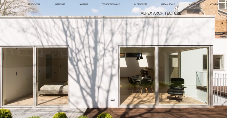
Alpex Architecture keeps its homepage clean and striking: one big, full-screen project photo with the studio name on top and a menu running along the side. The menu covers residential, interiors, awards, and even a Venice Biennale page. Contact details, social icons, and professional badges sit neatly at the bottom. Simple, elegant, and photo-first.
What you can learn from this great architecture website:
- Lots of whitespaces
- Great call to actions
- Nice scrolling animations
3. Austin Lebbon Architecture Construction
URL: https://www.austinlebbon.co.uk/
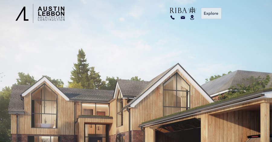
Austin Lebbon keeps its homepage short and to the point: a logo, quick phone, email, and location icons, and one large project render front and center. An "Explore" button opens a pop-out menu with a photo alongside links to Projects, About, Blog, Testimonials, and Contact. Minimal, tidy, and easy to reach.
What you can learn from this great architecture website
- Great pictures
- Clean design
- Lots of whitespace which makes the website easy on the eye
4. BFE Architects
URL: https://am-arc.com/
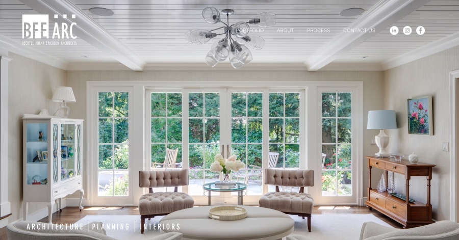
BFE Architects keeps its homepage clean and professional: a large cover photo with three bold words, "Architecture," "Planning," and "Interiors," front and center. A short line about the firm's collaborative spirit sits underneath. The top menu sorts the portfolio into Residential, Multi-Family, Commercial, and Civic, so it's easy to find what you need.
What you can learn from this great architecture website
- Large compelling imagery
- Maximizes web technology and multimedia elements
- Unique user experience online
5. Blue Velvet Studio
URL: https://www.bluevelvetstudio.net/
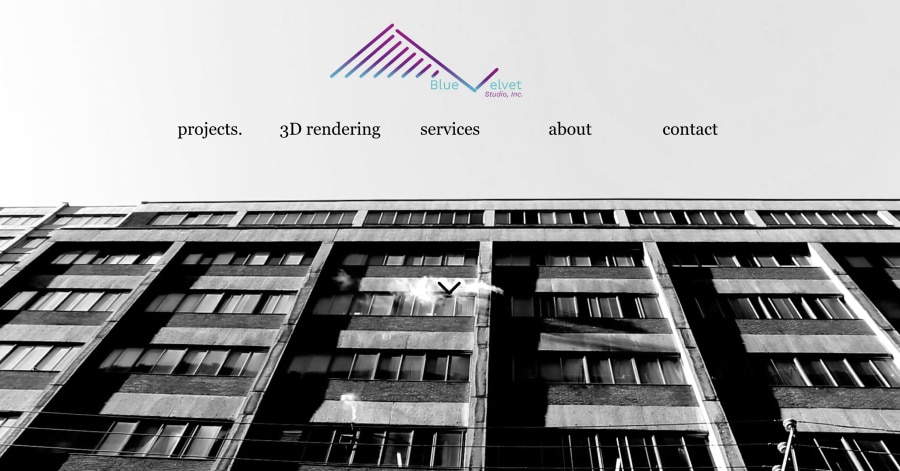
Blue Velvet Studio has a relaxed, one-page feel: a big full-screen photo and logo at the top, then a grid of small project thumbnails. Lowercase headings with a period, like "projects" and "about," give it a laid-back, modern vibe. A short About section, a contact form, and even a built-in music player round it out.
What you can learn from this great architecture website
- Bold style
- Clean, big images
- Unique web design style
6. CHG Architecture
URL: https://www.chgarchitecture.com/
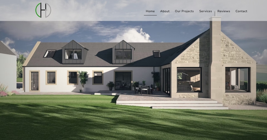
CHG Architecture has a warm, welcoming layout: a big project render up top with a friendly "Let's Grow Your Vision" message and a "Learn More" button. The "Get Inspired" section shows a mix of tall and wide project photos, from barn conversions to modern extensions. Client reviews, contact details, and RIBA/RIAS badges finish it off nicely.
What you can learn from this great architecture website
- Great pictures
- Lots of whitespace
- Good tagline
7. Clearview
URL: https://www.clearviewconsultancy.co.nz/
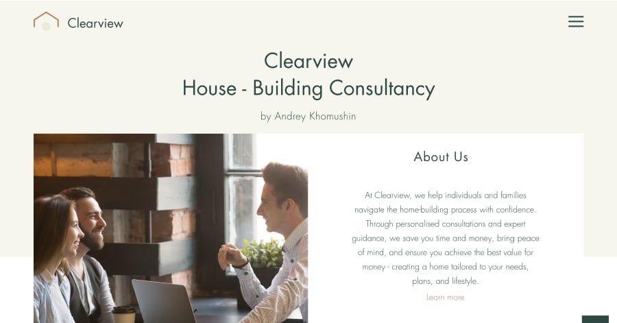
Clearview has a friendly, reassuring layout in warm, earthy tones. It walks you through the benefits in simple sections like "Save Money and Time" and "Gain Peace of Mind," with soft lifestyle photos in between. A "Book Free Consultation" button pops up throughout, and a handy FAQ at the bottom answers common questions. Helpful and easy to follow.
What you can learn from this great architecture website
- Beautiful pictures
- Lots of whitespaces
- Clear menu structure
8. Cosan Studio
URL: https://www.cosanstudio.com/
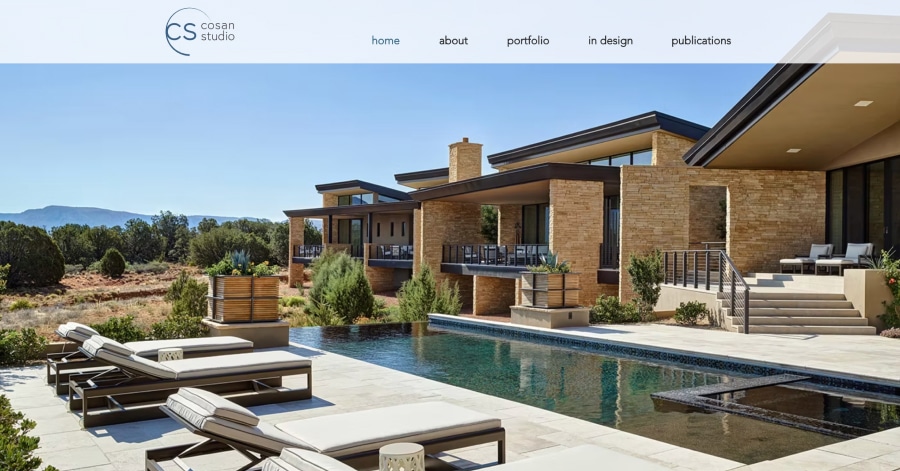
Cosan Studio feels upscale yet simple: a big hero photo, a small logo, and a lowercase menu across the top. The "Featured Projects" section shows three numbered homes, each with a photo, a short description, and a "View Project" link. A contact form and details close the page. Polished, uncluttered, and very easy to browse.
What you can learn from this great architecture website
- Clean design
- Great font style
- Breathtaking images
9. Craftwell
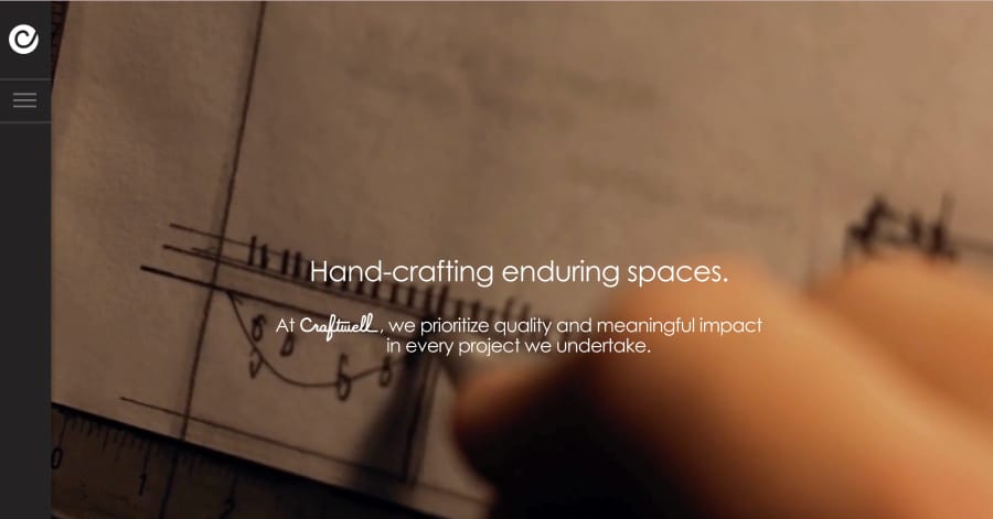
Craftwell opens with a striking full-screen background and a simple tagline: "Hand-crafting enduring spaces." A small stamp-style logo and a hamburger menu keep the top clean, with links to projects, awards, interiors, and "The Craft." Contact details sit quietly at the bottom. It feels artisanal, confident, and refreshingly uncluttered.
What you can learn from this great architecture website
- Nice video background
- Beautiful pictures
- Clean design
10. Donny Ankri Architects
URL: https://www.donnyankri.com/
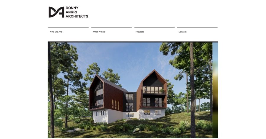
Donny Ankri Architects keeps things simple and photo-focused. A wide background image sits behind the logo and a short four-link menu: Who We Are, What We Do, Projects, and Contact. The center of the page is a 16-image project slideshow. With almost no text, it's clean, easy to navigate, and lets the work speak for itself.
What you can learn from this great architecture website
- Clear site structure
- Engaging pictures throughout the website
- Unique design
11. Edward Fitzgerald Architects
URL: https://www.efarchitects.com/
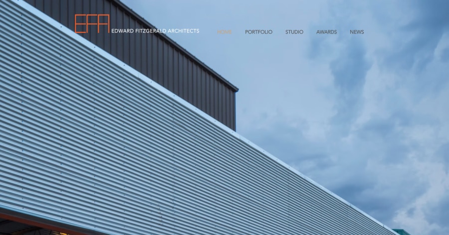
Edward Fitzgerald Architects opens with a big full-screen photo of a featured project, a climbing gym in Albuquerque, with the logo and a simple menu on top. Below, short labels like Urban Design and Contemporary Residential Design sum up what they do. A contact form and details close the page. Straightforward, bold, and easy to scan.
What you can learn from this great architecture website
- Amazing background picture
- Clean design with lots of whitespaces
- Nice font styling throughout the website
12. Furze Architecture + Design
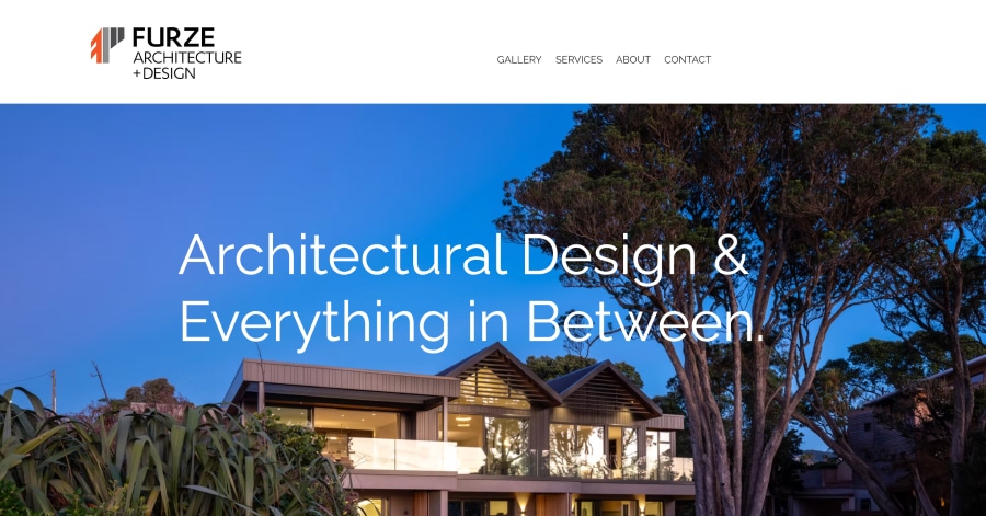
Furze has a warm, polished layout that leads with a big hero photo and the line "Architectural Design & Everything in Between." Short, punchy sections like "Beauty is in the detail" sit beside a scrolling strip of home and interior photos. A project video, a client testimonial, and plenty of social links round it out. Inviting and easy to explore.
What you can learn from this great architecture website
- By showing a lot of projects, they create a lot of social proof
- Great picture
- Clear menu structure
13. Granum Consulting
URL: https://www.granum.consulting/
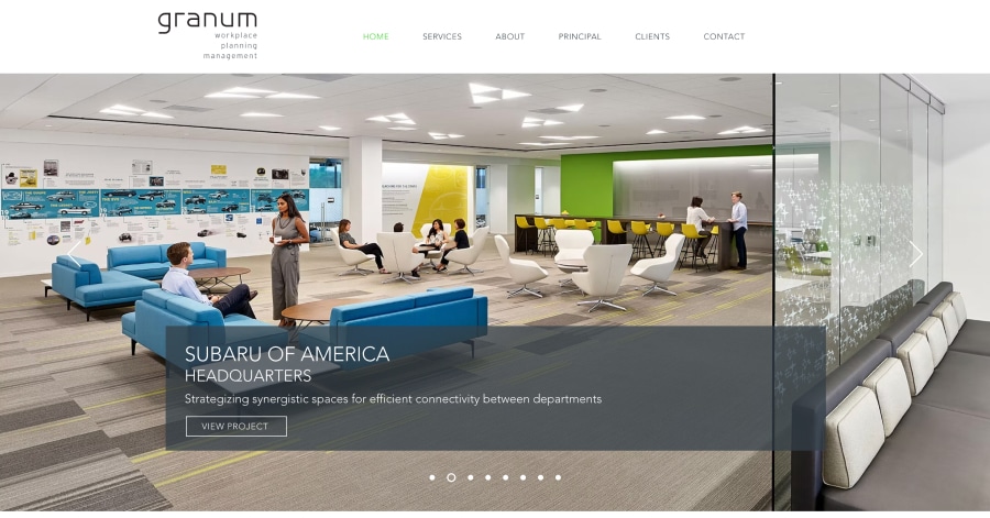
Granum Consulting has a sleek, corporate look. A large project slideshow opens the page, featuring big-name workplaces like Subaru's headquarters, with a short caption and a "View Project" button. Below, three square image tiles cover its services: workplace consulting, strategic planning, and project management. A short company blurb and contact links close it out. Clean and professional.
What you can learn from this great architecture website
- Beautiful background picture
- Nice font styling
- Lots of whitespaces which makes it easy to read
14. Greenline Architecture
URL: https://www.greenlinearch.com/
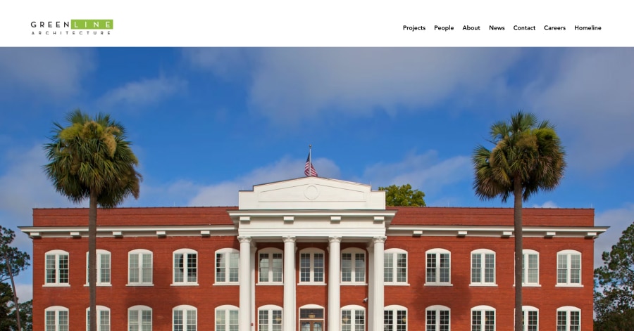
Greenline Architecture has a well-organized, full-featured homepage. A big project slideshow leads into short "Who we are" and "What we do" sections, followed by quick links to Architecture, Interior Design, and Historic Preservation. A client testimonial and a "What's new?" news section keep it fresh. Detailed but easy to scan, with a tidy dropdown for every project type.
What you can learn from this great architecture website
- Simple design but intuitive user experience
- Clear navigation
- Beautiful pictures
15. Habanero Architecture
URL: https://www.habaneroarchitecture.com/
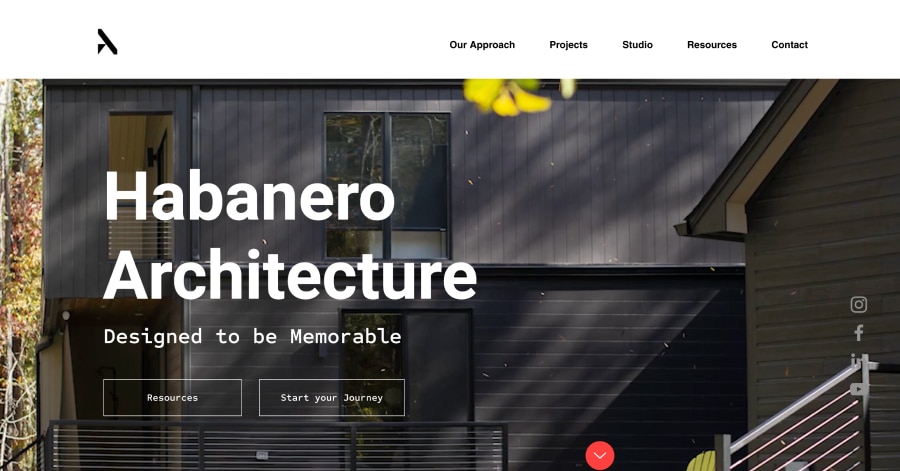
Habanero Architecture has a modern, story-driven homepage. A big hero image with "Designed to be Memorable" and a "Start Your Journey" button kicks things off. Below, a grid of square project photos leads into a simple five-step numbered process, from Discovery to Move-In. Client quotes, press logos, and a consultation button finish it off. Polished and inviting.
What you can learn from this great architecture website
- Cool animations
- Beautiful pictures
- Clear navigation
16. HMAD Architects
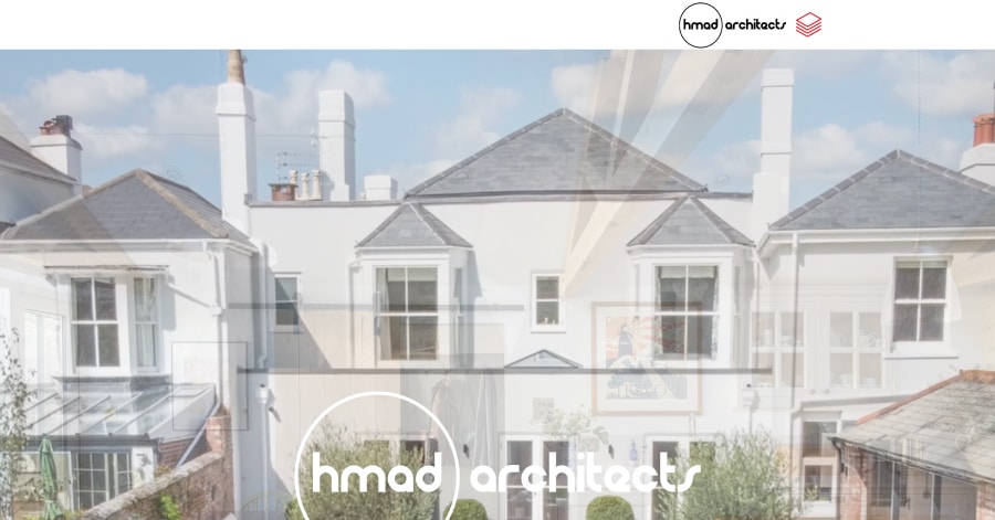
hmad architects keeps it simple and confident. A large photo of a listed cottage extension fills the screen with the logo on top, followed by the tagline "better by design." Below, a friendly block of text explains their focus on historic and listed buildings. With just three menu links and a direct call-to-action phone number, it's clean, personal, and easy to follow.
What you can learn from this great architecture website
- Big pictures
- Lots of whitespaces
- Great overview of the previous project
17. Janssen Designs
URL: https://www.janssendesigns.com.au/
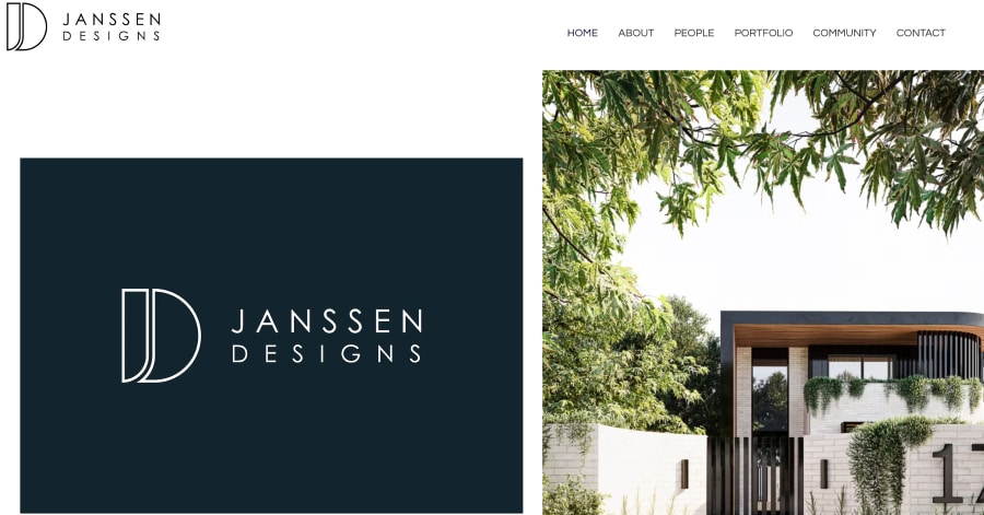
Janssen Designs has a simple, friendly layout. A large logo greets you at the top, followed by the line "We aim to inspire" and a short studio intro next to a couple of project photos. The menu covers the basics, plus a community page. Contact details sit neatly at the bottom. Clean, personal, and quick to read.
What you can learn from this great architecture website
- Unique design
- Great way of displaying previous projects
- High-quality images
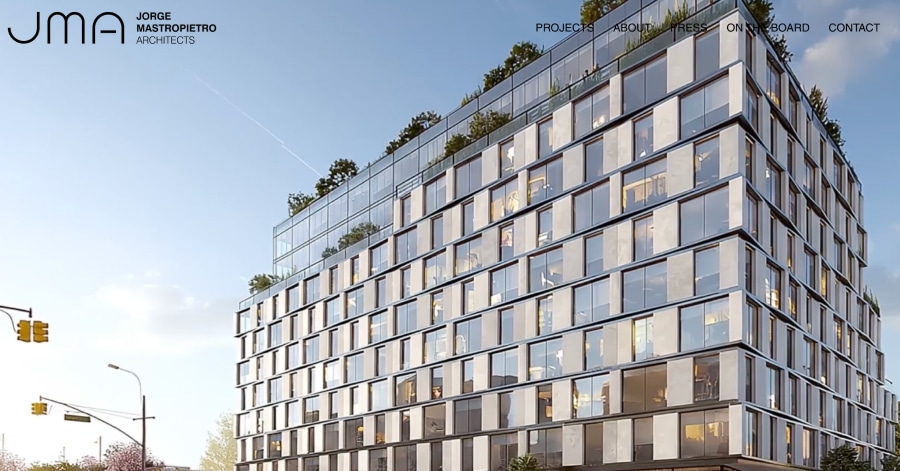
18. Jorge Mastropietro Architects
JMA keeps its homepage sleek and minimal. A clean black logo and a short menu sit at the top: Projects, About, Press, On the Board, and Contact. Below is a large full-width slideshow of project photos. There's no extra text, just social icons at the bottom, so the focus stays on the work. Simple, stylish, and easy to browse.
What you can learn from this great architecture website
- Nice scroll animations throughout the website
- Amazing images
- Clean design
19. Kraft Architects
URL: https://www.kraftarchitects.net/
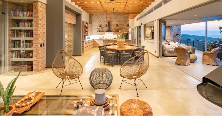
Kraft Architects lets its projects do the talking. A small logo and a big header image open the page, then a bold grid of square photos mixes large and small tiles for a magazine-style feel. Projects range from estates to Zannier Hotels. There's almost no text, just social icons at the bottom. Striking, modern, and very visual.
What you can learn from this great architecture website
- Unique design
- Great images
- Playful design
20. Layton Design
URL: https://www.laytondesign.com.au/
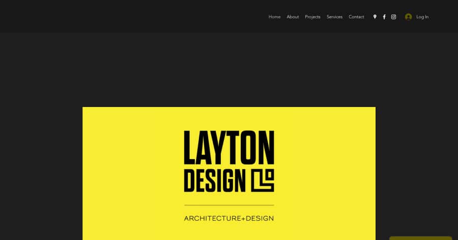
Layton Design has a fun, personal one-page layout. A wide hero image and a friendly About section with the director's photo open the page. Projects come with playful hashtag names like #Oreo and #Butch, each with a "#CheckItOut" link, set in an alternating photo-and-text layout. A clear five-step process and a contact form close it out.
What you can learn from this great architecture website
- Nice black and clean design
- Subtle animations
- Small touches of color to highlight navigation elements
21. Local Element Architects
URL: https://www.localelementarchitects.com/
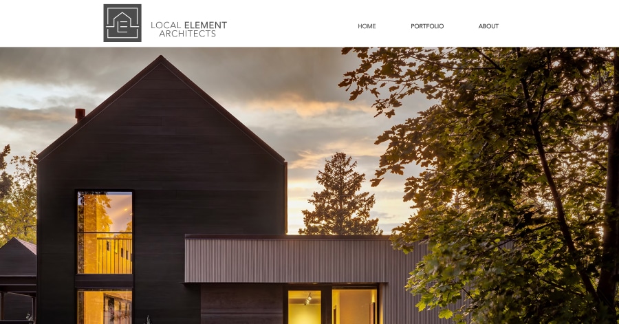
Local Element Architects keeps things short and sweet. A big full-width background photo sets the mood, with a small logo and a simple three-link menu: Home, Portfolio, and About. One more featured image follows, then contact details and a quick message form at the bottom. Clean, quiet, and easy to navigate, letting the photos do the talking.
What you can learn from this great architecture website
- Lots of whitespaces
- Call to action just below the fold
- Great touches of color
22. Michael Lewis Architects
URL: https://www.mlarchitect.com/
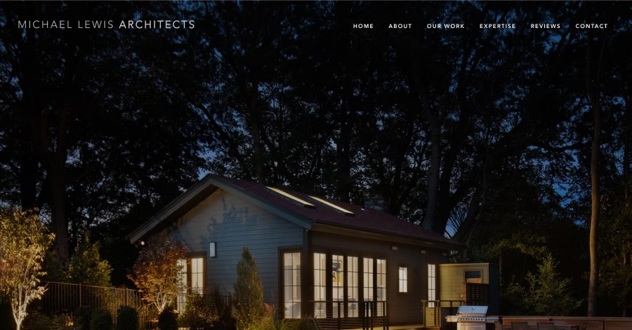
Michael Lewis Architects has a polished, welcoming homepage. A captioned project slideshow opens the page, followed by a short intro about the firm and a "Let's Talk" button. The "Selected Work" section highlights four homes, with a "See More Work" link. A newsletter signup, a Best of Houzz badge, and contact details close it out. Professional yet approachable.
What you can learn from this great architecture website
- A lot of whitespaces
- Focus on images
- Easy to build and maintain
23. Moussaoui
URL: https://www.moussaoui.com.au/
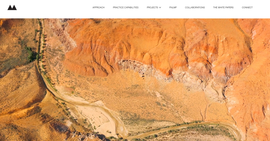
Moussaoui has a thoughtful, story-driven homepage. It opens with sweeping Australian desert imagery and the tagline "Connect. Refine. Discover." From there, it scrolls through featured projects tagged "Macro" for architecture and "Micro" for interiors, plus videos, a sustainability article, and partner logos. Rich and detailed, it feels more like a magazine than a typical portfolio.
What you can learn from this great architecture website
- Smooth scrolling animations and page transitions
- Strikethrough text style activates when the mouse hovers on top of certain texts.
- Classic color scheme
24. Nest Architectural Design
URL: https://www.nestarch.com/
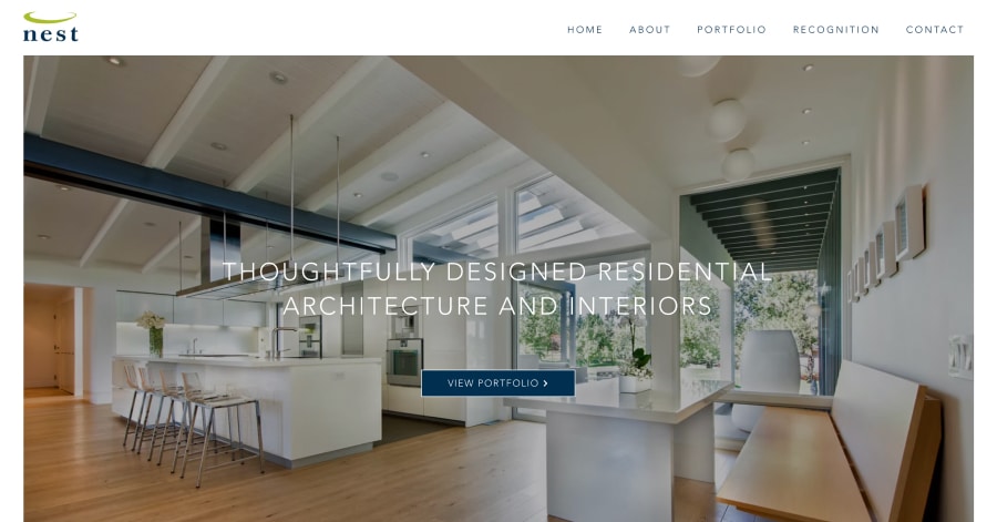
Nest keeps its homepage short and sweet. One big hero photo fills the screen with a single headline, "Thoughtfully designed residential architecture and interiors," and a "View Portfolio" button. A small logo and a five-link menu sit up top, with social icons at the bottom. Simple, focused, and easy to use, it points you straight to the work.
What you can learn from this great architecture website
- Background color changes upon scrolling
- Well-thought-out and artistic images
- Sleek and professional web design
25. Proform
URL: https://www.proformgroup.co.nz/
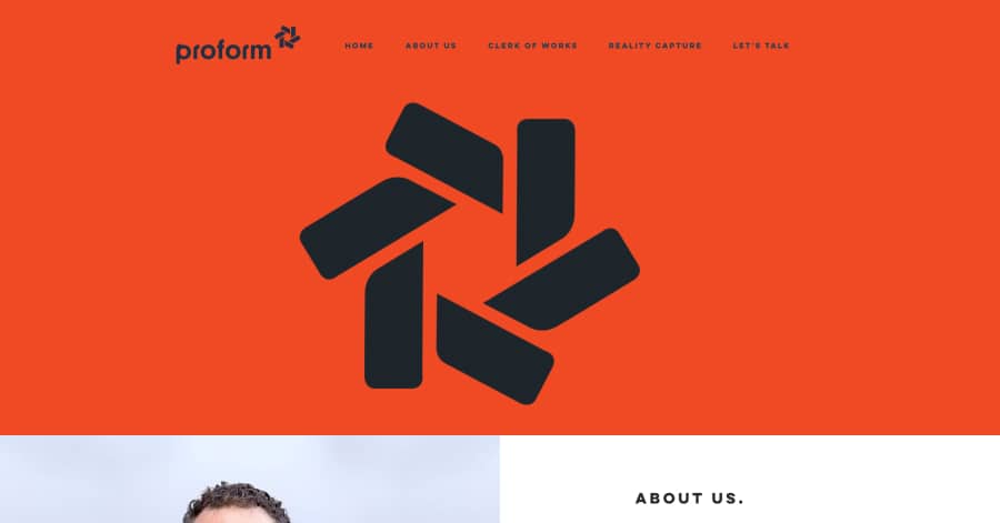
Proform Group has a practical, business-friendly layout with a blue logo and pops of bright orange. A short About section and quick call and LinkedIn links lead into a detailed Services list with catchy headings like "Getting it done" and "Lending a hand." A teamwork quote and a "Let's Talk" contact form close it out. Clear, upbeat, and informative.
What you can learn from this great architecture website
- A color scheme combination of light-muted and dark-muted colors
- Captivating and trendy content above the fold
- Awesome images
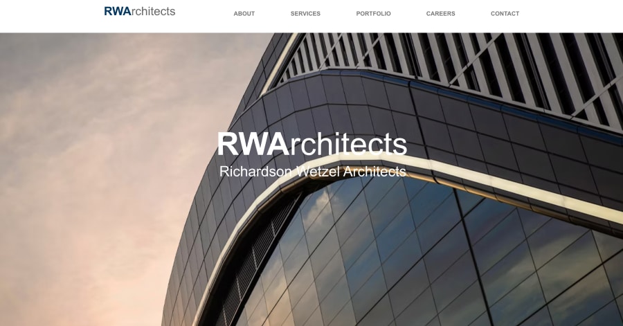
26. Richardson Wetzel Architects
URL: https://www.rwa-design.com/
RWA has a clean, corporate one-page layout. A wide banner photo of a big-name project, Allegiant Stadium, opens the page, followed by an About section with a photo of the leadership team. Three service links (Architecture, Planning, and Local Support) sit over a large image, then a neat photo gallery and a contact form close it out. Professional and easy to scan.
What you can learn from this great architecture website
- Great theme
- Minimalist aesthetic
- Elegant ambiance
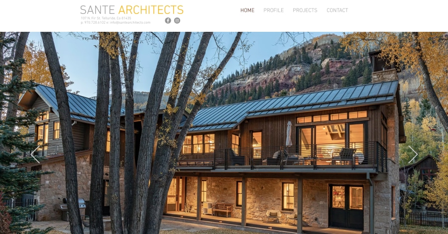
27. Sante Architects
URL: https://www.santearchitects.com/
Sante Architects keeps it clean and simple. The firm's name, address, and phone number sit right at the top, followed by a large slideshow of mountain-modern homes. A short "Learn About Our Practice" blurb with a Profile button comes next, and the dropdown menu lists every project by name. Straightforward, tidy, and easy to explore.
What you can learn from this great architecture website
- Awesome color palette
- Clean images
- Welcoming vibe
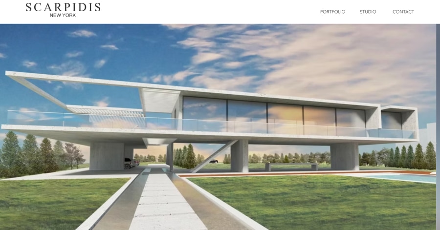
28. Scarpidis Design
URL: https://big.dk/
Scarpidis Design feels sleek and luxurious. A spaced-out wordmark and a tidy dropdown menu sit above a 12-image slideshow of high-end interiors. A short, elegant intro describes the studio's blend of architecture, interiors, furniture, and art, with a "Get in Touch" button. With minimal text and a refined footer, it feels upscale and effortlessly stylish.
What you can learn from this great architecture website
- Minimalist aesthetic
- Simple and clean
- Sophisticated vibe
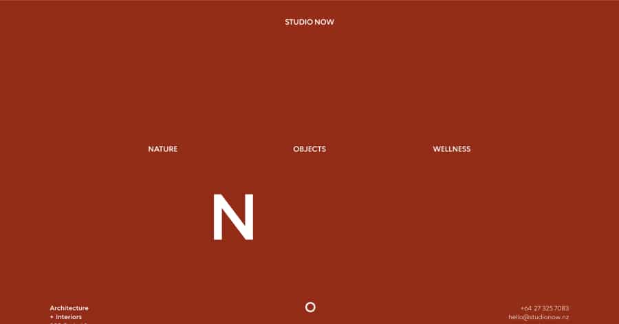
29. Studio Now
URL: https://www.studionow.nz/
Studio Now has a calm, nature-inspired feel. Three simple words, Objects, Nature, and Wellness, sit above an animated logo and a short tagline about "nature-inspired architectural objects." Below, a long stream of large project photos flows down the page, followed by a tidy list of awards and press links. Minimal, peaceful, and refreshingly different.
What you can learn from this great architecture website
- Stunning web design
- Simple header
- Great color palette
30. Studio Razbash
URL: https://www.studiorazbash.com/
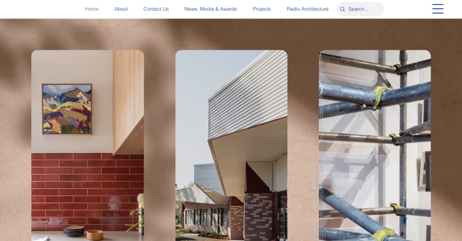
Studio Razbash has a creative, easy-to-navigate homepage built around great sound. A big background image sets the scene, then three photo cards point you to the right path: Homeowners ("Co-Create"), Commercial ("Transform"), and Installations ("Reveal"). A full footer lists services and links, including a unique "Radio Architecture" page. Fresh, clear, and a little different.
What you can learn from this great architecture website
- Rich and elegant vibes
- Stylish font
- Awesome images
31. Swansilva Architecture
URL: https://www.swansilva.com/
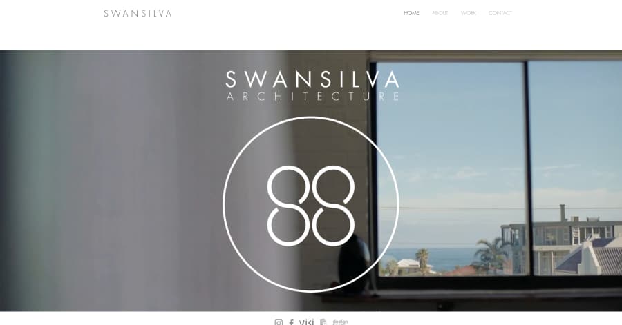
Swansilva keeps things bold and minimal. A full-screen background image fills the page, with the studio name in large letters, a white logo, and a simple four-link menu: Home, About, Work, and Contact. Small press logos from ArchDaily and Designboom sit quietly at the bottom. Clean, confident, and easy on the eyes, it lets the imagery set the mood.
What you can learn from this great architecture website
- Lots of white spaces
- Simple and clean
- Great images

32. The High-Line Group
URL: https://www.high-linegroup.com/
The High-Line Group has a solid, business-focused layout. A big banner opens the page, followed by three clear sections—Commercial Design, Program Management, and Planning & Sustainable Design—each pairing a large project photo with a short description. A wall of client logos, including CBRE and BNY Mellon, builds trust before the contact form. Professional and easy to follow.
What you can learn from this great architecture website
- Simple vibe
- Clean and minimalist
- Great use of black spaces
33. Torrence Architects
URL: https://www.torrencearchitects.com/
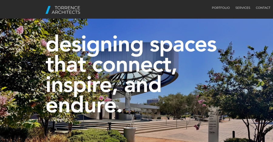
Torrence Architects has a full, well-organized one-page layout with relaxed lowercase headings like "Welcome to Torrence Architects!" A big hero photo leads into scrolling galleries of homes and restaurants, then five numbered services, including ADUs and wildfire rebuilds. Team bios and a detailed consultation form round it out. Informative, friendly, and easy to follow.
What you can learn from this great architecture website
- Elegant and sophisticated
- Stylish font
- Awesome images
34. Architecture South
URL: https://www.architecturesouth.com/
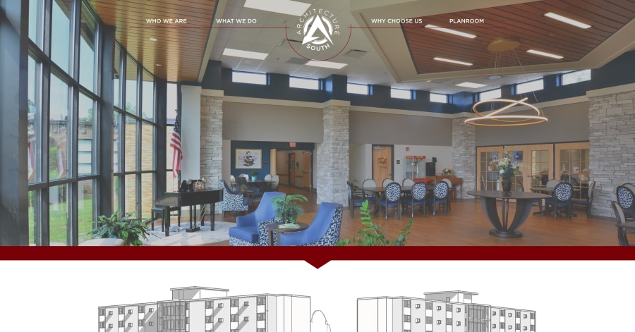
Architecture South has a classic, full-featured one-page layout with a badge-style logo and a decorative header border. A black-and-white banner and a short mission line open the page, followed by an About section, bold slogans like "We listen intently. We create value," and a big project photo grid. A testimonial, contact form, map, and online planroom link close it out.
What you can learn from this great architecture website
- Simple web design
- Great pop of color
- Minimalist aesthetic
35. Atelier 4e Niveau
URL: https://www.atelier4niveau.com/
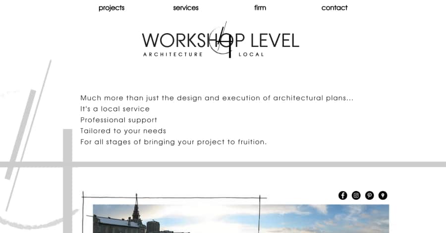
Atelier 4e Niveau has a clean, friendly layout in French, with lowercase menu links like "projets" and "contact." The name and tagline "Architecture de proximité" (local, close-to-home architecture) lead the page, followed by a short welcoming intro. Simple text links sort projects by type, a wide photo banner follows, and quick "About" links close it out. Simple and approachable.
What you can learn from this great architecture website
- Great color palette
- Awesome images
- Visually pleasing to the eyes
36. CA Homes
URL: https://www.ca-homes.co.uk/
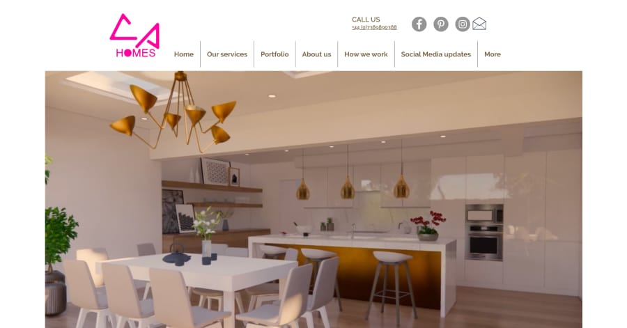
CA-Homes has a busy but helpful one-page layout. A round logo, phone number, and social icons sit up top, followed by a video banner and a project slideshow. Each service, from loft conversions to outdoor buildings, gets its own mini slideshow and short explanation. A founder bio, a step-by-step "How we work" section, and contact details close it out. Thorough and homeowner-friendly.
What you can learn from this great architecture website
- Lots of white spaces
- Simple and clean
- Awesome image
37. Brandon Breaux Design
URL: https://www.brandonbreauxdesign.com/
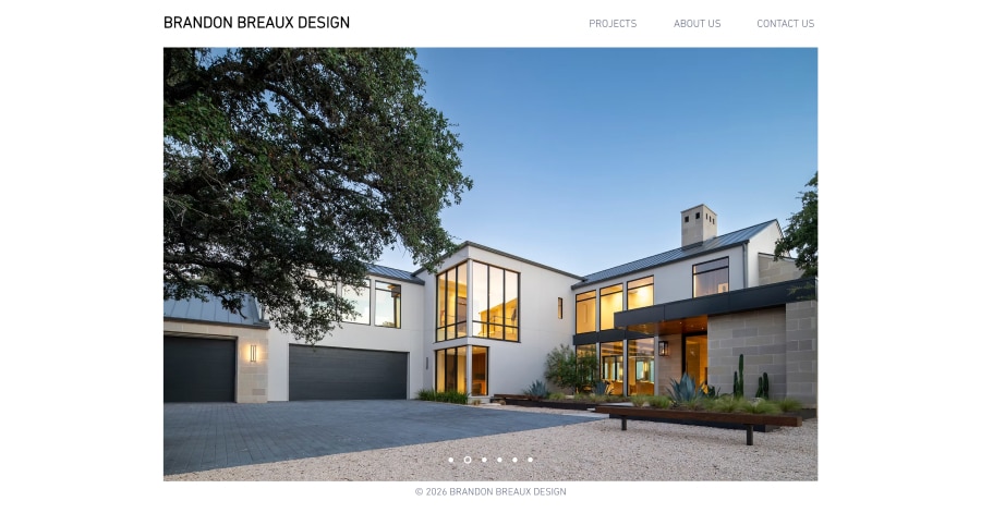
Brandon Breaux Design keeps it super minimal. The studio name sits at the top with a short three-link menu: Projects, About Us, and Contact Us. The rest of the homepage is a large six-image slideshow of custom homes, with just a small "Residential Architecture, Houston, TX" line at the bottom. Clean, quiet, and completely photo-focused.
What you can learn from this great architecture website
- Rich color palette
- Captivating and trendy content
- Easy menu navigation
38. Jason Chandler Architecture
URL: https://www.chandlerarchitecture.com/
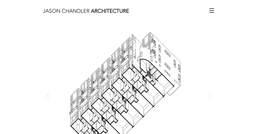
Jason Chandler Architecture is about as minimal as it gets. The name sits at the top, followed by a square three-image project slideshow. There's no menu or extra text, just an Instagram icon, an email address, and a phone number at the bottom. It feels like a quiet digital business card that lets a few strong images speak for the work.
What you can learn from this great architecture website
- Great use of white spaces
- Captivating aesthetic
- Awesome images
39. Destree Architecture & Design
URL: https://www.destreearchitects.com/
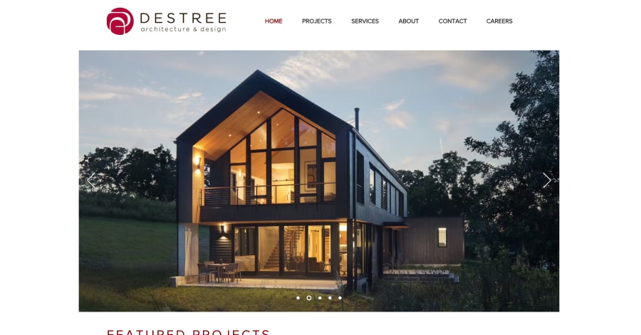
Destree Design Architects has a polished, well-organized homepage. A large project slideshow opens the page, followed by a "Featured Projects" section that pairs square photos with short, story-like descriptions of a workspace, a lake lodge, a bank, and a modern home. A wide photo, contact details, and certification badges close it out. Inviting and easy to explore.
What you can learn from this great architecture website
- Fun images
- Stunning logo
- Rich and elegant vibe
40. Duffy-Magas + Associates
URL: https://www.duffy-magas.com/
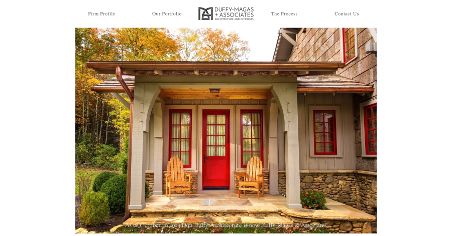
Duffy-Magas + Associates keeps its homepage short and simple. A small logo and a five-link menu sit above a six-image slideshow of custom homes, and you can click to zoom in on each photo. Below, a short note explains the firm's recent name change, followed by the address and phone number. Clean, classic, and easy to navigate.
What you can learn from this great architecture website
- Great photograph
- Stunning homepage
- Easy navigation
41. Dykeman Architecture + Design
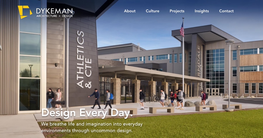
Dykeman Architects has a bright, people-focused homepage. A wide hero photo with the punchy slogan “Design Every Day.” kicks things off, followed by a short intro to its three studios: Architecture, Interiors, and Graphic Design. A large featured project photo leads into a friendly “Our Team” section with candid staff photos. Modern, welcoming, and easy to explore.
What you can learn from this great architecture website
- Short, catchy slogan
- Friendly and approachable
- Clear categories
42. Framework Architects
URL: https://www.frameworkarchs.com/
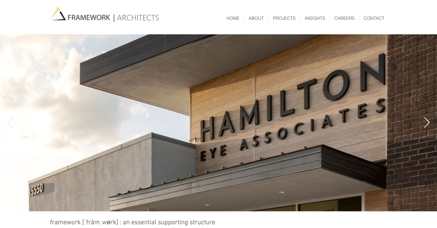
Framework Architects keeps its homepage clean and image-led. A long logo and a tidy menu sit at the top, with projects sorted into categories like Office, Retail, and Medical. Below, a wide, cinematic slideshow of project photos takes center stage. A clever dictionary-style definition of “framework” in the footer adds a thoughtful touch. Simple and professional.
What you can learn from this great architecture website
- Wide, banner-style photos make a homepage feel bold and cinematic
- Small creative detail
- Sorting projects by type in the menu helps visitors find relevant work fast
43. Kent Design Studio
URL: https://www.kentdesignstudio.co.uk/
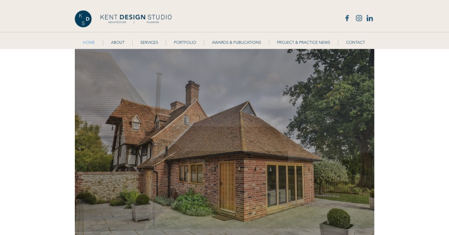
Kent Design Studio keeps its homepage simple and focused. A clean logo, small social icons, and a full menu sit at the top, followed by an eight-image project slideshow where each slide links to its project page. A short headline explains their expert architectural services, and contact details sit neatly in the footer. Tidy, professional, and easy to use.
What you can learn from this great architecture website
- Linking each slideshow image to its project page makes browsing quick and natural
- One clear headline can explain what a business does without extra clutter
- Pages like Awards and News help build credibility
44. Martin Riley Architects
URL: https://www.martin-riley.com/
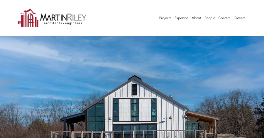
Martin Riley has a lively, well-structured homepage. A big project slideshow with a playful “There’s more where that came from” line opens the page, followed by a short mission statement. The “Expertise” section uses neat icons that switch from black to red on hover, covering everything from architecture to engineering. A featured project and a client testimonial round it out.
What you can learn from this great architecture website
- Simple icons with hover effects make a long list of services fun and easy to scan
- Playful headlines add personality to a professional firm
- Pairing a featured project with a client testimonial builds trust quickly
45. Konosky Associates
URL: https://www.myplanfile.com/
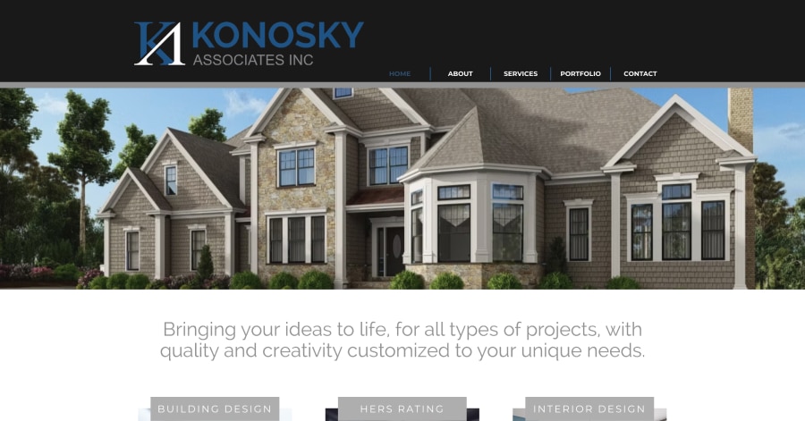
Konosky Associates has a friendly, easy-to-follow homepage. A logo and dropdown menu sit above a seven-image slideshow of wide project photos. Three neat service cards, Building Design, HERS Rating, and Interior Design, each pair a photo with a short blurb and a “More” link. A dedicated ADU section and a clear “Contact Us” prompt close it out.
What you can learn from this great architecture website
- Service cards with a photo, a short blurb, and a link make offerings easy to compare
- Giving a key service its own section helps it stand out
- A simple closing call to action encourages visitors to reach out
46. Mitchell & Milmine
URL: https://www.mitchellandmilmine.com/
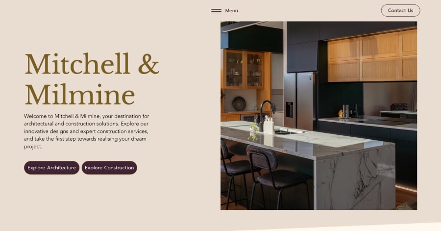
Mitchell & Milmine has a warm, straightforward one-page layout. A welcome message with two clear buttons, “Explore Architecture” and “Explore Construction,” lets visitors choose their path right away. Friendly team bios with photos follow, then a tidy list of key services and a contact form. Simple, personal, and easy to navigate.
What you can learn from this great architecture website
- Two clear buttons up top help visitors with different needs find the right section fast
- Team bios with photos make a small business feel personal and trustworthy
- A short, linked list of services keeps things scannable
47. Neely Architecture
URL: https://www.lneelyarchitecture.com/
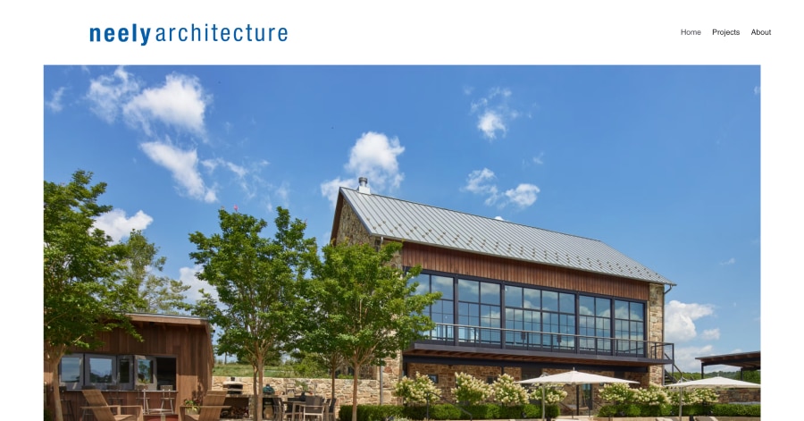
Neely Architecture keeps its homepage simple and elegant. A slim logo and short menu sit at the top, and the Projects dropdown lists every home by name, from farmhouses to city residences. One large photo of a barn guesthouse fills the page with an “Explore Our Projects” button. Contact details and social icons sit neatly at the bottom.
What you can learn from this great architecture website
- One strong hero photo can make a homepage feel calm and confident
- A single clear button guides visitors straight to the work.
- Listing projects by name in the menu makes it easy to jump to a specific one.
48. NICEMAKERS
URL: https://www.nicemakers.com/
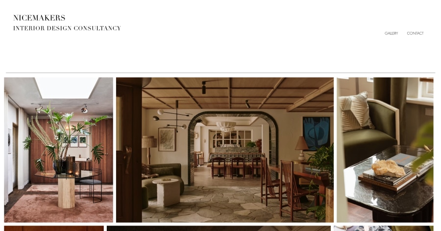
NICEMAKERS feels stylish and editorial. The bold studio name and “Interior Design Consultancy” sit at the top with a tiny menu. The homepage is basically one big photo gallery, mixing tall and wide interior shots in neat rows like a design magazine. A tidy footer menu and quick links to featured projects close it out. Chic, minimal, and very visual.
What you can learn from this great architecture website
- Mixing tall and wide photos in rows creates a stylish, magazine-like gallery
- Letting the work fill the homepage can say more than paragraphs of text
- Quick links to featured projects in the footer help visitors dive deeper
49. Sander Design
URL: https://www.sanderdesign.ca/
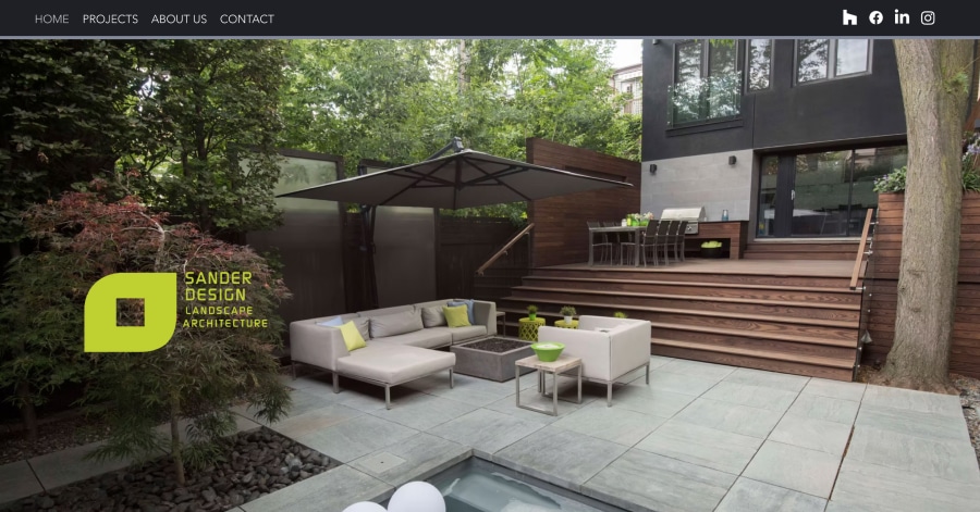
Sander Design has a fresh, garden-inspired homepage for this Toronto landscape architect. A big full-screen photo of a lush outdoor space opens the page, followed by a short intro and a glowing client quote. A “Professional Services” section pairs photos with short steps, from consultation to inspection. A mosaic of garden photos and a contact form close it out.
What you can learn from this great architecture website
- Showing services as clear, step-by-step stages helps clients understand the process
- Placing a client quote near the top builds trust right away
- A photo mosaic makes outdoor work feel inviting and full of life
50. Phillips Win Architecture
URL: https://www.phillipswin.com/
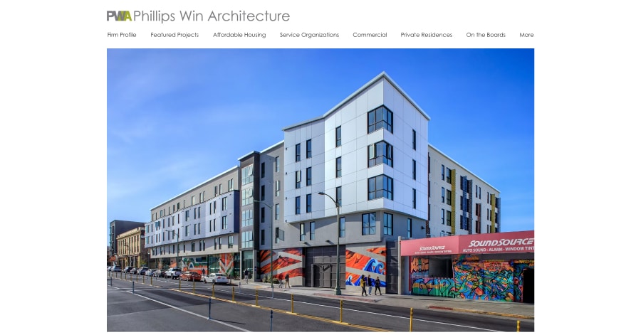
Phillips Win Architecture has a clean, organized homepage. A slim logo sits above a detailed menu that sorts projects into categories like Affordable Housing, Service Organizations, and Community Spaces. The main area is a 13-slide project slideshow, with each slide showing the project name and city and linking to its page. Contact details and social icons sit neatly at the bottom.
What you can learn from this great architecture website
- Adding the project name and location to each slide gives visitors helpful context
- Organizing projects by purpose shows what a firm truly cares about
- A detailed menu makes a large portfolio easy to explore
BONUS - Here is my favorite template

Architect Website Template
URL: https://mycodelesswebsite.com/try-theme/architecture-firm
Why this is such a great template
- Clean design, great to turn visitors into customers
- Wordpress compatible, easy to customize
- Free download if you're a Divi member

Traditional Architect Template
- Classic architect design
- WordPress compatible, easy to customize

Beautiful Architect Template
- Elegant template, great design
- WordPress compatible, easy to customize

Constructor Architect Template
- Great template, easy to install
- WordPress compatible, easy to customize

Elegant Architect Template
- Compelling design which will turn visitors into customers
- WordPress compatible, easy to customize

Practical Architect Template
- Great template for the practical side of architecture
- WordPress compatible, easy to customize

Electrician Architect Template
- Although this template was originally built for electricians, it’s great for architects
- WordPress compatible, easy to customize

Classic Architect Template
- Classic template which has a professional look and feel
- WordPress compatible, easy to customize

Architect Agency Template
- Great template, easy to set up
- WordPress compatible, easy to customize

Indoor Architect Template
- Great template for indoor architecture
- WordPress compatible, easy to customize
FAQ
What makes a good architect website?
A great architect design should have a clean design, be easy to navigate and include a lot of social proof. Have a look at this page for great example websites.
How to create an architect website?
- Analyze the best examples on this page
- Make notes of what you like – and what you don’t like
- Design your own site with this a drag & drop website builder
- Publish your website with our recommended hosting platform.
How much does an architect website cost?
A web designer will charge anywhere between $2500 and $5000 for a decent website. However, this article will teach you to do it yourself for less than $100.
What information is needed on an architect website?
Your website will need at least the following pages: 'Home, About us, Contact, Portfolio'. To create trust with your visitor it's important to show lots of pictures of your team and your latest projects.

Next steps to build your architect website
1. Find a template to get started
When building a architect website, I prefer not to start from scratch. Get started with a template that you can 100% adjust to how you like it.
2. Try 14-Days For Free
I recommend Wix to build a architect website. If you use this button you can sign up and cancel within 14-days and get 100% of your money back no matter the reason.